| Author | Thread |
|
|
01/23/2009 03:17:31 PM · #1 |
I was hoping some of you might be able to offer me some more tips on what I could do to make my photos better, specifically by Best of '08 shot.
I scored in the top 60%, but I figure that still leaves a whole lotta room for improvement. So what would you do different? Post-process it differently? Color/BW? Composition/crop? Chuck the whole thing and start over?
Feel free to be as harsh as you feel necessary. I have pretty tough skin and I think the best way to learn is to find out *exactly* what's wrong.
Thanks. |
|
|
|
01/23/2009 03:44:50 PM · #2 |
|
|
|
01/23/2009 03:49:05 PM · #3 |
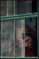
My take is that it's subtle, moody, and introspective - just the sort of thing that generally doesn't "wow" here. When people are wading through over 500 submissions they don't spend much time with any one, so subtler shots get buried.
If I were to critique and nitpick I'd say that the skin tones look a little off to me (though I'm not on a calibrated monitor, so take that with a grain of salt) and the eye is perhaps a touch overprocessed (seems unnaturally bright to me). But in general I don't think these things probably altered your score much.
I think it's a great shot. |
|
|
|
01/23/2009 04:36:58 PM · #4 |
Thank you for the replies.
bobonacus: Thanks for being honest about how much time you looked at the photo. That you didn't look too long means that my photo wasn't strong enough or interesting enough to hold your attention. I was actually at a 45 degree angle to the boy in the window (I was sitting in another truck with a broken foot, so I did very little moving : )). Maybe the crop makes it looks straight on with the right angle on the bottom right. When taking the photo, I purposely tried to make that corner a right angle. I thought it looked better like that, but I guess not : ) I also took one version in landscape orientation, but the bus/truck is actually white with only the window trim in the teal color and I preferred the version without the white so that the two main colors (red and the teal/green) would be opposites. I thought about cropping some off the top, but worried that voters don't seem to like square crops. Maybe if I crop the top and a little of the left? Or would that be too tight? My poor old Oly was terrible with noise, so I guess I should have paid more attention to that.
eamurdock: I wondered if this might do better in the posthumous "Best of 2008" due to the moody feel, but I entered it in this one instead because I wanted to see what the masses would think of it : ) How off do the skin tones look to you? What color? I have only a cheap, uncalibrated laptop to edit on. I try to edit the color specifically for the skin, but I can never tell if I'm right or not. I worried that people might find the eye a little overprocessed, but I knew that the dirty window might be a bigger attention getter and that voters like pretty/sharp eyes. I scaled the dodging back some, but I guess not enough : ) I've been trying to find the sweet spot between "not processed enough" and "too processed," so it's helpful to know which side this one falls on.
Thank you both again for taking the time to give me some helpful comments! |
|
|
|
01/23/2009 04:59:00 PM · #5 |
| No critical input here. I was one of your 9's. |
|
|
|
01/23/2009 08:47:13 PM · #6 |
I dunno, they just look a little pink/grey to me, like maybe it needs a touch more yellow in the skin? But like I say I'm also on an uncalibrated monitor, so perhaps mine is not the advice to seek on this issue.
Overall I think it's a very powerful image, just one that takes a little more time to appreciate than DPC generally provides (particularly in such a huge challenge). My criticisms were as much an attempt not to just leave you with "I dunno, it looks good!" answers. But it does.
As to this quote: "That you didn't look too long means that my photo wasn't strong enough or interesting enough to hold your attention. " I wouldn't spend too much time thinking about that if I were you. There are some spectacular pictures that are very subtle, and require the investment of some time to understand. Flash and attention-grabbing images are not bad things, but they're not the only good things. |
|
|
|
01/24/2009 01:43:08 PM · #7 |
yospiff: Thank you. Your comment on my photo and the fave had me dancing at work : )
zackdezon: Thank you for the compliments. Chris does have pretty nice blue eyes, but I wasn't sure I did them justice by painting the color back in : )
earmurdock: You're probably right about the pink/gray skin. He was incredibly sunburned, so I partially desaturated his face, which would make him look a little gray. I'll have to keep that in mind for future edits! I know that more subtle shots can be just as good as the attention-grabbing ones, but most clients aren't photographers and they seem more likely to buy the attention-grabbers than anything else. My style seems to fall into the "anything else" category, so I'm trying to take my style and add just enough "attention-grabbing-ness" to make it appealing to more people while still being very "me." It's hard to make a living with just fine art shots, so I figure it'll be better if I can make my photographs appealing to the majority, if not the masses : )
chromeydome: Thank you for the PostLuminous Award! I'm honored! |
|
Home -
Challenges -
Community -
League -
Photos -
Cameras -
Lenses -
Learn -
Help -
Terms of Use -
Privacy -
Top ^
DPChallenge, and website content and design, Copyright © 2001-2025 Challenging Technologies, LLC.
All digital photo copyrights belong to the photographers and may not be used without permission.
Current Server Time: 12/03/2025 04:35:54 AM EST.


