| Author | Thread |
|
|
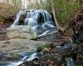
12/30/2008 07:38:26 PM · #1 |
I would like comments and suggestions for improvement on this image. My son says it is not one of my best because of the "decay" (actually a stream bank) on the right.
 |
|
|
|
12/30/2008 07:42:10 PM · #2 |
I agree with your son, the bank at the right side of the stream doesn't add anything to the image, you should just crop it out. I would leave the bottom bit though, the brown leaves on the rock are nice.
Might also be useful to increase the contrast a bit, or apply a curves adjustment to get a little more out of the colours and enhance the water.
Apart from that, it's a very nice shot! |
|
|
|
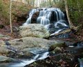
12/30/2008 08:01:44 PM · #3 |
OK, this is a different shot with a bit different angle and more changes to curves. Is this better? To my eye, it strikes me as more garish.
 |
|
|
|
12/30/2008 08:18:12 PM · #4 |
I prefer the framing of the first shot (without the right side) but the adjustments on the second shot :) I am viewing on a laptop screen mind you, so the colours may look a little different to me.
Saying that, (and at the risk of getting sidetracked) I've just had a look at your portfolio and your nature shots in general are very good, I particularly like this one:
|
|
|
|
12/30/2008 08:19:03 PM · #5 |
| To me the second shot feels off balanced... i like the angle better on the first shot. |
|
|
|
12/30/2008 09:25:43 PM · #6 |
I rather like the second shot actually.

Edit steps
Cropped to square
Desaturated
I did selective color adjustments on the greys and whites also.
Dodged/burned
Added vignette
Neat Image
Message edited by author 2008-12-30 21:30:02. |
|
|
|
12/30/2008 09:35:58 PM · #7 |
Originally posted by aliqui:
I rather like the second shot actually.
Edit steps
Cropped to square
Desaturated
I did selective color adjustments on the greys and whites also.
Dodged/burned
Added vignette
Neat Image |
This is an interesting take on the image. I think it could grow on me. I never thought of trying these in B&W |
|
|
|
12/30/2008 09:44:58 PM · #8 |
| yeah, the "decay" is too prominent in the foreground, draws your eye away from the falls |
|
Home -
Challenges -
Community -
League -
Photos -
Cameras -
Lenses -
Learn -
Help -
Terms of Use -
Privacy -
Top ^
DPChallenge, and website content and design, Copyright © 2001-2025 Challenging Technologies, LLC.
All digital photo copyrights belong to the photographers and may not be used without permission.
Current Server Time: 12/03/2025 02:15:10 PM EST.


