| Author | Thread |
|
|
12/08/2008 12:47:31 AM · #1 |
Hey guys,
I haven't really had time to enter many challenges here lately due to school and starting my own business (more on that when my website is finished later this month). Anyhoo, I was wondering, on my most recet free study entry what I could have done better. From one of the few comments I recieved from someone who apparently didn't like it, the editing didn't lend itself to the photo. Thoughts, would an completly saturated version be better? It just seems as though this entery is much better than some of my other work and I'm confused as to why it got such a lower score. Here is the image... 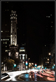
Tear me down and build me back up please!
Evan |
|
|
|
12/08/2008 01:26:27 AM · #2 |
|
|
|
12/08/2008 01:34:04 AM · #3 |
| I actually like the image, but the colors threw me off as well. The pastel treatment seems a little odd - where you'd normally expect green & red, we get aqua & pink. It would be interesting to see them for comparison. |
|
|
|
12/08/2008 01:34:29 AM · #4 |
Left you one. Here's an interesting excercise - tell us why you like the photo. What is your analysis of why this is much better than your other work?
|
|
Home -
Challenges -
Community -
League -
Photos -
Cameras -
Lenses -
Learn -
Help -
Terms of Use -
Privacy -
Top ^
DPChallenge, and website content and design, Copyright © 2001-2025 Challenging Technologies, LLC.
All digital photo copyrights belong to the photographers and may not be used without permission.
Current Server Time: 12/03/2025 06:30:55 AM EST.


