| Author | Thread |
|
|
12/04/2008 07:03:17 AM · #1 |
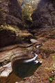
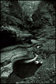
Curious to know what folks think about the processing of these 2 images but especially the one on the right. The one on the left was just some curves. select color, contrast, and D&B. I then added a quadtone to the one on the right.
Thanks in advance!!
  |
|
|
|
12/04/2008 07:49:52 AM · #2 |
| I am not a PP guru, but I really like the image on the left. The flow of the image draws you into it and the colors are very nice. The one on the right really doesn't appeal to me. Somehow it lacks depth and perhaps a full range of B&W....don't know how to quantify what I see. |
|
|
|
12/04/2008 08:03:07 AM · #3 |
| I definately prefer the one on the left also. Way more interesting in color. |
|
|
|
12/04/2008 08:11:49 AM · #4 |
| another vote for the one on the left ... |
|
|
|
12/04/2008 09:14:26 AM · #5 |
I would have to say the one of the left, too.
I also could resist trying to add a little more mood to it. I hope you don't mind put I wanted to play around and see what I could come up with in about 5 minutes. Here it is.
[thumb]744671[/thumb] |
|
|
|
12/04/2008 09:47:19 AM · #6 |
Originally posted by SDW:
I would have to say the one of the left, too.
I also could resist trying to add a little more mood to it. I hope you don't mind put I wanted to play around and see what I could come up with in about 5 minutes. Here it is.
[thumb]744671[/thumb] |
Soft glow plug-in or filter?
I like it! |
|
|
|
12/04/2008 10:56:32 AM · #7 |
Originally posted by glad2badad:
Originally posted by SDW:
I would have to say the one of the left, too.
I also could resist trying to add a little more mood to it. I hope you don't mind put I wanted to play around and see what I could come up with in about 5 minutes. Here it is.
[thumb]744671[/thumb] |
Soft glow plug-in or filter?
I like it! |
No plug-in or filter.
I did it with dodge and burn layer along with gb layer x2, one screen and one multiply mode.
The a layer using the color mode to enhance the colors using d/b with the brush tool and color.
ETA: a small amount of neat image was used then applied one round of USM at 150-.03-0 (normal mode).
Thanks for the complement on the PP.
Message edited by author 2008-12-04 11:00:37. |
|
|
|
12/04/2008 02:02:53 PM · #8 |
Originally posted by SDW:
I would have to say the one of the left, too.
I also could resist trying to add a little more mood to it. I hope you don't mind put I wanted to play around and see what I could come up with in about 5 minutes. Here it is.
[thumb]744671[/thumb] |
Cool. I like that. What is the gb layer? |
|
|
|
12/04/2008 03:28:19 PM · #9 |
Originally posted by smichener:
Originally posted by SDW:
I would have to say the one of the left, too.
I also could resist trying to add a little more mood to it. I hope you don't mind put I wanted to play around and see what I could come up with in about 5 minutes. Here it is.
[thumb]744671[/thumb] |
Cool. I like that. What is the gb layer? |
gb layer is Gaussian Blur layer.
|
|
|
|
12/04/2008 03:37:42 PM · #10 |
Great location! It seems like such a shame to take those Autumn colors and desaturate them, so I like the colored version also.
Your original colored version looked a bit washed out to me, so I bumped the contrast and saturation. I thought the bridge was really neat too, so I dodged it to make it bring it out of the shadows a bit. This version might be a little too red overall, so I probably went too far with the saturation, but I think the contrast brings a lot of life to the rocks.
 |
|
|
|
12/04/2008 06:54:30 PM · #11 |
Originally posted by SDW:
gb layer is Gaussian Blur layer. |
I should've figured that out. Thanks.
Originally posted by aliqui:
Great location! It seems like such a shame to take those Autumn colors and desaturate them, so I like the colored version also.
Your original colored version looked a bit washed out to me, so I bumped the contrast and saturation. I thought the bridge was really neat too, so I dodged it to make it bring it out of the shadows a bit. This version might be a little too red overall, so I probably went too far with the saturation, but I think the contrast brings a lot of life to the rocks.
|
Yes a little too saturated, but otherwise contrast seems to be what this needed.
Does anyone though have suggestions as to a B&W version of this? The more I look at the quadtone version the less I like that one, but I'd like to be able to do something in B&W with this (even though it does have nice colors). Any ideas on how to do that? |
|
|
|
12/04/2008 07:09:31 PM · #12 |
[thumb]744786[/thumb]
My try at a b&w version, done playing around with my new toy. |
|
|
|
12/04/2008 07:23:32 PM · #13 |
|
Home -
Challenges -
Community -
League -
Photos -
Cameras -
Lenses -
Learn -
Help -
Terms of Use -
Privacy -
Top ^
DPChallenge, and website content and design, Copyright © 2001-2025 Challenging Technologies, LLC.
All digital photo copyrights belong to the photographers and may not be used without permission.
Current Server Time: 12/03/2025 01:30:27 PM EST.


