| Author | Thread |
|
|
11/19/2008 06:49:01 AM · #1 |
This is a thread that is part of the Discussion Composition, Technicals, asthetics Etc thread. These threads were created for for the furthering of understanding of photography. This week the entries were chosen from the Red III Challenge. This thread was created to discuss:
At 84th Place: New Boots
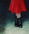 By: By:  Stevieian Stevieian
For more information, please see origional thread here:
//www.dpchallenge.com/forum.php?action=read&FORUM_THREAD_ID=842215&page=1#5071696
Message edited by author 2008-11-19 06:52:17.
|
|
|
|
11/19/2008 07:52:50 AM · #2 |
| This image has tremendous potential with just some minor adjustments in the background. The background is what detracts from the image as a whole. The skirt, socks, and boots ROCK. All three have great color and light. They come off the image at you and really work together and the partial view of the wearer works great, BUT the background is bland, mottled and distracting. Had the background been a blown out white or possibly black this would be an awesome image. |
|
|
|
11/19/2008 08:51:33 AM · #3 |
I think a sharper image would have made it better as well. Maybe add some contrast to the image.

Contrast +13
Levels 21.100.255
USM high TH for darks
USM Low TH for image sharpness
Message edited by author 2008-11-19 09:01:16.
|
|
|
|
11/19/2008 09:52:45 AM · #4 |
This photo really had the potential to place a little higher and I think Joe's edit hit it right on the nose. All the while keeping it legal in basic editing. Although not legal in basic, i would also clone out some of the white marks that show up in the background. The added contrast really adds to the photo.
The composition is exceptional. I don't think many people would take that approache of only capturing that part of the photo and its perfect.
Message edited by author 2008-11-19 09:54:20. |
|
|
|
11/19/2008 03:13:17 PM · #5 |
I really think you're taking the easy way out here, you're trying to turn the photographers interpretation into your own interpretation. Even worse yet is you're making suggestions that would turn it into a very boring stock photo and stock is one thing we definitely don't need more of around this site! That background is gritty and full of details(not distractions) that compliment the very urban style of the outfit quite well. It's interesting that you would use bland to describe the background, when there is nothing more bland, boring and overdone than the "blown out white" background you've suggested.
Let your mind loose a little here if you want to grow. Instead of trying to turn this photo into how you would have done it, how about thinking a little bit about what the photographer was trying to tell you the viewer, and how they are trying to tell it. What photos are showing or telling doesn't always have to be deep and intellectual, photos can be telling you something at a very surface level. Your analysis doesn't have to nail it exactly as the photographer intended, you can have your own interpretation. In most cases the photographer will appreciate that, knowing that you took the time at "seeing".
I just want to add that I think there is a lot to be learned from this photo compositionally...there is a very interesting symmetry created about the horizontal axis with the red skirt and the illuminated spot on the ground at her feet. At the same time there is a not-so-symmetrical balance between the subject and the negative space, happening about the vertical axis. Even with all of that there is still a rule of thirds happening with the boots.
...and at the risk of sounding like a total kiss-ass, this photo is perfect the way it is!!!
Originally posted by rlewis:
This image has tremendous potential with just some minor adjustments in the background. The background is what detracts from the image as a whole. The skirt, socks, and boots ROCK. All three have great color and light. They come off the image at you and really work together and the partial view of the wearer works great, BUT the background is bland, mottled and distracting. Had the background been a blown out white or possibly black this would be an awesome image. |
Message edited by author 2008-11-19 16:24:30. |
|
|
|
11/19/2008 03:18:30 PM · #6 |
It's the background that makes this image interesting to me - the receding, cool blues plays well against the advancing, hot reds to give it a whole lot of dimension and colour depth. The interplay of that blue and red is really where the depth is created to my eye.
I dig the dynamic pose (crossed legs) and the unanswered mystery of not showing the whole person. The pool of light adds to that.
|
|
|
|
11/19/2008 05:21:30 PM · #7 |
I had to look twice to see if this wasn't a red tablecloth, since it doesn't look like a real person. It is static and dull, one commentor gave it a 1 for "interesting". Many times I like to see implied action. Actions sometimes attract more then inactoin.
Maybe a side view with legs kicking (and/or bent). A slightly different angle with more emphasis on the Red. Exteme low, or extreme high and 1-foot from the subject's waist looking down. This could be for Red, Socks or Boot Challenge. The colors are okay.
|
|
|
|
11/19/2008 07:06:28 PM · #8 |
A somewhat precocious pose , a little rigid & pretentious, but also an amusing juvenile cross–legged stance.
The possibly too sharp subject or rather with unresolved sharpness, is emerging from a background of a gritty low step gradient, colored in cross-process cyan & black to the light foreground vignette ring of brighter light.
Framed from just lower than the waist, a dress-up silky skirt & irregular translucent organza/organdy slip, waves the saturated pure red over Seuss stripped socks, fixed to fresh glossy hightop wingtips.
|
|
|
|
11/19/2008 07:46:11 PM · #9 |
| My abosolute favourite thing about this image is the choice of colour for the fore/background. The acid greens really lend well to making the dress pop out. I do think that for the purposes of the challenge, I myself find my eyes drawn to the boots (they are placed on the third, and they are sharp) and not the red dress. You will find that voters here are picky and often quite narrow in their personal interpretations of a given challenge, you really have to hit them with a big stick to make them understand. However, as a photograph, this was pulled off very well. I like the pose, kind of nervous, I like the colours and those boots are fantastic! |
|
|
|
11/19/2008 10:13:54 PM · #10 |
I love this image as is, and gave it an 8. This is an unusual composition, tone, and approach when compared with more 'mainstream' DPC challenge entries. If pressed to think about a minor technical change to the image, it might be to burn down the foreground near the bottom of the frame just slightly. But it is such a subtle change as to be questionable at best.
After rollover, I read stevieian 's note about her image (emphasis mine):
"I don't expect a high score with this one, but it's my vision and I'm sticking with it ..."
Well Said! So, even if did consider radical changes appropriate for this image (which I do not), I would not offer them. I will offer some comments about what makes this image work for me:
The overall image just grabs me, makes me want to look at it. The vivid red, it's placement provide a bright element that at first draws the eye, as if suggesting it is the main element. Yet, it isn't, it is like a loss-leader to get me in the door: I go into the image because of it, and then discover so many more things to love. The socks, the crossed legs, the boots. Are they new boots? Favorite boots? I didn't notice the title until I had spent some time in the image. The truncation of the model leaves a mystery: without a facial expression, I have no idea of her mood: the colors suggest happiness and youthful playfulness--but the crossed-leg stance could just as easily be petulant, or impatient. The floor and background are just right, with texture, tonality, color that compliment the image without competing--light to dark, but supporting the dress, socks, boots in the composition and tonality, and not drawing attention. The use of negative space and off-center composition are not forced, but feel natural and easy on the eye--no "look at my clever composition" sort of feel at all, but a simple "of course that is how it should be" response as soon as I see this image.
This image "qualified" for a Red challenge, but this image stands alone, and needs no challenge to justify it. Some images in the challenge are expertly staged to overwhelm the senses with their redness (not a fault--it is a Red challenge, after all) but this image has a sense of serendipity about it, even if it was just as expertly staged. It is easy to accept this as an opportunistic capture, that would have been taken even if there were no challenge.
I respectfully disagree with suggestions of more sharpening or increased contrast--this has a natural sort of feeling to it which would be diminished by such changes.
Message edited by author 2008-11-19 22:19:28. |
|
|
|
11/19/2008 10:32:58 PM · #11 |
She looks like an umbrella with feet. Imagine that: an umbrella with feet! Her only purpose is to keep her own feet dry. That's how I feel sometimes.
This is in danger of being too cute, but we have to take risks sometimes. |
|
|
|
11/19/2008 10:39:48 PM · #12 |
My only comment is to wonder if the white balance was a mite cool on purpose.
Other than that, I really like everything about it, it's VERY well done IMNSHO.
I'm about half surprised there's not a Posthumous ribbon hanging off it.
|
|
|
|
11/20/2008 01:32:36 AM · #13 |
I think the use of thirds is interesting here. The higher scoring photo was centered (although a completely different subject). I think this photo is much more creative and "Artsy." enough comparison.
Back to thirds, If you notice, the bottom shoes is in a focal point abd her toes hit it perfectly. The frame places her in the the right third nicely. And for me, the background is awesome. I would almost like to see her dress more pressed just to build on teh contrast.
Oh last thought, usage of colors really appeals to the eyes. You enter on the bottom left, find the light spot and are drawn to the dress. Then drift off to the left darkness and search for light again.
Nice work.
ETA:sp.
Message edited by author 2008-11-20 01:33:00. |
|
|
|
11/20/2008 02:28:05 AM · #14 |
Originally posted by posthumous:
She looks like an umbrella with feet. Imagine that: an umbrella with feet! Her only purpose is to keep her own feet dry. That's how I feel sometimes.
This is in danger of being too cute, but we have to take risks sometimes. |
You sure it's not a lamp shade? It reminded me of that burlesque style version in the movie A Christmas Story.
|
|
|
|
11/20/2008 02:41:48 AM · #15 |
 pekesty already noted what I would have said - I love the background the way it is. In part, I'm sure that's because I just like backgrounds that have substance to them - that lend depth, interest, context. To me, it's a fun, kicky shot and I would have scored it well in the challenge. pekesty already noted what I would have said - I love the background the way it is. In part, I'm sure that's because I just like backgrounds that have substance to them - that lend depth, interest, context. To me, it's a fun, kicky shot and I would have scored it well in the challenge.
Interesting - compare this one being discussed to something similar from timfythetoo:
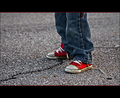
84th versus 9th. Is the challenge tie-in responsible for that much of a gap? The 84th shot has more red, but the 9th shot has red as the focal point, where arguably the one discussed here has black as the focal point with red as the supporting element.
What other elements might account for the difference in placement? |
|
|
|
11/20/2008 03:22:03 AM · #16 |
Interesting comparison. What is also interesting is the vote distribution. Tim actually received more votes 5 and under than Joanne. Where Joanne failed was in receiving enough 9s and 10s to compete with Tim. You only get those when you either wow the voters with your technical expertise or you connect strongly with them on an emotional level. Tim was able to do the latter where as Joanne may have missed the mark. The titles are probably the key here. It's much harder to convey "happy boots" than "worn" sneakers. On top of that more people probably relate to Tim's photo because it looks like every kid's shoes where as Joanne's boots are shown in a much more quirky way and would be more associated with that of an outcast, which less people might identify with. Had she actually played that up more she may have done better but the pose used was probably too conservative given the chosen subject matter.
ETA: LOL For some reason I thought Joanne's photo was called Happy Boats so scratch that part. :P
Message edited by author 2008-11-20 04:31:07.
|
|
|
|
11/20/2008 03:50:20 AM · #17 |
I totally agree with the focus point analysis. Along the same line, maybe a better placement could have been achieved by binding the red into the title: New boots, new socks - Favorite skirt |
|
|
|
11/20/2008 07:57:41 AM · #18 |
Originally posted by yanko:
Originally posted by posthumous:
She looks like an umbrella with feet. Imagine that: an umbrella with feet! Her only purpose is to keep her own feet dry. That's how I feel sometimes.
This is in danger of being too cute, but we have to take risks sometimes. |
You sure it's not a lamp shade? It reminded me of that burlesque style version in the movie A Christmas Story. |
I think you're right. It's a walking lamp.
Thank you for your help. Sometimes it feels like I'm all alone out here... |
|
|
|
11/20/2008 09:41:09 AM · #19 |
| Wow, this thread has really taken off! I'm really enjoying reading the in-depth critiques and finding them very helpful as well. Even though I don't agree with everything said, it's still interesting to get different points of view. Art is subjective, and everyone sees different things. I'm grateful to Rich for starting this learning thread and I'm off now to put my two cents in on the other two Red entries being critiqued this week ... |
|
|
|
11/20/2008 09:47:33 AM · #20 |
I did mention above..
1) that it looked unreal, like thos tables with feet on them.
2) the colors were good, (even great)
3) different composition and/or shooting angle could emphasize RED more
I totally agree with Yanko's analysis, too.
1) different title to emphasize RED
2) emphasize the radical aspect more
How about laying down, with red dress in the bottom thirds and feet crossed and bent in the air? I don't think those manufactured lampshades/end tables, have crossed legs.
ADDED: So, maybe position emphasizes greater then color?
even the most powerful, atttracting color of Red?
Message edited by author 2008-11-20 09:49:35.
|
|
|
|
11/20/2008 12:58:51 PM · #21 |
I think this image would actually have scored higher in a Free Study--in the Red challenge, there were other images that did a better job with "redness", but were not better images than this. Out of the context of the Red challenge, those images likely would have received lower scores and "too red" comments. There was another wonderful image in the Red challenge, a garden tool in a window, and it got slammed in voting with a lot of "not enough red", "red isn't dominant" kinds of comments--voters clearly weighted the "redness" heavily in the Red Challenge, and would not have had the same "filter" on their vision if this image was in a different challenge.... I think the sneaker image might have still scored higher with the voters, but this image would have scored much higher in a non-red-themed challenge.
This is a wonderful standalone image, and does not require the context of a challenge theme to be understood or appreciated.
Message edited by author 2008-11-20 13:01:16. |
|
|
|
11/20/2008 01:19:35 PM · #22 |
One more thing I'd like to add ... after reading all the posts concerning the title, and whether that had anything to do with the low score. I've been under the impression that you don't have to 'shout' the Challenge theme back at the viewer through your title. To me, that's akin to repeating the Challenge title within your title; i.e. "Red Skirt" for the Red Challenge; "Blue Skies" for the Blue Challenge.
What does this all mean? If I hadn't been of this mindset and had a crystal ball regarding the title & how it would've related to the score, I could've gone with something like "favorite skirt" or whatever ... BUT the boots were new, they were cool looking and that's what I really wanted to take a photo of. There, I said it! The voters are smart and found me out after all .... bottom line, the red skirt is red. ;) |
|
|
|
11/20/2008 01:58:05 PM · #23 |
Originally posted by stevieian:
One more thing I'd like to add ... after reading all the posts concerning the title, and whether that had anything to do with the low score. I've been under the impression that you don't have to 'shout' the Challenge theme back at the viewer through your title. To me, that's akin to repeating the Challenge title within your title; i.e. "Red Skirt" for the Red Challenge; "Blue Skies" for the Blue Challenge.
What does this all mean? If I hadn't been of this mindset and had a crystal ball regarding the title & how it would've related to the score, I could've gone with something like "favorite skirt" or whatever ... BUT the boots were new, they were cool looking and that's what I really wanted to take a photo of. There, I said it! The voters are smart and found me out after all .... bottom line, the red skirt is red. ;) |
I concur--you shouldn't have to shout the theme, but some do so. Titles rarely influence my vote. Your title was fine, IMHO, and your stance to stick with your vision is the way to stay. Your image is a gem. |
|
|
|
11/20/2008 02:51:54 PM · #24 |
Originally posted by chromeydome:
I concur--you shouldn't have to shout the theme, but some do so. Titles rarely influence my vote. Your title was fine, IMHO, and your stance to stick with your vision is the way to stay. Your image is a gem.
Thanks for the kind words. I appreciate it!
BTW ... I'm liking this shot very much  |
|
|
|
11/20/2008 08:33:56 PM · #25 |
so Stevieian,
what is the BG (of much discussion) that you used? |
|


