| Author | Thread |
|
|
11/08/2008 04:35:29 PM · #1 |
My Oct freestudy scored quite well though I feel I could of done better in the processing arena.
Here's my entry:
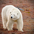
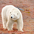
Here's the re-edit:
[thumb]737603[/thumb]
There are some artifacts in this one as well but is it an improvement, or no?
|
|
|
|
11/08/2008 04:41:14 PM · #2 |
hmm... on my monitor at least, the re-edit has the top of the head, neck and back as blown highlights. Taking that out of the equation, though, I find that I prefer the warmer, redder tones of the submission, but perhaps the vignetting could be a bit more subtle (maybe a darker reddish vignette color, a bit more transparency?)
But the vision is yours, and it should be the way you envisioned it when you shot the image. A great capture! |
|
|
|
11/08/2008 04:51:35 PM · #3 |
Here's a slight touch up to the reedit. I think this is much better.
[thumb]737605[/thumb]
... still playing with the vignette.
[thumb]737607[/thumb]
Message edited by author 2008-11-08 16:55:03. |
|
|
|
11/08/2008 04:54:10 PM · #4 |
| yes--that is better, I think. Those areas are still missing a slight bit of detail as compared with the original, but you shouldn't go chasing the view on my monitor! LOL |
|
|
|
11/08/2008 04:56:12 PM · #5 |
Originally posted by chromeydome:
yes--that is better, I think. Those areas are still missing a slight bit of detail as compared with the original, but you shouldn't go chasing the view on my monitor! LOL |
The histogram still shows a lot of room on the right so nothing is really blown out but these latest versions definitely show more texture in the fur. |
|
|
|
11/08/2008 04:58:27 PM · #6 |
Originally posted by cpanaioti:
Originally posted by chromeydome:
yes--that is better, I think. Those areas are still missing a slight bit of detail as compared with the original, but you shouldn't go chasing the view on my monitor! LOL |
The histogram still shows a lot of room on the right so nothing is really blown out but these latest versions definitely show more texture in the fur. |
Trust your histogram, not the eyes and monitor of some questionably strange stranger :-)
(I had only original to re-edits to compare--you have the source, the data, the histogram) |
|
|
|
11/08/2008 05:06:36 PM · #7 |
It's still not quite right. Thanks for taking a look.
[thumb]737614[/thumb] |
|
|
|
11/08/2008 05:25:56 PM · #8 |
| I like this more subtle vinegarette better :-) |
|
|
|
11/08/2008 05:28:58 PM · #9 |
Great capture. There is something about the bears eyes though that doesn't seem totally right. They seem kind of washed out to me. Maybe try selecting the bear and then apply an adjustment layer to increase the black levels on the bear. Then use a black paintbrush at 50% opacity on the adjustment layer to touch up the spots that end up too dark, like between the front legs.
|
|
|
|
11/08/2008 05:36:05 PM · #10 |
All editing here has been done in LR. The eyes were really dark so I selected just the eyes and was playing with exposure, brightness, contrast etc. Maybe just a little less on the exposure reduction and a little more contrast to darken the eyes a bit.
All versions can be found here for comparison: //www.dpchallenge.com/portfolio.php?USER_ID=7743&collection_id=31391
Message edited by author 2008-11-08 17:46:16. |
|
|
|
11/09/2008 09:45:37 AM · #11 |
Chrome and Ricky, thanks for your input and suggestions.
Version 3 of the do overs is what appeals to me, however going back to my entry I think doing some work on the bear is necessary to bring out the detail some more in version 3.
My entry, I feel, I went a bit overboard with the processing of the bear. Hence this thread.
|
|
|
|
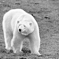
11/12/2008 07:48:51 PM · #12 |
Two more versions of Mr. Maritimus...
  |
|
|
|
11/12/2008 09:53:10 PM · #13 |
WOW.
So, both of these are beautiful. I am slightly confused, though, as on the 9th you indicated you felt like you may have originally overprocessed the bear.
In these two new, beautiful versions, the color one looks like a subtle watercolor image, and the b/w has a bit of charcoal/pencil look to it. I am intrigued, because the effect is so subtle :-) |
|
|
|
11/12/2008 10:02:19 PM · #14 |
Originally posted by chromeydome:
WOW.
So, both of these are beautiful. I am slightly confused, though, as on the 9th you indicated you felt like you may have originally overprocessed the bear.
In these two new, beautiful versions, the color one looks like a subtle watercolor image, and the b/w has a bit of charcoal/pencil look to it. I am intrigued, because the effect is so subtle :-) |
From what I can see, it's most likely an artistic filter applied on a layer, and then blended in various opacities.
Doing this, you can make it as strong or as subtle as you want. Then you can even hand-paint detail in and out as you please :) |
|
|
|
11/12/2008 10:03:33 PM · #15 |
Originally posted by K10DGuy:
Originally posted by chromeydome:
WOW.
So, both of these are beautiful. I am slightly confused, though, as on the 9th you indicated you felt like you may have originally overprocessed the bear.
In these two new, beautiful versions, the color one looks like a subtle watercolor image, and the b/w has a bit of charcoal/pencil look to it. I am intrigued, because the effect is so subtle :-) |
From what I can see, it's most likely an artistic filter applied on a layer, and then blended in various opacities.
Doing this, you can make it as strong or as subtle as you want. Then you can even hand-paint detail in and out as you please :) |
Or, more likely, I'm completely missing the point. lol. |
|
|
|
11/12/2008 10:16:10 PM · #16 |
Originally posted by chromeydome:
WOW.
So, both of these are beautiful. I am slightly confused, though, as on the 9th you indicated you felt like you may have originally overprocessed the bear.
In these two new, beautiful versions, the color one looks like a subtle watercolor image, and the b/w has a bit of charcoal/pencil look to it. I am intrigued, because the effect is so subtle :-) |
To me my entry looks a bit overprocessed. These latest two were deliberate. The filter applied was for highlighting edges.
eta: so I guess the intent of this thread has changed. Comments welcome on all versions, good or bad, referencing the original intent or not.
Message edited by author 2008-11-12 22:20:05. |
|
|
|
11/12/2008 10:21:12 PM · #17 |
Originally posted by cpanaioti:
Originally posted by chromeydome:
WOW.
So, both of these are beautiful. I am slightly confused, though, as on the 9th you indicated you felt like you may have originally overprocessed the bear.
In these two new, beautiful versions, the color one looks like a subtle watercolor image, and the b/w has a bit of charcoal/pencil look to it. I am intrigued, because the effect is so subtle :-) |
To me my entry looks a bit overprocessed. These latest two were deliberate. The filter applied was for highlighting edges. |
deliberate is even better than a happy accident! I am impressed. I refuse to choose between the two, however :-)
|
|
Home -
Challenges -
Community -
League -
Photos -
Cameras -
Lenses -
Learn -
Help -
Terms of Use -
Privacy -
Top ^
DPChallenge, and website content and design, Copyright © 2001-2025 Challenging Technologies, LLC.
All digital photo copyrights belong to the photographers and may not be used without permission.
Current Server Time: 12/03/2025 08:35:22 PM EST.


