| Author | Thread |
|
|
08/06/2008 12:24:37 AM · #1 |
Originally posted by "Violinist123 the Prophet":
I'm just going to skip ahead and post the final score as I know damn well where it's going to end up
Votes: 157
Views: 210
Avg Vote: 5.322
Comments: 3 (all of which will say 'too dark')
Favorites: 0
Wish Lists: 0
Updated: 08/07/08 12:01 am
|
So I was not a very good prophet in that I predicted a bit of a higher score and underestimated the number of comments by quite a bit (also my crystal ball appears to have a really serious problem with calculating calendar dates). But overall it was a fairly accurate prediction of how the image would be received by the masses. Of course this is like predicting that the sun will rise in the east when submitting such an image to a challenge.
This isn't a rant and I don't care about the score (or I wouldn't have entered it to begin with). I just thought it might be interesting to read some discussion about why an image like this is 'too' anything. When I read 'too dark' I ask myself, 'too dark' compared to what? What is the standard? Is there some line in the sand that creative choice dare not cross because it won't be understood? Are these comments just gut reactions to images that are obviously ill suited for the audience and venue? Maybe just a less hostile pair of words than 'this sucks'?
'Too' something indicates to me that artistic expression and creative choice are not to stray outside of certain bounds.
What do you think?
Message edited by author 2008-08-06 00:28:18. |
|
|
|
08/06/2008 12:38:57 AM · #2 |
i didn't vote in the still life challenge, but i love it! The darkness makes the contrast of the jars stand out that much more. It is almost as if the jars are melting into the darkness. The simplicity makes it beautiful! I do agree that the bottles might be made to stand out a little bit more, though.
Philosophically, while artistic standards should be set by the artist, the viewer brings his/her own biases to the artwork, so their personal preferences will affect how they perceive your art. That being a given, it is interesting as to just how many people commented on the darkness. A difference in monitors probably affected some of that, but also you have to remember that people will usually only comment when the feel more strongly about an image, since it is a voluntary response, meaning that the comments are not usually an accurate measurement of the image. (My statistics teacher would be so proud!) |
|
|
|
08/06/2008 12:41:43 AM · #3 |
The only problem I see with the photo is the vase in the back is out of focus which IMO doesn't look good.
As for too dark, I agree, too dark compared to what. I've gotten comments like those before. I think a lot of people just have a somewhat narrow idea of what life should look like, or what something photoworthy should look like. Bright, over saturated, over sharpened, simplest meaning...
Sorry don't mean to rant myself, I just wish people could accept the full range of beauty the human eye and mind is able to see, and not some subset of it. |
|
|
|
08/06/2008 01:50:49 AM · #4 |
My opinion, which is probably something I have to pay you to read, that's how much it's worth...
"Too dark" for a print is a personal preference; "too dark" for online presentations is a personal preference AND a factor of monitors, which differ considerably across a very wide spectrum. |
|
|
|
08/06/2008 04:36:21 AM · #5 |
Originally posted by Melethia:
AND a factor of monitors, which differ considerably across a very wide spectrum. |
On my monitor here at work, when viewed at full size, all I can see are three white ovals on a completely black background. This is one of the reasons why I never vote in my lunch-break at work, but I bet there are plenty of people who have equally bad monitors as their sole viewing experience, and thus don't actualy know just how distorted a viewe they are often getting. |
|
|
|
08/06/2008 11:18:38 AM · #6 |
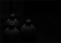
All I know is that when I looked at this image the first thought that came to my mind is "gee that is really dark" Then I sat and stared at it and tried to come up with some reason why the darkness was of interest, failing that I then focused on the objects and again found little of interest as the image was to dark to garner any details and thus I finally decided that perhaps there is something interesting here but its so dark I cant see what it is.
FWIW I am using a calibrated monitor.
In general I have noticed that complex or dynamically textures subjects become very interesting in low light, creating many complex and interesting shadows and forms to contemplate. On the other hand very simple objects seem to lose definition in low light where as in brighter light you can see more of the texture and shape of the object and sense its depth and contour.
In your image the jugs are very simple subjects, but so poorly lit that there is no texture, no contour just vague hints of both but not enough to be interesting, and since the amount of light in the photo seemed to be the primary cause for this the comment about it being too dark seemed relevant. On first glance one might conclude that you were attempting to be "artsy" or abstract without really knowing what you were doing(like people who photograph cars and think that tilting the camera is artistic).
Oh and by the way the title was totally off the wall, perhaps you could clarify what it was meant to mean and perhaps that would clear up some of the confusion.
Its ok to have your vision and your view of the world(its what makes you an artist) but unless you can convince others to see the world in your way they will never understand what it is you are trying to show them. This is not a question of right or wrong it is merely the reality of the world. In this case most people didn't share your view.
Message edited by author 2008-08-06 11:25:35.
|
|
|
|
08/06/2008 11:24:32 AM · #7 |
|
I gave you a 6 for being bold. I'd probably like to see a little more light on the shoulders of the vases, but other than that, it think its a good shot. |
|
|
|
08/06/2008 11:32:33 AM · #8 |
Originally posted by jhomrighaus:
Oh and by the way the title was totally off the wall, perhaps you could clarify what it was meant to mean and perhaps that would clear up some of the confusion. |
The name of the song I was listening to when I uploaded the photo, that's all. Titles carry far too much weight around here for a photography site imo. They often remove the need for people to try and draw their own conclusions about what they are seeing. Here's my image, here's my witty title which explains it, no thinking on your part is required. If you remove the need/opprtunity/requirement for interpretation, you've reduced the medium itself to one of pure visual stimulation.
Anyway all good comments, and thanks for them. |
|
|
|
08/06/2008 12:56:35 PM · #9 |
Originally posted by Melethia:
My opinion, which is probably something I have to pay you to read, that's how much it's worth... |
I'll be less humble and claim that my opinions are probably worth more than what I get for them, but I'll continue to listen to Melethia, for economic reasons :-)
The OP says " 'Too' something indicates to me that artistic expression and creative choice are not to stray outside of certain bounds". The bounds, in my view, are set by the parameters of any individual image, as these evolve from its own facts, including the specific context these establish or allude to. When we measure a work by taken reference to habits of viewing derived from outside of its own givens, when we apply these perceived standards to anything new, unusual and extraordinary, it is easy to obscure or negate its very essence.
Is this image, then, too dark, not dark enough or just right? This is a leading question. The issue, in my view, is not solely technical. A more profitable question would be any that sought to determine an overall merit, range and significance as a whole, as one complete thing among many others. Only then can we compare and arrive at a sense of value.
I would ask what I ask of any image: does it exhilarate, stimulate awareness, show me something I haven't seen before? Whether, then, the image is too dark or not, would depend on the answers to all and any of these questions.
The technical, any technical aspect of a photograph, is only worth what and how it contributes to its own inherent sense and essence (the less visible the contribution, the better).
Message edited by author 2008-08-06 13:00:45. |
|
|
|
08/08/2008 11:40:59 AM · #10 |
Originally posted by violinist123:
Originally posted by jhomrighaus:
Oh and by the way the title was totally off the wall, perhaps you could clarify what it was meant to mean and perhaps that would clear up some of the confusion. |
The name of the song I was listening to when I uploaded the photo, that's all. Titles carry far too much weight around here for a photography site imo. They often remove the need for people to try and draw their own conclusions about what they are seeing. Here's my image, here's my witty title which explains it, no thinking on your part is required. If you remove the need/opprtunity/requirement for interpretation, you've reduced the medium itself to one of pure visual stimulation.
Anyway all good comments, and thanks for them. |
Might I suggest "Untitled" as your future titles then, since I almost guarantee that using random titles, as you have done, hurts your scores. Your stated desire is that people spend less time thinking about your title and more time thinking about your photo. In this case I believe your title achieved the exact oppostite effect. |
|
|
|
08/08/2008 12:22:57 PM · #11 |
I didn't vote, but what is the problem with the term "too dark"?
I'm sure you turn the lights on at night. And why? Because you think it is getting TOO DARK, right?
Someone else might turn them on 10 minutes before or after you, but so what? Do YOU worry about comparing yourself to your neighbors as to exactly when and why you turn your lights on?
Most people like to SEE the stuff they are looking at, no need to worry about standards or whatever. |
|
|
|
08/08/2008 12:37:01 PM · #12 |
Originally posted by Beetle:
I didn't vote, but what is the problem with the term "too dark"?
I'm sure you turn the lights on at night. And why? Because you think it is getting TOO DARK, right?
Someone else might turn them on 10 minutes before or after you, but so what? Do YOU worry about comparing yourself to your neighbors as to exactly when and why you turn your lights on?
Most people like to SEE the stuff they are looking at, no need to worry about standards or whatever. |
Your analogy doesn't really apply unless you present your house as a piece of art open to the interpretation of others. Assuming you do that, and for some creative reason you decide to show them your living room lit by a single candle, what relevance is a 'too dark' comment coming from them? It is exactly as dark as you decided to make it, no more no less. Maybe it's 'too dark' compared to their living room or 'too dark' compared to how they think it should be lit, but none of that has anything to do with your reason for presenting it to them lit by a single candle. Again, a more fitting response from them would be 'this sucks'. That's a commentary on your creativity that isn't based on a comparison to some unknown metric. |
|
|
|
08/08/2008 01:04:09 PM · #13 |
Originally posted by violinist123:
... Again, a more fitting response from them would be 'this sucks'. That's a commentary on your creativity that isn't based on a comparison to some unknown metric. |
LOL ok then....... how about if I think it sucks that I can't see much (and my monitor is just fine), so what's the point looking at it?
Is that better? ;-) |
|
|
|
08/08/2008 01:20:51 PM · #14 |
Originally posted by Beetle:
Originally posted by violinist123:
... Again, a more fitting response from them would be 'this sucks'. That's a commentary on your creativity that isn't based on a comparison to some unknown metric. |
LOL ok then....... how about if I think it sucks that I can't see much (and my monitor is just fine), so what's the point looking at it?
Is that better? ;-) |
Yep ;) |
|
|
|
08/08/2008 01:34:39 PM · #15 |
[eta] edited to remove everything which wasn't on point, which was everything.
Message edited by author 2008-08-08 21:50:21. |
|
|
|
08/08/2008 01:47:50 PM · #16 |
|
Interesting thread comments. Often there is something in the "too something" comments - something but not too much. I have started to check auto-levels just for my own amusement, but not too much. And I appreciate the OP's feelings about titles, but not too much. On the other hand, I may be getting too many "too something" comments myself. |
|
|
|
08/08/2008 02:10:41 PM · #17 |
Edited to remove good attempt but ultimately failed bitingly sarcastic take down of Op based on comment not made by OP by attributed to the OP by this poster, which ultimately lead to spectacular crash and burn on the part of this poster and thus lead to the removal of said commentary which has been replaced by this message describing the reason this post was edited.
Message edited by author 2008-08-08 16:15:15.
|
|
|
|
08/08/2008 03:43:35 PM · #18 |
Originally posted by jhomrighaus:
So from here you can either buck up, learn from the comments and try something new(perhaps with more light in it), or you can sit an whine about how we are all a bunch of stupid sheep that are too dumb to get your message. |
I was trying to prompt a discussion about an idea, not a dissection of this particular image or why it didn't score well. I believe I made that clear in the original post. Before your paragraph devolved into a very poor attempt at biting sarcasm, you made some good points.
|
|
|
|
08/08/2008 04:08:59 PM · #19 |
Originally posted by violinist123:
Originally posted by jhomrighaus:
So from here you can either buck up, learn from the comments and try something new(perhaps with more light in it), or you can sit an whine about how we are all a bunch of stupid sheep that are too dumb to get your message. |
I was trying to prompt a discussion about an idea, not a dissection of this particular image or why it didn't score well. I believe I made that clear in the original post. Before your paragraph devolved into a very poor attempt at biting sarcasm, you made some good points. |
My apologies for some reason I associated one of the recent replies to you(as the OP) rather than to the person who made it. I will edit my sarcastic response which I had made thinking(why I don't really know) that you were griping about the too dark comment again. And I thought it was a pretty decent attempt at biting sarcasm, just directed at the wrong party. ;-)
Message edited by author 2008-08-08 16:10:28.
|
|
|
|
08/08/2008 04:20:13 PM · #20 |
Originally posted by bobnospum:
Might I suggest "Untitled" as your future titles then, since I almost guarantee that using random titles, as you have done, hurts your scores. Your stated desire is that people spend less time thinking about your title and more time thinking about your photo. In this case I believe your title achieved the exact oppostite effect. |
No doubt the given title invited some thought or curiosity as to how the title might relate to the image. This, in my view, is not a bad thing here, as without it (the 'stretch'), we would be left with less.
If this photo were labeled Untitled, most of us would likely expect a significant charge via the image itself, as is often the case with well-known works that already stand on their own two legs and neither need nor, necessarily, benefit from a title.
There is no easy way out. |
|
|
|
08/08/2008 04:28:42 PM · #21 |
|
I would not spend a penny to have the Mona Lisa hanging in my living room for a year. But I would spend $1,000,000 to take it to Christie’s auction house, because there are others that would spend 10 times that to hang it in theirs…..Such is the way of art… |
|
|
|
08/08/2008 07:17:12 PM · #22 |
|
Some art, but not too much art. |
|
|
|
08/08/2008 08:11:27 PM · #23 |
I hope you don't mind; I took the liberty of lightening the image up a little bit.
(image removed because creator minded the liberty)
Of course, the amount of lightness or darkness in your image is entirely subjective. Still, I can feel a sense of quietness in the lighter image that I can't feel with the darker version. Maybe because I'm searching too hard for enough details to help me understand what I'm seeing? I dunno. That's my take.
-Kim
Message edited by author 2008-08-08 21:00:10. |
|
|
|
08/08/2008 08:32:30 PM · #24 |
Originally posted by moswyn:
I hope you don't mind; I took the liberty of lightening the image up a little bit.

Of course, the amount of lightness or darkness in your image is entirely subjective. Still, I can feel a sense of quietness in the lighter image that I can't feel with the darker version. Maybe because I'm searching too hard for enough details to help me understand what I'm seeing? I dunno. That's my take.
-Kim |
This is a much more interesting image. I think the idea was spot on, it was simply too dark.
Message edited by author 2008-08-08 20:33:08.
|
|
|
|
08/08/2008 08:56:56 PM · #25 |
Originally posted by moswyn:
I hope you don't mind; I took the liberty of lightening the image up a little bit. |
Hmm, I do mind. I don't need to see what it looks like lighter, I purposely chose to make it as dark as it was. I'm glad you like the lighter version, but it's now your image and no longer mine - your interpretation, not mine. That being the point, or my point at least, of the entire discussion. It's not 'too' anything, you either like it or you don't - it simply is what it was intended to be.
|
|


