| Author | Thread |
|
|
11/12/2003 10:45:36 AM · #1 |
I have a recurring issue that hopefully someone knows how to address.
Many of the images I'm printing are extremely saturated and colourful images (particularly many wildflower and butterfly shots)
I can print these successfully on inkjet printers using the wide gamut dye based inks. However, when I try to get photographic prints made, by e.g., a Frontier system I find large amounts of the colours are out of gamut for the printer (when I do a soft proof in photoshop, and enable gamut warnings, large areas of the image are unprintable without adjustment)
So given this, what strategies do you use to adjust an image to come back 'in gamut' and still give a faithful print ? The easiest and least satisfying approach seems to be just to reduce the saturation to a point where everything is back in gamut - but the result is very washed out.
Any pointers, links, recommendations, suggestions or plain straight answers would be extremely helpful as I've wrestled with this for several months without finding a good solution. |
|
|
|
11/12/2003 10:55:25 AM · #2 |
Yes!! Thank you Gordon, for raising this question. I have been experiencing the same problems, especially with shades of red on my Canon i9100 printer.
I have found this to be a problem when choosing a Canon paper profile for the Proof Settings option in Photoshop. Since I don't have enough experience or knowledge about working with Curves to get the results I want with my paper/printer profiles, my workaround is to simply use the Monitor RGB profile as my proof space, and either my printer profile or monitor RGB profile as my print space (as required for the results I want) during the printing phase.
Not particularly helpful in terms of your actual question - I have not yet actually used a print service to produce my prints.
|
|
|
|
11/12/2003 02:57:39 PM · #3 |
|
I'm surprised, because CMYK and related color models should have a far more restricted gamut than an RGB-based Frontier, which should give you the same gamut as a color negative->paper print. |
|
|
|
11/12/2003 02:59:49 PM · #4 |
Originally posted by GeneralE:
I'm surprised, because CMYK and related color models should have a far more restricted gamut than an RGB-based Frontier, which should give you the same gamut as a color negative->paper print. |
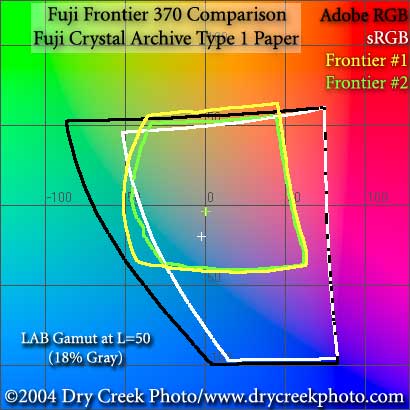
Yes - but a dye inkjet gamut is wider than a Frontier, at least as far as I can tell from the profiles I've seen this is the case.
E.g., below. I'm typically working in Adobe RGB and wanting to print in the Frontier spaces:
Message edited by author 2003-11-12 15:01:02. |
|
|
|
11/12/2003 03:04:58 PM · #5 |
The advice I've seen is
If you are not familiar with how your printer responds, or do not trust the profile, it is a good idea to check for out-of-gamut colors (View→Gamut Warning). Minor changes to a carefully selected color range will bring the problem colors into the printer gamut. Using the Hue/Saturation dialog, the knobs to turn (in order of decreasing preference) are: slight change to lightness, smaller shifts to hue, and even smaller decreases to saturation.
I guess I need to learn how to make better selections or something. |
|
|
|
11/12/2003 03:10:39 PM · #6 |
Try opening a seperate window for the frontier space. You should have 2 windows open. The original Adobe19998 window, and then the adjustment window for your Frontier space. You can make the color changes in the adobe98 window and see how they will be effected in the frontier space. Some times you have to tweak them alot. This is the same thing I have to do when I convert to CMYK for printing on difficult files.
Hope this helps! |
|
|
|
11/12/2003 03:37:53 PM · #7 |
|
I guess one of the advantages of being partially colorblind is that I just don't care about what might be "problems" for some other people. |
|
|
|
11/12/2003 04:51:25 PM · #8 |
Originally posted by GeneralE:
I guess one of the advantages of being partially colorblind is that I just don't care about what might be "problems" for some other people. |
Yeah - but these have physical, horrible consequences. Areas that are out of gamut print as large areas of solid colour ruining the final print. |
|
|
|
11/12/2003 05:14:25 PM · #9 |
First, I recommend this book by John Paul Caponigro.
Second, I recommend this software to get an even better understanding of how colors in a given image are out of gamut for a given color space. The nice thing about this software is that it graphs the two in a 3-D color space as opposed to the usually seen 2-D and shows you not just what colors are out of gamut, but also which highlights/shadows.
Finally, and probably NOT as specific an answer as you want, Gordon, tweak.
Open a duplicate of the image, set it to soft proof, and tweak until you get an image that looks comparable to the original. Caponigro made the point that you're almost always going to have to sacrifice something depending on your paper and ink set. Highlights will have to be a bit blown out on paper X but retain excellent shadow detail. Shadow detail will be too dark on paper Y, but retain excellent highlights.
He adjusted images using the following:
1. Basic levels layer
2. Curves Layer for contrast set to Luminosity blend mode
3. Curves Layer for colors set to Color blend mode
4. Hue/Sat layer set to Saturation blend mode
5. Dodge/Burn on a new layer set to soft light with a black brush
Again, not the detailed answer you want -- but I hope the book might point you in a better direction.
Message edited by author 2003-11-12 17:14:47. |
|
|
|
11/12/2003 05:32:55 PM · #10 |
That's great - thanks for all of the replies so far. I'll have a tweak.
The opening two windows suggestions in particular are useful - as are the book recommendations. Thank you |
|
|
|
11/12/2003 08:48:23 PM · #11 |
When I have used printing labs in the last for digital prints, they insist that you use the ICC profiles for their printers. ICC profiles are imported into PhotoShop, and will give you a better idea of how your photo will look as a print from a particular printer.
Ron.
|
|
|
|
11/12/2003 08:50:21 PM · #12 |
When I have used printing labs in the last for digital prints, they insist that you use the ICC profiles for their printers. ICC profiles are imported into PhotoShop, and will give you a better idea of how your photo will look as a print from a particular printer.
Calypso Imaging are fairly respected. Take a look at the
advice on their web page which goes into more detail.
Ron.
|
|
|
|
11/12/2003 08:55:48 PM · #13 |
Originally posted by Gordon:
Originally posted by GeneralE:
I guess one of the advantages of being partially colorblind is that I just don't care about what might be "problems" for some other people. |
Yeah - but these have physical, horrible consequences. Areas that are out of gamut print as large areas of solid colour ruining the final print. |
Actually, I have had that problem -- I have some roses that show detail throughout on the screen, but which print with large solid patches of pinkisk-red on the petals.
It's my understanding that in Photoshop you need to set a monitor profile to match your unit, and a printer/output profile for the end device, and then you are supposed to see a display "distorted" to be what you should get from the printer (as compared to the same pixel values being displayed "raw"). Fair summary? |
|
|
|
11/12/2003 10:38:45 PM · #14 |
Originally posted by ronners:
When I have used printing labs in the last for digital prints, they insist that you use the ICC profiles for their printers. ICC profiles are imported into PhotoShop, and will give you a better idea of how your photo will look as a print from a particular printer.
Ron. |
Yes - I'm using ICC profiles to do the soft proofing. The problem is that many of the colours fall out of the colour gamut for the targetted printer - I'm trying to understand how best to manipulate the image back within the correct colour gamut, defined in the ICC profiles.
|
|
|
|
11/12/2003 10:41:26 PM · #15 |
Originally posted by GeneralE:
Actually, I have had that problem -- I have some roses that show detail throughout on the screen, but which print with large solid patches of pinkisk-red on the petals.
|
Yes - you are describing the problem that I have. When I do the soft proof large areas of the image are highlighted as being out of gamut (typically the colours are too saturated for the particular printer) If you go ahead and just print anyway, these areas block up and over saturate, giving the effect you describe. You need to manipulate the image back within the colour gamut for the particular target profile and rendering intent - I'm just not sure of the least intrusive way to do this. The easiest and nastiest way is to just turn down the saturation - which washes out the whole image, but means it prints correctly.
|
|
|
|
11/12/2003 10:58:48 PM · #16 |
Originally posted by ronners:
Calypso Imaging are fairly respected. Take a look at the
advice on their web page which goes into more detail.
Ron. |
Calypso Imaging does have a good reputation and their site has a lot of good info. Unfortunately the advice on the linked page doesn't seem to mention anything about compensating appropriately for out of gamut colours when applying a profile - at least I couldn't find it - am I missing something ?
|
|
|
|
11/12/2003 11:01:04 PM · #17 |
Originally posted by GeneralE:
It's my understanding that in Photoshop you need to set a monitor profile to match your unit, and a printer/output profile for the end device, and then you are supposed to see a display "distorted" to be what you should get from the printer (as compared to the same pixel values being displayed "raw"). Fair summary? |
Yes - pretty much. You capture the image in a colour space then convert that to a known space (e.g., Adobe RGB) Your monitor is profiled, so that the correct compensation to map from Adobe RGB to your monitor is applied to let you view the image at something approximating AdobeRGB.
Your output space is also profiled, and by using soft proofing, Photoshop can give an indication of what the final output might look like, approximating given your monitor profile and output target profile.
|
|
|
|
11/12/2003 11:17:40 PM · #18 |
Originally posted by Patella:
Open a duplicate of the image, set it to soft proof, and tweak until you get an image that looks comparable to the original. Caponigro made the point that you're almost always going to have to sacrifice something depending on your paper and ink set. Highlights will have to be a bit blown out on paper X but retain excellent shadow detail. Shadow detail will be too dark on paper Y, but retain excellent highlights.
He adjusted images using the following:
1. Basic levels layer
2. Curves Layer for contrast set to Luminosity blend mode
3. Curves Layer for colors set to Color blend mode
4. Hue/Sat layer set to Saturation blend mode
5. Dodge/Burn on a new layer set to soft light with a black brush
|
This is great - these various adjustment layers helped me get much closer to what I want, while staying with something that should be printable - thank you!
|
|
|
|
11/13/2003 11:23:45 AM · #19 |
|
|
|
11/30/2003 08:48:54 PM · #20 |
Originally posted by Patella:
First, I recommend this book by John Paul Caponigro.
|
Spent the last 4 days reading this book - excellent, really fantastic. Thank you for pointing it out - covers exactly the sort of techniques I was interested in. |
|
|
|
11/30/2003 09:54:15 PM · #21 |
|
A quick fix is to convert your image to CMYK then back to RGB. It is not the ideal soultion and you will notice some color shift but will usually render decent results. |
|
|
|
12/01/2003 03:25:04 AM · #22 |
|
what about lightjet or durst lambda? |
|
|
|
12/01/2003 03:49:46 AM · #23 |
Contact your printing place and ask them to send you an ICC profile file. Load that inot photoshop and tweek until good.
If they don't allow/have an ICC profile, I would suggest going somewhere else.
I only print large files at places where I can get their printer profile and load it up in PS.
|
|
|
|
12/01/2003 09:03:24 AM · #24 |
Originally posted by jonpink:
Contact your printing place and ask them to send you an ICC profile file. Load that inot photoshop and tweek until good.
If they don't allow/have an ICC profile, I would suggest going somewhere else.
I only print large files at places where I can get their printer profile and load it up in PS. |
I'm using ICC profiles. Its because I'm using the profiles, and soft proofing the image, that I am aware of the out of gamut colours. My whole flow is colour managed, its just that some of the colours in the image are unprintable - various rendering intents don't address the issue either. The colours are just unprintable and have to be further adjusted to come up with a printable result that remains true to the original image.
I've just been trying to find the best way to bring those colours back into gamut, without a/ desaturating the whole image or b/ adjusting just those colours - as these two approaches produce pretty unsatisfactory results. The book Patella recommended has many strategies for addressing this and treats colour management in a much deeper sense than a 'click this button' approach. |
|
|
|
12/01/2003 10:09:43 AM · #25 |
Can I suggest a different profile/printer?
I printed out two huge shots at A2 at the weekend, and in quite a few profiles my warnings took up about 40% of my image - I was not best pleased.
I found another printer - downloaded their profile and not a single warning, adjuted the images as they were washed out and they have printed perfectly.
I have one of them in a challenge so I can't explain the image. |
|
Home -
Challenges -
Community -
League -
Photos -
Cameras -
Lenses -
Learn -
Help -
Terms of Use -
Privacy -
Top ^
DPChallenge, and website content and design, Copyright © 2001-2026 Challenging Technologies, LLC.
All digital photo copyrights belong to the photographers and may not be used without permission.
Current Server Time: 07/26/2026 05:49:46 PM EDT.


