| Author | Thread |
|
|
01/25/2008 12:24:45 AM · #1 |
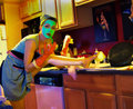
Okay. I'm still waiting for the book that was suggested to me to get here from Amazon, and I haven't really had a chance to poke around online as much as I would have liked to :P...so does anyone mind looking at these settings (which I absolutely was just leaving on what seemed 'okay' when I had it on the tripod looking through the screen :/)
I could have done so much better with this...the colors, both pre and post processing are just NOTHING like what I wanted.
Also, is this an annoying thing to do? ROFL (asking for help on a specific picture like this?).
Thanks in advance for help :P
The picture:
[thumb]637784[/thumb]
Things to know...
The only real 'light' in the shot is the lamp above, a halogen through a frosted globe...hardly any natural light since it was such a blah day today..kitchen (obviously LOL)
The settings:
Exposure: 0.2 sec (1/5)
Aperture: f/2
Focal Length: 9.7 mm
ISO Speed: 100
Exposure Bias: 0/10 EV
Orientation: Horizontal (normal)
X-Resolution: 72 dpi
Y-Resolution: 72 dpi
Software: Paint Shop Pro Photo 11.20
Date and Time: 2008:01:24 14:31:37
YCbCr Positioning: Co-Sited
Exposure Program: Aperture priority
Date and Time (Original): 2008:01:24 14:29:37
Date and Time (Digitized): 2008:01:24 14:29:37
Compressed Bits per Pixel: 2 bits
Maximum Lens Aperture: 33/16
Metering Mode: Spot
Color Space: sRGB
Compression: JPEG
Image Width: 1748 pixels
Image Height: 1428 pixels
This is the shot I ended up using after my disgust with that one up there :P not much better, but, anyhooooooo
[thumb]637785[/thumb]
|
|
|
|
01/25/2008 12:42:58 AM · #2 |
I want to start by saying... I love the artwork over the sink.. AND I think you and I are gonna get along well. I'm digging your style :-D
As far as exposure goes, I don't think you went horribly wrong considering the light source. It's more a matter of lighting than exposure. Had you been able to light from the right of the frame, this photo would have been completely different.
|
|
|
|
01/25/2008 12:47:11 AM · #3 |
Originally posted by fotomann_forever:
I want to start by saying... I love the artwork over the sink.. AND I think you and I are gonna get along well. I'm digging your style :-D
As far as exposure goes, I don't think you went horribly wrong considering the light source. It's more a matter of lighting than exposure. Had you been able to light from the right of the frame, this photo would have been completely different. |
LOL, I LOVE the paintings over the sink...want me to get a full shot? who doesn't love gals in martini's, right? :P
I feel like my 'style' is allllllllll over the place, I guess I'm trying to find what 'fits' LOL.
So, lets say (keep in mind I've got Ah Camera and Ah computer, and that's about it ;) LOL), I got a desk lamp (snicker) from the sewing room and put it to the right of the shot, it could have been an improvement? I do feel like it's realllll flat or something.
|
|
|
|
01/25/2008 12:53:35 AM · #4 |
Originally posted by Tuesday:
I got a desk lamp (snicker) from the sewing room and put it to the right of the shot, it could have been an improvement? I do feel like it's realllll flat or something. |
I do believe it would add some punch to the shot. Put it just of of frame. You can bounce it off poster board or wrinkled aluminum foil if you want diffused light.
And yes, I would love a full shot of the paintings.
|
|
|
|
01/25/2008 12:53:58 AM · #5 |
Ok, I will warn you, you will probably get a ton of different answers as how to take a shot is a very subjective thing. I will tell you more about some of what your settings did not necessarily how to take the shot. Your shot is something you decide. But I will also throw in some compositional things afterward to think about that have very little to do with your settings. Here we go!
Ok, with the camera on Aperture Priority (most likely noted as AV on your camera) your camera essentially keeps your aperture solid at the setting you have given or that is already there and then adjusts the other settings around that aperture value. In this case it changed the exposure to .2 seconds or 1/5th of a second. For your own reference this is a fairly long exposure for a portrait in certainly settings. You clearly have the camera either on a tripod or on a tabletop or this image would almost certainly be blurry from camera shake. I must say I am pretty impressed by your ability to stay solidly in that pose for the entire exposure :) I think that your color and lighting issues that you are referring to stem from your ISO speed in this image. 100 ISO is very very low for indoor shots typically. Low ISO's are going to keep your noise down and really give you detail, but 100 ISO is typically at least in my shots reserved for long exposure (more than 1 second) type shots.
After saying all that I must admit with only indoor lighting and the settings described here I think you got quite an image out of it. My advice to you is fairly simple with or even before getting the book. Play with your camera. If it has full manual mode go to it and adjust settings one at a time up then down then repeat. All the books in the world can help, but part of photography is seeing it and feeling it to recognize what you like your images to look like.
Ok, with regards to the composition. I love the main theme/character (ie you) the playful and fun nature is awesome and really made me smile and laugh. Things to think about are the glare that the cabinets will create when lit from above, as well as the fact that there is something in the bottom left of the frame that catches my eye. For my taste the tilted horizon on this shot really works for the picture to convey the helter skelter portrait that you are going for. In conclusion, it takes time keep it up. Ansel Adams didn't snap off his first picture and sell a million :)
Message edited by author 2008-01-25 00:54:58. |
|
|
|
01/25/2008 01:24:21 AM · #6 |
Regarding the settings, if the camera could be moved further away and zoomed further it would help shallow the DOF and help drop the background out of focus.
I know you asked about the settings, but there are a number of things I would change. First, if the shot could be more directly toward the sink the background would be far less distracting. Because of the lighting the background is far brighter than the subject so it draws my eye away from the subject. Also, because of the angle the appliances are very distracting. Also, the image lacks contrast in the shadows. If you look at the histogram there is nothing in the dark end.
I did a quick down and dirty edit of the photo to show what I would have done in post:
- Change levels to bring contrast to the shadows
- Masked the subject off and adjusted the curves to brighten without washing out
- Adjusted skin tone to get rid of excessive red
- Created adjustment layer to darken cabinets behind subject (masked with layer mask)
- Created mask covering all but subject and cabinets in same focal plane (roughly) and blurred background slightly to simulate shallower DOF
- Sharpened subject
- Burned highlights on cabinet and face of dishwasher
Anyway, here is my edit for what it is worth. Hope it helps.
|
|
|
|
01/25/2008 02:41:49 AM · #7 |
Here is the second one with some Shadow/Highlight adjustment, Levels, Curves and a touch of USM.
[thumb]637810[/thumb]
I think it really brought your eyes out well.
Message edited by author 2008-01-25 02:42:31.
|
|
|
|
01/25/2008 03:08:20 AM · #8 |
wow, everyone, thanks so much! It's late here, but I am going to come back in the morning and address each of you. This is EXACTLY the feedback I have been looking for :D
|
|
|
|
01/25/2008 02:55:05 PM · #9 |
Originally posted by Mike_Adams:
Ok, with the camera on Aperture Priority (most likely noted as AV on your camera) your camera essentially keeps your aperture solid at the setting you have given or that is already there and then adjusts the other settings around that aperture value. In this case it changed the exposure to .2 seconds or 1/5th of a second. For your own reference this is a fairly long exposure for a portrait in certainly settings. |
Okay, I understand this, it makes sense. Thank you for explaining that.
Originally posted by Mike_Adams:
You clearly have the camera either on a tripod or on a tabletop or this image would almost certainly be blurry from camera shake. |
Yes, I had it on the tripod (it was interesting to see the shots where I didn't *quite* get myself set up before the timer went of and it snapped LOLOL)
Originally posted by Mike_Adams:
I must say I am pretty impressed by your ability to stay solidly in that pose for the entire exposure :) |
Thanks, lol...some of them turned out pretty...interesting :P
Originally posted by Mike_Adams:
I think that your color and lighting issues that you are referring to stem from your ISO speed in this image. 100 ISO is very very low for indoor shots typically. Low ISO's are going to keep your noise down and really give you detail, but 100 ISO is typically at least in my shots reserved for long exposure (more than 1 second) type shots. |
Okay, I understand this...thank you for explaing it.
Originally posted by Mike_Adams:
After saying all that I must admit with only indoor lighting and the settings described here I think you got quite an image out of it. |
Thank you!! I like the idea I had, it just didn't turn out QUITE like I'd though it should, yk? But, it means a LOT to me for you to say that!
Originally posted by Mike_Adams:
My advice to you is fairly simple with or even before getting the book. Play with your camera. If it has full manual mode go to it and adjust settings one at a time up then down then repeat. All the books in the world can help, but part of photography is seeing it and feeling it to recognize what you like your images to look like. |
I know this is so true, and you are right!! I really need to set aside more time just to 'playing' with the settings and figuring out what feels/works for me.
Originally posted by Mike_Adams:
Ok, with regards to the composition. I love the main theme/character (ie you) the playful and fun nature is awesome and really made me smile and laugh. |
Thank you!!
Originally posted by Mike_Adams:
Things to think about are the glare that the cabinets will create when lit from above, as well as the fact that there is something in the bottom left of the frame that catches my eye. For my taste the tilted horizon on this shot really works for the picture to convey the helter skelter portrait that you are going for. In conclusion, it takes time keep it up. Ansel Adams didn't snap off his first picture and sell a million :) |
Thank you so much for taking the time to write all this out an help me, it REAAAALLLLLYYYY helps me out so much and gives me things to think about. I appreciate it.
|
|
|
|
01/25/2008 02:58:32 PM · #10 |
Originally posted by good_ham:
Regarding the settings, if the camera could be moved further away and zoomed further it would help shallow the DOF and help drop the background out of focus. |
Okay, that makes sense to me...thank you!
Originally posted by good_ham:
I know you asked about the settings, but there are a number of things I would change. First, if the shot could be more directly toward the sink the background would be far less distracting. Because of the lighting the background is far brighter than the subject so it draws my eye away from the subject. Also, because of the angle the appliances are very distracting. Also, the image lacks contrast in the shadows. If you look at the histogram there is nothing in the dark end. |
Okay, looking at the picture again (and sitting here in the kitchen) I totally get what you are saying! It would have helped immensly I think. As for the contrast in shadows/histogram, I'm not quite sure what to do in that case. How would I effect that in the original shot/set up?
Originally posted by good_ham:
I did a quick down and dirty edit of the photo to show what I would have done in post:
- Change levels to bring contrast to the shadows
- Masked the subject off and adjusted the curves to brighten without washing out
- Adjusted skin tone to get rid of excessive red
- Created adjustment layer to darken cabinets behind subject (masked with layer mask)
- Created mask covering all but subject and cabinets in same focal plane (roughly) and blurred background slightly to simulate shallower DOF
- Sharpened subject
- Burned highlights on cabinet and face of dishwasher
Anyway, here is my edit for what it is worth. Hope it helps.
|
I see the differences you made in editing, and appreciate the time you took!!! :D I'm noting all these things I learn, so thanks so much!!
|
|
|
|
01/25/2008 02:59:04 PM · #11 |
Originally posted by Greetmir:
Here is the second one with some Shadow/Highlight adjustment, Levels, Curves and a touch of USM.
[thumb]637810[/thumb]
I think it really brought your eyes out well. |
Thank you so much! It does brighten up some, doesn't it!? :D
|
|
Home -
Challenges -
Community -
League -
Photos -
Cameras -
Lenses -
Learn -
Help -
Terms of Use -
Privacy -
Top ^
DPChallenge, and website content and design, Copyright © 2001-2026 Challenging Technologies, LLC.
All digital photo copyrights belong to the photographers and may not be used without permission.
Current Server Time: 05/13/2026 04:02:19 PM EDT.


