| Author | Thread |
|
|
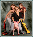
12/16/2007 03:51:58 PM · #1 |
in the studio for a christmas party that my friends and I had last Friday night. I am even in some of them! Im proud of them, but I see a lot of problems still. Just wondering what some of you thought.
Edit: Removed dead links
Message edited by author 2007-12-18 16:40:46.
|
|
|
|
12/16/2007 03:54:40 PM · #2 |
I like them... I think it's a good start. I think some post process need to be done to cover some stuff, and enhance the images. But, nice stuff, not much to say for a start I think :)
Keep the good work ;) |
|
|
|
12/16/2007 04:11:41 PM · #3 |
You have some very cute poses and VERY relaxed subjects going on!!!!
My biggest gripe would be the orange cast on them (easily fixed, though). |
|
|
|
12/16/2007 04:12:12 PM · #4 |
Originally posted by Beetle:
You have some very cute poses and VERY relaxed subjects going on!!!!
My biggest gripe would be the orange cast on them (easily fixed, though). |
How do I fix the orange cast? |
|
|
|
12/16/2007 04:14:36 PM · #5 |
Originally posted by bennettjamie:
How do I fix the orange cast? |
Open the files (either RAW or even just the jpg's) in Camera RAW, then use the temperature slider.
That will do the trick, I bet, but if it doesn't, try a color balance layer or Hue/Sat to lower the yellow/red tones.
ETA: all assuming you have PS CS3 of course.... if not, you'll have to just find the Hue/Saturation equivalent of the program you are using.
Message edited by author 2007-12-16 16:18:10. |
|
|
|
12/16/2007 04:18:24 PM · #6 |
Originally posted by bennettjamie:
Originally posted by Beetle:
You have some very cute poses and VERY relaxed subjects going on!!!!
My biggest gripe would be the orange cast on them (easily fixed, though). |
How do I fix the orange cast? |
In Photoshop:
Image / Color Balance / Move the slide bar from Red to Cyan. |
|
|
|
12/16/2007 04:20:56 PM · #7 |
Jamie, that color cast is really strong.... I just tried to get rid of it in one example, and didn't find it quite as easy as I had hoped.
For future shots it would be worth your while to take a moment and set the white balance for that particular setting (use your custom white balance function on your camera) BEFORE you start shooting. |
|
|
|
12/16/2007 04:24:00 PM · #8 |
It looks to me that you need to fine tune the white balance. Your magenta-green is all over the place some have very green bias and others very magenta.
First question I should ask I guess is are you shooting RAW or jpg? if your using RAW it should be very easy to fix the WB for all of those using a batch process in your RAW converter. If its jpg your going to have to balance each individual shot with one of the many tools in photoshop(or paint shop pro).
Thats really my only gripe other than the lighting in #4 and #5 looks like it missed the left/bottom person.
The poses and compesitions are really nice. |
|
|
|
12/16/2007 04:27:17 PM · #9 |
Originally posted by Nocturnal_Delusion:
It looks to me that you need to fine tune the white balance. Your magenta-green is all over the place some have very green bias and others very magenta.
First question I should ask I guess is are you shooting RAW or jpg? if your using RAW it should be very easy to fix the WB for all of those using a batch process in your RAW converter. If its jpg your going to have to balance each individual shot with one of the many tools in photoshop(or paint shop pro).
Thats really my only gripe other than the lighting in #4 and #5 looks like it missed the left/bottom person.
The poses and compesitions are really nice. |
Im shooting JPEG, have never shot in RAW, will try it next time. Thank you for the critique. |
|
|
|
12/16/2007 04:41:32 PM · #10 |
I think they're fantastic. You're really improving quickly. Your models are all relaxed and happy, and you've got some real keepers there. Other than the color cast, the biggest thing I noticed was the background. The people are close enough to the background that they're casting shadows on it, and you can see the wrinkles in the cloth. If you have enough room, you might want to move the people further from the background, and set the aperture just wide enough so that your people are fully in focus, but the background is blurred.
I always have to iron my backgrounds, because I can't get the people far enough away... |
|
|
|
12/16/2007 04:53:51 PM · #11 |
I really like how you captured the models in a relaxed and fun way. Looks good with the exception of WB (as mentioned above). What kind of lighting were you using?
I think you did a good job.
SDW |
|
|
|
12/16/2007 04:56:07 PM · #12 |
Speaking of lighting...
The way to soften those harsh shadows that you see behind them, is to diffuse the light. You do that by use a bigger light source. An example is a soft box. But even if you don't have a soft box you can still achieve the same effect ... by bouncing your flash off the ceiling or a wall or even a white card. The larger the light source, the softer the shadows.
|
|
|
|
12/16/2007 04:59:29 PM · #13 |
Originally posted by dwterry:
Speaking of lighting...
The way to soften those harsh shadows that you see behind them, is to diffuse the light. You do that by use a bigger light source. An example is a soft box. But even if you don't have a soft box you can still achieve the same effect ... by bouncing your flash off the ceiling or a wall or even a white card. The larger the light source, the softer the shadows. |
For some reason my flash did not work during the shoot, so I didn't use a flash or my strobe. That information is realy helpful though, im going to try that next time. Thanks |
|
|
|
12/16/2007 05:25:18 PM · #14 |
Ah... so what kind of lighting were you using? Perhaps Tungsten? If so, that would explain the orange cast. It is strange that the orange cast is more on their faces than on the backgrounds though...
|
|
|
|
12/16/2007 09:53:00 PM · #15 |
| Thank you for the critique everyone...anyone else want to leave comments? |
|
|
|
12/17/2007 01:52:40 AM · #16 |
With the color cast being what it is why don't you convert the shots to BW? They'd come out nice with some softening and desat. Good luck
Nick |
|
|
|
12/17/2007 01:32:16 PM · #17 |
Okay, so I went back and did some minor editing to try and get rid of the color cast. Please tell me what you think. Also, please tell me if you see anything else that I should be fixing in these portraits. I really appreciate your help on this. Thanks so much:
Edit: removed dead links
Message edited by author 2007-12-18 16:40:28.
|
|
|
|
12/17/2007 02:02:07 PM · #18 |
Ok, here's my critique of this second set of shots. T
1. The pose isn't very flattering, and makes her shoulder appear much larger than it should, because she's having to support her wait on her arms.
2. Too much dead space on the right, wrinkle on the right is distracting, and her foot appears dirty (again, not flattering).
3. - 5. In all of these, they either have their feet or hands completely cut off! I think you'll find that these are never the most pleasing crops. Also, they all still have somewhat of a color cast.
Keep at it, though! It's not easy!!!! |
|
|
|
12/17/2007 02:22:53 PM · #19 |
Thank you for the critique, greatly appreciated!
Originally posted by bowronfam3:
Ok, here's my critique of this second set of shots. T
1. The pose isn't very flattering, and makes her shoulder appear much larger than it should, because she's having to support her wait on her arms.
2. Too much dead space on the right, wrinkle on the right is distracting, and her foot appears dirty (again, not flattering).
3. - 5. In all of these, they either have their feet or hands completely cut off! I think you'll find that these are never the most pleasing crops. Also, they all still have somewhat of a color cast.
Keep at it, though! It's not easy!!!! |
|
|
|
|
12/17/2007 02:26:23 PM · #20 |
I thought I would post an example of how I might of cropped one of the photos. They usually say that it's a "no no" to crop at the ankles and wrists, and that's what's generally unpleasing to folks. So, I came up with this crop... (the top one is my edit, and the bottom is the original)
 |
|
|
|
12/17/2007 02:38:20 PM · #21 |
I really like that. Could you post the steps you took to do it? BTW, thank you so much for your time on helping me. Greatly appreciated!
|
|
|
|
12/17/2007 02:44:14 PM · #22 |
So I just edited trying to do the same thing you did, thanks for the advice.
Edit: Removed Dead Links
Message edited by author 2007-12-18 16:40:11.
|
|
|
|
12/17/2007 03:34:56 PM · #23 |

Using NIK Color Effect Pro I did a White Neutralizer and Color Cast adjustment filter on your edit.
-danny |
|
|
|
12/17/2007 05:10:07 PM · #24 |
you might want to remove the dead links from the original post - having all the empty dead thumbs sort makes one want to hit the back button before they get to see the images in question...
my input would be to use a shallower depth of field - or move them farther from the backdrop.
|
|
|
|
12/18/2007 04:43:20 PM · #25 |
  
 
Okay, so after getting tons of suggestions, I went back and did more editing on these pictures, took out some and added new ones. Please let me know what you think. There are a few, where one person in particular is out of focus in the group shots, but I don't know how to take her out. Thanks everyone. You all have helped me soo soo much and I am greatly appreciative.
|
|
Home -
Challenges -
Community -
League -
Photos -
Cameras -
Lenses -
Learn -
Help -
Terms of Use -
Privacy -
Top ^
DPChallenge, and website content and design, Copyright © 2001-2025 Challenging Technologies, LLC.
All digital photo copyrights belong to the photographers and may not be used without permission.
Current Server Time: 09/10/2025 02:16:48 PM EDT.


