| Author | Thread |
|
|
12/06/2007 03:09:04 AM · #1 |
Hey folks, thanks for looking. My recent entries have been getting mid to high five scores. I am getting comments that tell me my execution is lacking, there's something not right, et cetera. I need advice as to how I can move forward and do better. If you are up for it, please cast an eye over my last 10 - 15 entries and tell me if there is anything I should or should not be doing. There must be something.
Thanks
Dave
|
|
|
|
12/06/2007 03:46:13 AM · #2 |
Hey dave, I'm by no means a resident expert here on DPC but i'll throw in my 2 pennies.
I think one critical thing your images lack (which is easy to fix!) is sufficient contrast to make them appear more 'dynamic'. Images like your entries in Landscape III and Trees have too many grey pixels in them, thus giving the appearance of flatness. Most images are served well by setting the "black point" on the darkest dark point of the image, to set a 'true black' value that acts as the bookend for the dark values. A "white point" can also be advisable where applicable. Additionally, these point settings help to remove unsightly color casts. You do this in Curves or Levels, by selecting the little dropper icons, and clicking on the darkest (for black point) and lightest (for white point) parts of the image. Then from there you can play with curves (I can't teach how to do it, i just fiddle!), or levels to increase the dynamic range between your darkest darks, and lightest lights.
Also, take advantage of those advanced editing rules! In your Rainbow entry, as an example, some subtle dodging and burning of the clouds for example (especially the puff of white), could add another element of intrigue into your photos. Take advantage of dodge & burn to selectively lighten/darken areas of your image to help lead the viewer's eye through the frame. As an example, dodging (lightening) the head and body of the bird in your stopped motion entry would draw the eye to it and i think improve the image.
Alternatively, learn to use layers to darken/lighten areas of the frame w/o affecting the actual pixels themselves. You'll be amazed at how you can transform photos with these tools.
Oh, and I have a suspicion that borders somehow improve the score of a photo but I'm not sure, try doing that more often :)
hope it helps! happy trails
adam |
|
|
|
12/06/2007 04:31:55 AM · #3 |
Hey Adam, I seem to have opened the same image as you did - Landscape III. Great advice Adam will take it on board.
Hi Dave, I'm trying to get better at processing myself,thought I'd have a play with one of your images. Probably made it worse, lol.
Here is your copy 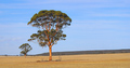
I flipped the image so that the mountain range leads you to the trees. Leveled the horizon. Cropped it so that the tree sits more on the 1/3 line. Altered levels and selectively burned a bit and now it looks like this.
[thumb]620106[/thumb]
Having a second look at my attempt, the colors may be a bit too saturated but I think the composition may be more interesting or maybe not, lol.
Message edited by author 2007-12-06 17:18:31. |
|
|
|
12/06/2007 09:58:29 AM · #4 |

Help!!! mmm
Message edited by author 2007-12-06 10:02:47. |
|
|
|
12/06/2007 04:13:53 PM · #5 |
The building is the focus but there are a lot of distractions. Please remember I'm just new to this but have been trying to learn as much as I can. I'm using Photoshop Elements 5. This took me about 2 minutes and it would be better to be working with a large file for editing and spending a bit more time with it.
I'm sure others would do a much better job than I have.
Your photo: 
My Edited version: [thumb]620200[/thumb]
Brought the whites up in levels, a slight vertical straighten, sharpened using a high pass with hard light. Soft burn brush to bring detail to the white of the building. Cropped a bit of the bottom then added a vignette to force a focus on the building.
Don't know if that's all that much better but it can give you an idea of what to do. There are probably lots more options but I'm still learning.
Message edited by author 2007-12-06 16:35:10. |
|
|
|
12/06/2007 04:25:36 PM · #6 |
Last 6 challenges--
5.82
5.91
5.82
5.88
5.39
6.29
I dont have any advice, but those arent too bad of scores..
|
|
|
|
12/06/2007 04:39:38 PM · #7 |
Originally posted by buzzrock:
Last 6 challenges--
5.82
5.91
5.82
5.88
5.39
6.29
I dont have any advice, but those arent too bad of scores.. |
Thanks, yes I know and I am impressed myself but I want to keep advancing.
|
|
|
|
12/06/2007 05:55:21 PM · #8 |
What I see when I look through your portfolio is that you're taking the critiques people are giving seriously, and you're improving. Continue to do that, and you'll be winning ribbons soon enough.
If I would give one bit of advice, it would be to pay close attention to the lighting in your shots. That seems to be the area where your challenge entries break down the most. Look at the lighting in the top finishers, and try to reproduce it. If you can't figure out what they have done, then ask. Most people are pretty helpful if you're sincerely trying to improve. |
|
Home -
Challenges -
Community -
League -
Photos -
Cameras -
Lenses -
Learn -
Help -
Terms of Use -
Privacy -
Top ^
DPChallenge, and website content and design, Copyright © 2001-2025 Challenging Technologies, LLC.
All digital photo copyrights belong to the photographers and may not be used without permission.
Current Server Time: 08/27/2025 12:03:22 AM EDT.


