| Author | Thread |
|
|
11/29/2007 08:45:29 AM · #1 |
If you have time I would like to have your opinion on this re-edit.
Re-Edited
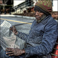
Original Entry
Thanks in advance.
SDW
|
|
|
|
11/29/2007 08:55:21 AM · #2 |
| I love the re-edit, though I'm a black and white girl at heart. The reason the re-edit works so well for me is that all details are brought back to life, and the emphasis is on the man and what he is doing. The paper is especially beautiful. In the original, the man himself is gorgeous, but the other parts of the photo - such as the splotches of white in the background and the blown area of the newspaper - are distracting. I hope this helps! |
|
|
|
11/29/2007 09:02:30 AM · #3 |
Here is my opinion...
WHOAAA...
very nice, muuuuuch better than bw ;) |
|
|
|
11/29/2007 09:04:43 AM · #4 |
I don't know why it should even bother me, but my brain keeps repeating "HDR Photomatix HDR Photomatix..." at me :-(
However, in some way I DO love this version. It is a wonderful shot, and the post processing is allowing it to show off every little detail. I am getting so much more out of this one than the b+w.
This image is one of those rare gems that want me to keep looking at it in great length and detail.
I also noticed the HUGE difference the bigger size is making !!!!!!! |
|
|
|
11/29/2007 09:36:47 AM · #5 |
Thanks everyone for your comments and feedback.
SDW
|
|
|
|
11/29/2007 10:15:36 AM · #6 |
Originally posted by noraneko:
I love the re-edit, though I'm a black and white girl at heart. The reason the re-edit works so well for me is that all details are brought back to life, and the emphasis is on the man and what he is doing. The paper is especially beautiful. In the original, the man himself is gorgeous, but the other parts of the photo - such as the splotches of white in the background and the blown area of the newspaper - are distracting. I hope this helps! |
Ditto! I totally agree with Catherine's comments ... Great job with the re-edit ... mind posting steps on how you did that? |
|
|
|
11/29/2007 12:32:23 PM · #7 |
It's a terrific improvement, but you may have gone a little too far. The image is extraordinarily flat overall now. You might consider masking the BG out (especially the street, maybe only the street) to about one zone lighter, to bring in some depth.
R.
|
|
|
|
11/29/2007 12:50:50 PM · #8 |
Just an opinion here but I'm not a big fan of what you've done to the shot.
Again, just my opinion but I think you've taken a perfect image and made it more about the processing and less about the subject. It's now more about you and less about him.
I've done the same thing many times but I believe if the image is truly good you don't need all the razzle-dazzle. If I do that type of thing now, it's with the direct intent of putting my finger print on the shot.
I hope to feel less inclined to do that as I move on.
Message edited by author 2007-11-29 13:11:22. |
|
|
|
11/29/2007 01:05:07 PM · #9 |
| Your first edit has a nice crisp feel to it, lots of dark darks and bright whites that give the picture energy to me. The re-edit just does a little Joey-Lawrence tapdance and says "look at how cool I am!" It doesn't interest me, since Joeylawrencism has proven that any picture can be made to look that way. |
|
|
|
11/29/2007 01:30:11 PM · #10 |
I would like...No no no... I NEED to know how you did this. Please?
Needless to say, I really like it! |
|
|
|
11/29/2007 02:20:54 PM · #11 |
Originally posted by lifternessjt:
I would like...No no no... I NEED to know how you did this. Please?
Needless to say, I really like it! |
It's basically a heavy dose of tone mapping, probably with Photomatix Pro.
Here's an image that's somewhat less exaggerated but following the same path. In the photographer's comments section is a link to a thread talking about how it is done, and showing the original from which it was processed:
R.
|
|
|
|
11/29/2007 03:57:00 PM · #12 |
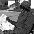
Here is the entry, re-edit, and the ORIGINAL to compare.
I did use photomatrix pro HDR/Tonemapping but not a high dose of editing in photomatrix. Then I opened the photograph in CS3E and did the following; levels and sharpen. That's all that was done to the picture.
[thumb]617965[/thumb]
I wanted to bring out the print in the paper so I had to use HDR/Tonemapping to achieve that. By doing that I had to reset the white point to the paper which is what made the photo pop-out with this look. At no time was I trying to do a little Joey-Lawrence tapdance and says "look at how cool I am!" . I have not purchase a CD on processing from anyone...just trial and error, mostly error :).
I have several images in my profile that been processed with HDR/Tonemapping, without me telling the viewer they would not know. The bottom line - I like the outcome of the image, it does exaggerate detail but I think it's appropriate in this type of image.
With that said I want to thank everyone for their comments and opinions. All will help me in finding a editing range for different photographs. I think both positive and negative opinions are what separates our community from others and HELPS all of us to learn.
I'm thick skinned and can handle any comment received :) but please when someone does an edit and it happens to look closely to someones style it does not mean that they are trying to be like that person.
The original has been posted. The only thing I did was crop and one round of sharpening. I would love to see what others could come up with if they would like to try an edit. If you would like the original (large) file I will send. I'm trying to learn and this could help.
Thanks
SDW
Message edited by author 2007-11-29 16:01:52.
|
|
|
|
11/29/2007 04:18:05 PM · #13 |
I prefer the B&W... There are things that could be improved (the blown out paper bugs me, for instance, and the B&W could pop more) but as a treatment it just works better for me.
I think I'm just not a big fan of the other style except for very specific purposes, like band/advertising shots. The feel is a little incongruous for a journalistic/editorial shot.
All that said, I think you did a good job at it - it's just not my cup of tea. |
|
|
|
11/29/2007 04:23:09 PM · #14 |
| Thanks Bear and SDW for the precisions. I for one like the editing you did. I think it would look great in print. |
|
|
|
11/29/2007 06:21:13 PM · #15 |
I think I'd like the edited version at about 75% of the editing effect. it's a little too much. And seeing the original convinces me Bear is right - making the background brighter would help the darker subject stand out better. It would also reduce the detail in the background, again helping it to fade out and drawing my attention to the subject.
Congrats for continuing to play around and learn!
|
|
|
|
11/29/2007 07:18:30 PM · #16 |
I have re-edited my re-edit :) to apply some suggestions from users in this thread. I thank everyone of you for taking time to offer your comments.
I have increased the brightness with a selective layer using levels. I also dropped the amount of process to 75%.
Below is a side by side comparison. Any thoughts? Comments welcome - Thanks in advance.
SDW
[thumb]618000[/thumb]
|
|
|
|
11/29/2007 07:43:26 PM · #17 |
Lookin' better, Scott! Howzabout toning down the contrast on the guy a bit? This is just my suggestion, of course; plenty of people loved your original edit. :)
|
|
|
|
11/29/2007 08:10:13 PM · #18 |
Originally posted by swhiddon:
At no time was I trying to do a little Joey-Lawrence tapdance and says "look at how cool I am!" . |
the photo! not you! sorry about that. what I really meant to say is that the style overwhelms the image, imho. art is the marriage of form and content. In other words, what about the content is making you use this particular style? That's the question we need to ask ourselves. |
|
|
|
11/29/2007 08:13:05 PM · #19 |
| I love this, and I do like it better than the BW. Good work! |
|
|
|
11/29/2007 08:35:38 PM · #20 |
I like that you can read the paper but the texture that was introduced with the tone mapping is unattractive, to me. I like the colors in the background and the smooth texture of the original one.
Did you try using a mask layer to just bring out the paper?
|
|
|
|
11/29/2007 08:39:20 PM · #21 |
Originally posted by posthumous:
Originally posted by swhiddon:
At no time was I trying to do a little Joey-Lawrence tapdance and says "look at how cool I am!" . |
the photo! not you! sorry about that. what I really meant to say is that the style overwhelms the image, imho. art is the marriage of form and content. In other words, what about the content is making you use this particular style? That's the question we need to ask ourselves. |
Thank your your comments and thank you for helping me understand what you were trying to say. Now I understand what you are saying and appreciate your comment just as much as everyones. And you are right that style must go with the the image and not clash.
That's why comments like you posted are very important. They balance the scale and hopefully help the photograph that is doing the editing find that thin line between to little and to much editing and how it may very from photograph to photograph based on subject and content.
Again thank you for your comments.
SDW
|
|
|
|
11/29/2007 08:46:01 PM · #22 |
Originally posted by pcody:
I like that you can read the paper but the texture that was introduced with the tone mapping is unattractive, to me. I like the colors in the background and the smooth texture of the original one.
Did you try using a mask layer to just bring out the paper? |
Honestly, No! I'm not good at layer mask and need to learn about that treatment. There are at least three tutorials in the learn section on layer mask. I think I need to visit that section more often.
|
|
|
|
11/29/2007 09:06:00 PM · #23 |
I just put your edit2 over the orginal and lowered opacity to 50%.
I love the way it brings out some detail without looking so very obviously HDR.
 |
|
|
|
11/30/2007 08:20:58 AM · #24 |
[thumb]618016[/thumb] I was a bit sloppy with this, but it's an example of using a mask layer. I put the tone mapped one on the bottom and the original on top. Mask layer>show all. Then I painted in the paper and some parts of his face and hands.
Using a mask layer is as easy as using the eraser tool but with so much more control. They allow you to have unlimited undo capabilities just by changing the color you use to paint with. I think if you try them, you will see exactly how easy they are and use them for most of your editing. |
|
|
|
11/30/2007 08:40:33 AM · #25 |
|
Home -
Challenges -
Community -
League -
Photos -
Cameras -
Lenses -
Learn -
Help -
Terms of Use -
Privacy -
Top ^
DPChallenge, and website content and design, Copyright © 2001-2025 Challenging Technologies, LLC.
All digital photo copyrights belong to the photographers and may not be used without permission.
Current Server Time: 09/10/2025 05:59:13 PM EDT.


