| Author | Thread |
|
|
11/21/2007 01:31:52 AM · #1 |
|
|
|
11/21/2007 01:51:29 AM · #2 |
Thanks ff.
For the first time ever, I've actually had an idea for the challenge before it was announced. I'd been waiting for a complementary colours challenge for *ages* so I can shoot this idea I've had :-) |
|
|
|
11/21/2007 02:55:15 AM · #3 |
Depending on which color model you are using (cmyk, rgb, whatever) and whether it is additive or subtractive, there are a number of different "sets" of complementary colors. From a traditional artistic point of view, this is the most common "definition" of complementary colors:
Because of the limited range of colors that was available throughout most of the history of art, many artists still use a traditional set of complementary pairs, including:
* red and green
* blue and orange
* yellow and purple
The complement of each primary color (red, blue, or yellow) is roughly the color made by mixing the other two in a subtractive system:
* red complements (blue + yellow) = green
* blue complements (red + yellow) = orange
* yellow complements (red + blue) = purple
When two complements are mixed they produce a grey or brown.
The use of complementary colors is an important aspect of aesthetically pleasing art and graphic design. This also extends to other fields such as contrasting colors in logos and retail display. When placed next to each other, complements make each other appear brighter. On an artistic color wheel, complementary colors are placed opposite one another. Although these artistic complements may not be precise complements under the scientific definition, most artistic color wheels are laid out roughly like the HSV color wheel discussed above.
//en.wikipedia.org/wiki/Complementary_color
Just to get the discussion going :-)
R.
Message edited by author 2007-11-21 02:55:28.
|
|
|
|
11/21/2007 03:08:49 AM · #4 |
| I can see a lot of complementary DNMCs handed out in this one. :P |
|
|
|
11/21/2007 03:36:35 AM · #5 |
Originally posted by yanko:
I can see a lot of complementary DNMCs handed out in this one. :P |
That's complimentary ! :-P |
|
|
|
11/21/2007 05:08:34 AM · #6 |
Its the funniest thing.
I was getting ready for office today morn and noticed I had matched my outfit for the day down to the socks. I thought of snapping it... and then thought to my self 'A Complimentary Colors challenge is way overdue'.
Almost got spooked when I saw it as I logged in from office. How strange is that!!
I'll be wishing for a million $$ tomorrow.
I think the old adage 'Be careful what you wish for' holds true here. |
|
|
|
11/21/2007 08:12:37 AM · #7 |
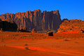
Does something like this qualify? |
|
|
|
11/21/2007 09:25:05 AM · #8 |
Originally posted by HighNooner:
Does something like this qualify? |
ummmm...YES!
What is everyone's opinion on pastel or flourescent colors? For example, Pink and Light Green?
|
|
|
|
11/21/2007 10:20:32 AM · #9 |
Originally posted by larryslights:
[
What is everyone's opinion on pastel or flourescent colors? For example, Pink and Light Green? |
Personally, I'm all for it. The "literal" voters? I'm not sure. Some people think complementaries involve only primaries...
R.
|
|
|
|
11/21/2007 11:57:41 AM · #10 |
Originally posted by saurabhv:
... and then thought to my self 'A Complimentary Colors challenge is way overdue'.
|
That's ComplEmentary...unless you are giving crayons out for free... LOL |
|
|
|
11/21/2007 05:50:19 PM · #11 |
Originally posted by Bear_Music:
Originally posted by larryslights:
[
What is everyone's opinion on pastel or flourescent colors? For example, Pink and Light Green? |
Personally, I'm all for it. The "literal" voters? I'm not sure. Some people think complementaries involve only primaries...
R. |
Just to throw something in the mix, how about black and white?
*runs and hides* |
|
|
|
11/21/2007 06:36:37 PM · #12 |
Red: "Hello Blue. You are looking lovely today."
Blue: "Thank you Red. Is that a new shade you have today? It looks great on you."
|
|
|
|
11/21/2007 08:40:45 PM · #13 |
Ok, I have a question. This challenge has got me thinking. So, here is the point that has me pondering considerably...what color background do you use when shooting complimentary colors in the studio? EDIT: when the background IS NOT part of the composition.
On this line I took some solid colored objects of the primary color type and placed them on white, black, gray (@21% gray) backgrounds. Before I state what my brain thinks my eye saw as far as appeal, I would like to hear what anyone who cares to share has to offer in the way of opinion.
Message edited by author 2007-11-21 20:41:36. |
|
|
|
11/24/2007 06:50:48 AM · #14 |
| Just got back from shopping for this challenge. can't wait to get started, but gotta clean the house first :( |
|
|
|
11/24/2007 07:58:10 AM · #15 |
Originally posted by Puckzzz:
Just got back from shopping for this challenge. can't wait to get started, but gotta clean the house first :( |
You should set your priorities right!
;) |
|
|
|
11/24/2007 12:52:14 PM · #16 |
Tell that to my boyfriend Han! My priorities are Ok, his are all backwards!
anyways...was a bit disappointed with the result, but I've sent it in anyway :-) |
|
|
|
11/27/2007 03:03:56 PM · #17 |
Originally posted by CEJ:
Ok, I have a question. This challenge has got me thinking. So, here is the point that has me pondering considerably...what color background do you use when shooting complimentary colors in the studio? EDIT: when the background IS NOT part of the composition.
|
I would think the background should be a darker shade of the less dominant of the two colors to provide balance.
|
|
|
|
11/27/2007 03:23:26 PM · #18 |
Originally posted by fotomann_forever:
Originally posted by CEJ:
Ok, I have a question. This challenge has got me thinking. So, here is the point that has me pondering considerably...what color background do you use when shooting complimentary colors in the studio? EDIT: when the background IS NOT part of the composition.
|
I would think the background should be a darker shade of the less dominant of the two colors to provide balance. |
Wouldn't a lighter shade also be a possibility? Depending on the color and the objects, of course, lol. I think either (darker or lighter)would probably be more interesting visually than b/w/g. Heck even a match to the dominant color would at least make a statement (and the less dominant object might stand out all the more). |
|
|
|
11/27/2007 03:31:34 PM · #19 |
Originally posted by Donna21:
Originally posted by fotomann_forever:
Originally posted by CEJ:
Ok, I have a question. This challenge has got me thinking. So, here is the point that has me pondering considerably...what color background do you use when shooting complimentary colors in the studio? EDIT: when the background IS NOT part of the composition.
|
I would think the background should be a darker shade of the less dominant of the two colors to provide balance. |
Wouldn't a lighter shade also be a possibility? Depending on the color and the objects, of course, lol. I think either (darker or lighter)would probably be more interesting visually than b/w/g. Heck even a match to the dominant color would at least make a statement (and the less dominant object might stand out all the more). |
Here's a good place to look (bg's are a mixed bag according to previous runs of this challenge).
Originally posted by fotomann_forever:
I
II
III |
|
|
Home -
Challenges -
Community -
League -
Photos -
Cameras -
Lenses -
Learn -
Help -
Terms of Use -
Privacy -
Top ^
DPChallenge, and website content and design, Copyright © 2001-2025 Challenging Technologies, LLC.
All digital photo copyrights belong to the photographers and may not be used without permission.
Current Server Time: 11/18/2025 08:58:28 PM EST.


