| Author | Thread |
|
|
09/26/2007 10:10:23 AM · #26 |
Originally posted by glad2badad:
Images geared toward use by advertising agencies for various usage: magazines, billboards, web ad's, etc...
Usually clean (clear subject, not cluttered) and tell a story in a simple manner. |
YES. Exactly. Nothing avant garde, or what I would consider "artful." |
|
|
|
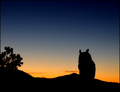
09/26/2007 10:23:38 AM · #27 |
Hi all...would love to know what I could have done better with this..only received 3 comments....btw..it's an owl not a horse...lol
 |
|
|
|
09/26/2007 10:45:04 AM · #28 |
Boo boo - I already commented on yours during the challenge. For "clean" DPC-like shots, you don't want "clutter", like cars and people. But I happen to very much like clutter and think it would have been a "ho hum" shot without 'em. I do think that it's maybe a tad bit oversaturated in the yellows. Though oversaturation usually isn't a bad thing here.
Quigley, I think I hit you during the challenge as well. I do very much like the way the sun splits the blade.
McFrikki - given what I've seen of DPC tastes, I'd have expected yours over a 5.4. That said, statues are "easy" and often not well rewarded. Also, there's a bit of an outline of sorts around the silhouette - hard to tell what from. Some may have seen it as an oversharpening artifact. And there are little lighter color spots in the sky, perhaps from lens flare/dust reflection - a smooth sky will be scored higher.
Jeb, I love your subject! I remember when voting on this one that when I scrolled down a bit, I liked it better. The heavy clouds at the top seem just that - top-heavy. There still is a lot of "dust" apparent on my monitor as well - this can lower a vote now that dust removal is allowed in basic. (Mostly in the upper right, by the way, but a bit more along the underside of the clouds. Easiest way to spot it is to really crank up the contrast in PS to see where it occurs.)
And I'll get to more here in a bit... |
|
|
|
09/26/2007 10:50:20 AM · #29 |
Originally posted by wizardry:
Hi all...would love to know what I could have done better with this..only received 3 comments....btw..it's an owl not a horse...lol
|
I like your silhouette and very surprised it did not do a bit better. Maybe if you cropped out the tree on the left it would have given it more of an impact and the focus would have been on the owl only. Who in the world thought that was a horse. I knew it was an owl as soon as I saw it. Love your colors too. |
|
|
|
09/26/2007 10:52:22 AM · #30 |
Thanks  Melethia for your wonderful constructive comment. Melethia for your wonderful constructive comment. |
|
|
|
09/26/2007 10:54:00 AM · #31 |
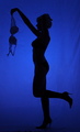
I seem to be the only one who noticed the model was wearing a completely different set of underwear? black bra & panties.
I gave it a 4 for that reason. nice attempt but do it right.
|
|
|
|
09/26/2007 11:03:37 AM · #32 |
Becky T - I liked yours just fine. I thought it a very good technical execution of the challenge (ie a very good silhouette) and I like your subject choice - and I love the tendrils! You may want to try a different crop - take away the tree and let the plant exist on its own and see if you like it.
Van - Your score is most likely because most voters don't see this as a silhouette, and are instead expecting little to no detail in the subject. This is, however, an excellent and different perspective of a bird in flight, and the light outlining the wings is quite lovely.
Don - your lens is very, very sexy. Do you share it with your better half? And I like the light in yours. Nice to add the webs for refracted color.
yospiff - I got yours, too, during the challenge. By the way (and this goes for everyone) if I really like your picture during voting, that may be a bad sign. I have weird taste. :-)
Wizardry, very good color (and a color set popular here at DPC). A pretty good composition, with nice negative space at the top and a pretty well balanced bottom third. I think part of what hurt you was the confusion as to what the critter was. For DPC-simple, yes, crop the shrub. In Deb's book of Mediocre Photography, keep the shrub - adds balance, context and scale. |
|
|
|
09/26/2007 11:04:42 AM · #33 |
| Oh, and Judy, dear, you know what I think of yours, right? :-) |
|
|
|
09/26/2007 11:09:23 AM · #34 |
Actually i think there were quite a few...lol...but thanks for the comments Becky ;-)
Originally posted by BeckyT:
Originally posted by wizardry:
Hi all...would love to know what I could have done better with this..only received 3 comments....btw..it's an owl not a horse...lol
|
I like your silhouette and very surprised it did not do a bit better. Maybe if you cropped out the tree on the left it would have given it more of an impact and the focus would have been on the owl only. Who in the world thought that was a horse. I knew it was an owl as soon as I saw it. Love your colors too. |
|
|
|
|
09/26/2007 11:42:35 AM · #35 |
I know the problem with mine was that I stepped outside the boundaries of the traditional definition of silhouette (ie: black object, against light background). I got a lot of comments about there being too much detail showing and it not being considered a silhouette. And, I think that voters were truly going for "traditional". I stepped outside of that box.
Having said that, I can see why it scored a 4.6 given the "boundaries" that were expected. I know now that you have to take the challenge literally and expect that the voters will want to see something that fits that criteria right on, or it will not do well. Also..STOCK, STOCK, STOCK shots!!!! Gotta remember that! *grin*
Has anyone noticed though that the non-camera voters, non-comment votes and the vote only's are really low?! Not sure on what to say about that but, I have a tiff with those who are "vote only" voting so low. If they never pick up a camera and take a shot, then it's hard for them to appreciate the work that goes into a shot. I had one commenter (in another challenge) make the comment "I don't think you tried". What kind of a comment is that???? *sigh* As photographers, we are of one mindset, as voters, we are of another! *grin*
|
|
|
|
09/26/2007 11:53:57 AM · #36 |
Originally posted by Puckzzz:
I seem to be the only one who noticed the model was wearing a completely different set of underwear? black bra & panties.
I gave it a 4 for that reason. nice attempt but do it right. |
Puckzzz......I respect your point of view on this shot. However, I have to say that I think there are a couple of things to be considered in this shot too. Firstly, I think it all depends on the calibration of each monitor. Personally, I wouldn't have noticed it had you not pointed it out. I see silhouette and to me, it fits the challenge very nicely. I think that we could potentially sit and totally rip any photo apart if we were to scrutinize every detail of ANY photo....doesn't matter who took it, including some of the greats and reknowned photographers of this world, both past and present.
In my own opinion, this shot deserves FAR higher than the 4 that you have given it. That's not a put down on you, just my personal opinion. Personally, I feel that the criteria by which you gave this shot a 4 was rather overly judgemental. A photo doesn't have to be "perfect" to be wonderful and entertaining or beautiful. Some of the best photos in this world are NOT perfect. Why go looking for it so heavily?
Had I voted in this challenge (I didn't because I was entered into it....personal rule for me only).....I would have given this shot at least a 6.00. That's me and my personal take.
Edited to add: BTW Puckzzz....we now know how closely you're looking at shots with potentially nude female bodies!!!! *Grin* "Does she really not have a bra on?" *wink*
Message edited by author 2007-09-26 11:57:13.
|
|
|
|
09/26/2007 11:54:58 AM · #37 |
| Jamie, you have something I've never received, though I one day hope to, and that's a Posthumous Blue Ribbon. Stepping outside the box has its own reward - all it takes is one person to "get it" and it beats a high score here. Or at least that's the way I feel about it. I wouldn't sweat the "no camera" voters - there are very very few of those and their vote is statistically insignificant in the long run. Commenter average tends to be higher because flames against those who don't leave loving, glowing comments have made a lot of folks hesitant to give comments with a low vote. Sad, but true. |
|
|
|
09/26/2007 12:34:17 PM · #38 |
As promised, Here is the edit...

Compared to the submission...
 |
|
|
|
09/26/2007 12:44:19 PM · #39 |
Originally posted by PhotoInterest:
Originally posted by Puckzzz:
I seem to be the only one who noticed the model was wearing a completely different set of underwear? black bra & panties.
I gave it a 4 for that reason. nice attempt but do it right. |
Puckzzz......I respect your point of view on this shot. However, I have to say that I think there are a couple of things to be considered in this shot too. Firstly, I think it all depends on the calibration of each monitor. Personally, I wouldn't have noticed it had you not pointed it out. I see silhouette and to me, it fits the challenge very nicely. I think that we could potentially sit and totally rip any photo apart if we were to scrutinize every detail of ANY photo....doesn't matter who took it, including some of the greats and reknowned photographers of this world, both past and present.
In my own opinion, this shot deserves FAR higher than the 4 that you have given it. That's not a put down on you, just my personal opinion. Personally, I feel that the criteria by which you gave this shot a 4 was rather overly judgemental. A photo doesn't have to be "perfect" to be wonderful and entertaining or beautiful. Some of the best photos in this world are NOT perfect. Why go looking for it so heavily?
Had I voted in this challenge (I didn't because I was entered into it....personal rule for me only).....I would have given this shot at least a 6.00. That's me and my personal take.
Edited to add: BTW Puckzzz....we now know how closely you're looking at shots with potentially nude female bodies!!!! *Grin* "Does she really not have a bra on?" *wink* |
I agree. I gave this an 8. I really like it and thought it fit the challenge perfect. I guess I need my monitor calibrated. IMO it's way better than a 4. |
|
|
|
09/26/2007 12:45:33 PM · #40 |
| HELP! I am in trouble!!! Being my first challenge i didn't know to save my original file and now they are requesting it. I need some help asap! I deleted the pictures off of my card, but i have been told that you can recover the pictures still. Does anyone have a link for me?? Please help! |
|
|
|
09/26/2007 12:48:55 PM · #41 |
Originally posted by battymaddie:
HELP! I am in trouble!!! Being my first challenge i didn't know to save my original file and now they are requesting it. I need some help asap! I deleted the pictures off of my card, but i have been told that you can recover the pictures still. Does anyone have a link for me?? Please help! |
There's quite a few threads on this topic. I searched the forums using "recover file" and found this (among others).
Recovery data from formatted CF
Good luck! :)
|
|
|
|
09/26/2007 12:49:17 PM · #42 |
I hope you can come up with the file...it would be a shame for this to be DQ'd...gorgeous shot!
Originally posted by battymaddie:
HELP! I am in trouble!!! Being my first challenge i didn't know to save my original file and now they are requesting it. I need some help asap! I deleted the pictures off of my card, but i have been told that you can recover the pictures still. Does anyone have a link for me?? Please help! |
|
|
|
|
09/26/2007 12:51:59 PM · #43 |
Originally posted by pix-al:
As promised, Here is the edit...
Compared to the submission...
|
That would have scored much better IMO. High 5 to low 6. Nice shot!
|
|
|
|
09/26/2007 12:56:55 PM · #44 |
Originally posted by battymaddie:
HELP! I am in trouble!!! Being my first challenge i didn't know to save my original file and now they are requesting it. I need some help asap! I deleted the pictures off of my card, but i have been told that you can recover the pictures still. Does anyone have a link for me |
Please help!
//www.pctools.com/file-recover/
try this |
|
|
|
09/26/2007 01:00:50 PM · #45 |
Originally posted by glad2badad:
That would have scored much better IMO. High 5 to low 6. Nice shot! |
Thanks - I think so too... Never mind. |
|
|
|
09/26/2007 01:05:57 PM · #46 |
i was rushed and neglected to think about the monitor issue when i submitted mine:

i'm kind of ashamed that i took so little care, especially with the dark patches around her hands.
i really enjoyed my post-entry edit much more:

purists will say it's not a silhouette because you can still see details. but i think most people would still identify it that way. i made a it a smidge darker:

Message edited by author 2007-09-26 13:06:21. |
|
|
|
09/26/2007 01:06:35 PM · #47 |
a rather undramatic foto intended for silhouette, I inadvertently posted in Blur - part deux and I was satisfied leaving it there. I liked the simple idea of multiple & separate silhouettes.
In this silhoutte challenge, beautiful entries:
vtruan -  , ,
posthumous -  , ,
or this fabulous posthumous blue best of show image by PhotoInterest, were uniformly peppered with DNMC.
I think it extremely unfortunate that proposals in some recent threads to implement a button to rate DNMC and/also actually DQ an entry like these on the basis of those results.
As in the past dpc silhouette challenges, pictures without the strongly favored, pitch black subject are often rated low. I think that black is a legitimate form, but not the only one. Art history & actual use
will reveal forms of the silhouette as outline in many manifestations from colourful cave paintings, American folk art, & commercial corporate logos to highly detailed & intricate cameos. I feel the variety of photographic interpretation of the subject has been barely explored.
|
|
|
|
09/26/2007 01:12:27 PM · #48 |
Originally posted by pix-al:
As promised, Here is the edit...
Compared to the submission...
|
Yes the newer one is much better than your submission. Great job on the editing. |
|
|
|
09/26/2007 05:43:29 PM · #49 |
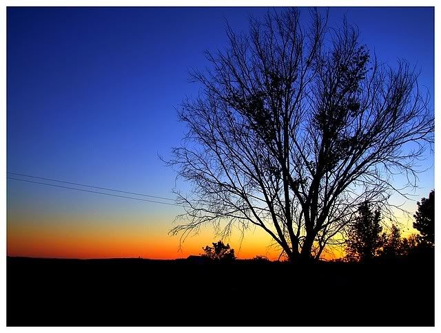
My entry -

Outtakes:
 I didn't like the power line in this one, it detracted from the mood. I didn't like the power line in this one, it detracted from the mood.
 I thought this was really cool - and wished I had found it for the Power challenge (it just screams "power" to me), but the smaller pole is very blurry, and one friend labelled it "scary." (And this is the one for Melethia) I thought this was really cool - and wished I had found it for the Power challenge (it just screams "power" to me), but the smaller pole is very blurry, and one friend labelled it "scary." (And this is the one for Melethia)
I also had a version of my submission w/ a darker border and deeper colors, but the lighter colors were starting to get grainy -

And then of course, was the possibility to just chuck them all and go w/ wealth. All I had for that was one title idea "You have horses, you must be RICH!" And 3 possible images -
  
|
|
|
|
09/26/2007 05:47:35 PM · #50 |
Originally posted by pix-al:
This is interesting.
Avg (all users): 4.6265
Avg (commenters): 7.3333
The commenters obvioulsy liked it a great deal more than the non-commenters!
|
Al, I've seen this observation before. I think it just means that people who really like a photo are more likely to leave a comment about it.
|
|
Home -
Challenges -
Community -
League -
Photos -
Cameras -
Lenses -
Learn -
Help -
Terms of Use -
Privacy -
Top ^
DPChallenge, and website content and design, Copyright © 2001-2026 Challenging Technologies, LLC.
All digital photo copyrights belong to the photographers and may not be used without permission.
Current Server Time: 04/23/2026 04:55:51 PM EDT.