| Author | Thread |
|
|
09/18/2007 03:24:17 AM · #1 |
Sooo...had to wait for  eyewave to retrun from his holliday with this thread, cause he's in that line of work. eyewave to retrun from his holliday with this thread, cause he's in that line of work.
Here's my entry for Motivational Poster.
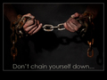
now, we don't see these kind of posters much in Holland, so I had to google for examples. I thought I had the general idea, and started shooting. The photo itself seems to be OK (although some people were bothered by the shadows, personally I think they add depth).
But the font - fontsize - border etc. that was all wrong apparantly.
Since I am here to learn as much as I can, I would really like to know what I could've done better to make a proper motivational poster out of it.
|
|
|
|
09/18/2007 03:56:20 AM · #2 |
Originally posted by Puckzzz:
what could I've done better? |
include some nudity ;-) |
|
|
|
09/18/2007 04:31:13 AM · #3 |
I really like the image!
In terms of the challenge- perhaps it could have been brighter (not literally)
I mean a lot of motivational posters have cheery, happy images, mostly of sunsets and really inspirational views.
|
|
|
|
09/18/2007 04:41:17 AM · #4 |
Originally posted by Art Roflmao:
Originally posted by Puckzzz:
what could I've done better? |
include some nudity ;-) |
LOL....wouldn't that de-motivate? you know, people wanting to go home early and ehhhhh...sleep? or eat candy?
|
|
|
|
09/18/2007 04:42:43 AM · #5 |
Originally posted by Puckzzz:
Sooo...had to wait for eyewave to retrun from his holliday with this thread, cause he's in that line of work.
Here's my entry for Motivational Poster.
Since I am here to learn as much as I can, I would really like to know what I could've done better to make a proper motivational poster out of it. |
Yes, the shot itself is good, though the shadows are bothering me too. What I miss, is something we (in Dialogue-Marketing) call "Call for action", like the addition "...give up smoking!" for example.
Regarding the layout , I don't understrand why you have that space below the image but didn't put the text there, but onto the image. The white border is not wrong, but the same color as in the text (see below) would have been an appropriate choice.
The typeface you chose is clean and light, doesn't match the strength of the image and therefor gets lost, it's grey color is certainly not drawing attention to it. I had chosen a bold typeface for the headline, maybe something with a "corroded" touch, in rust-red. For the subline (call for action) I had chosen a slanted font - because of their diagonal axis they convey a positive feeling - in a brighter tone of the same colour.
HTH, Oliver
PS: Or just follow Ken's proposal :)
Who's next?
|
|
|
|
09/18/2007 05:19:40 AM · #6 |
Thnx eyewave. you have some good points :)
|
|
|
|
09/18/2007 08:25:36 PM · #7 |
Generally, motivation posters highlight a single word (Teamwork, Perseverance, or the like) with a tag line. A dark picture isn't necessarily bad, but others were correct in saying that most are beautiful, colorful, bright, upbeat. How did you get so lucky as to avoid them in the Netherlands? We've had to put up with them for over 10 years as the latest wonderful thing to motivate workers so they will be happy no matter how badly we treat them. Cheer up - voters like mine 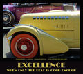 much less than yours... but they liked the font (even the Critique club). One of the things I did was sample the color of the car, and use it as the color of the text. Doesn't have to match - can contrast, but I liked the idea. Maybe mine was more of a definition than a motivation. much less than yours... but they liked the font (even the Critique club). One of the things I did was sample the color of the car, and use it as the color of the text. Doesn't have to match - can contrast, but I liked the idea. Maybe mine was more of a definition than a motivation. |
|
|
|
09/18/2007 10:18:59 PM · #8 |
| also, there's a shadow on the black backdrop. I think the effect you're trying to imitate is one of hands floating in darkness. There should be no shadow, no awareness of a backdrop. |
|
|
|
09/18/2007 11:07:58 PM · #9 |
I gave it a 7. I liked the lighting and the grittiness of the image (on it's own, I would have scored the image higher). I just didn't feel it had a powerful message ... and the weak font only reinforced, in my mind, that it wasn't a strong message.
|
|
Home -
Challenges -
Community -
League -
Photos -
Cameras -
Lenses -
Learn -
Help -
Terms of Use -
Privacy -
Top ^
DPChallenge, and website content and design, Copyright © 2001-2025 Challenging Technologies, LLC.
All digital photo copyrights belong to the photographers and may not be used without permission.
Current Server Time: 10/14/2025 05:38:59 AM EDT.


