| Author | Thread |
|
|
07/27/2007 08:16:14 PM · #1 |
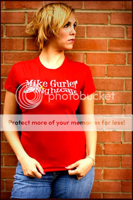
took these pictures today to be used on a web site to sell the tee shirt..
please tell me the good and the bad


 this is my favorite.. this is my favorite..


|
|
|
|
07/27/2007 08:21:51 PM · #2 |
All of them except #4 are a little too wrinkled at the bottom. But #4 is a little too stretched ... so much that she looses some of her "feminine charms" (remember, sex sells!).
So I think I prefer #3.
I also don't care for her expression too much ... she is a bit too "disinterested". Like ... she just doesn't care. She needs a more candid appearance ... as if she doesn't realize you're taking the picture.
|
|
|
|
07/27/2007 08:37:06 PM · #3 |
For what it is worth, IMHO:
Number 2 is the best of the lot. Crop needs to be much tighter.
Number one is definitely not selling tee shirts. She is definitely not interested in the pose.
Number 3 is probably the best pose of the lot. It would be my first choice but the color needs a little more saturation. Crop much tighter.
Your favorite - looks like she has bubble gum stuck in her hair.
Number four - not bad but a very disinterested gaze.
Last one same ad the first.
BOL |
|
|
|
07/27/2007 08:42:52 PM · #4 |
I am sorry, but these look so snapshottish to me... They may suffice unto the task, but there's nothing in them that elevates either them or the product...
R.
|
|
|
|
07/27/2007 08:50:58 PM · #5 |
Some ideas for improvement:
1) To smooth out the wrinkles, rather than pulling on the shirt continuously, have her simply flatten it by rubbing her hands downward (then get her hands out of that position).
2) To get her to pose more naturally, take an assistant with you. Have her look at / talk to your assistant. If that's not possible, give her a point of reference to look at. She needs to want to see what she's looking at in order to avoid that "aloof" appearance.
3) For better color ... switch your camera to "cloudy" instead of Auto WB. I'm guessing you're on AWB because the color of the bricks are markedly different between the shots of the red and purple shirts. You want your WB to stay the same from shot to shot - not change according to the clothing the people are wearing! If it's going to change, it should change according to the light. That's why I hate AWB. The camera can't tell the difference between the source of the light and the material reflecting it.
4) A little more texture in the background might be interesting. Right now it's just "there". It's nice that it's not just a white wall (but actually, a white wall might sell these shirts better!). But it would be nice if the bricks didn't look "the same". Find some tarnished bricks or something. (but the more you do that, the more this image turns into a portrait rather than an ad piece for the shirt - so you may want to consider that white background idea)
5) A little post processing would help these images.
|
|
|
|
07/27/2007 09:41:45 PM · #6 |
Definately agree that color is off; that hurts, particularly from selling clothes! The White balance should help, and bumping contrast would help, too.
Focus on some is a little soft; the wall is in better focus than the model.
I'd either shoot at an oblique angle to the wall, or move her away from the wall and use that hot 50mm f1.4 to make the wall dissapear a little; keep the texture but soften it.
I know you're going for a candid look, but it might be worth trying having her look away but then look back at the camera with just her eyes - get a little more connection with the viewer.
Also - definately work on the drape - you can always pin it in back to help smooth and shape it.
Message edited by author 2007-07-27 21:43:13. |
|
|
|
07/27/2007 09:51:17 PM · #7 |
awesome advice.. thanks to all for the comments please keep them coming.
I shot these with my 30mm but the light was not quite enough to blur the brick, I have done that in other shots. I was hoping the brick would look a but more interesting than the studio shots, although I have better control of the lights, maybe tomorrow I will just bring the lights outside.. |
|
|
|
07/27/2007 10:23:31 PM · #8 |
I think the cut of the t and the shape of the model oppose each other. Maybe get a different model that has less cleavage or get a larger t for this one. The one where she is pulling down the t shows off the it better, but her bra isn't fitting to well and there are bulges just outside of the bra area. The others just have to many wrinkles. The model is pretty and has a good shape. I think the problem is how the t itself is cut and would look better on someone that is less endowed.
Technically, I'd move the model away from the wall and also introduce some props into the scene. |
|
|
|
07/27/2007 10:39:36 PM · #9 |
Okay, this still doesn't make the shot an "ad piece" ... In fact, quite the opposite. But I wanted to see what a little more dramatic background would look like. So take a look at this:
Before:  After: After: 
Technique used:
1) Duplicated the original layer, set layer mode to multiply, added a mask to the layer, and then used the Render Difference Clouds filter to give the background some light and dark areas (this was quicker than dodging and burning by hand, and it was an idea that just hit me so I thought I'd try it).
2) Duplicated the original layer again, this time set to overlay. This brightened up the brighter areas.
3) Dodged her face.
4) Used a little "Local Contrast USM". That is ... I used USM with a radius of 60 and an amount of 9.
Again, the image still doesn't look like an ad for a t-shirt, but it's certainly a more interesting image. :-)
|
|
|
|
07/28/2007 02:06:58 AM · #10 |
From the look on the model's face this is not a "fun" band.Get the model away from the wall and narrow the DOF.Have her look at you with a fun yet adventurous look to get me excited to see not only the band but someone like "Her" there.
Before After After
1. Add contrast
2.Healing Brush to "press" the wrinkles.
3.Blur to hide the Healing Brush.
4.Airbrush the skin to even it out.
5.Airbrush the shirt to even it out.
6.Add vignette for fun.
Hope I could be helpful
Bruce |
|
|
|
07/29/2007 12:18:32 AM · #11 |
Ok, so I took your favorite shot and gave it what I thought it needed in Photoshop to bring the attention back to the shirt. If anyone's interested than I'll take the time to post my steps...just let me know! Hope this helps!
 |
|
|
|
07/29/2007 03:55:09 AM · #12 |
| I really like the PP done on the photo above. |
|
|
|
07/29/2007 04:52:07 AM · #13 |
I like the PP too, but my assistant hates this look - i'm 45 and he's 24 and more fashion consious (SP?) then I ever was.
Moral: Image should match the target audience.
That means model type/age, PP, scene, etc. Look at other ads targeted to your target audience, store displays (the images) and the like. Copy them.
|
|
|
|
07/29/2007 10:28:09 AM · #14 |
Some one commented that they looked like smug tee ads, the original ones and I guess somewhere during my surfing I had stumbled across those pictures. I think the PP is a little over the edge and one picture makes her breats look even larger. She really is not that big breasted. But I like the many ideas that were mentioned. I love that everyone takes the time to give so many of us options.
The thought was to make the logo the focus and Jamie, my model(daughter) just a nice addition to the shirt.
I sent the pictures to the band and they actually loved them. We are still going to play with some ideas, we only have 2 of the womans tees and 2 really large mens tees. So her friend may model the mens..
The band is a cool jazzy type music.. check them out The Nightcaps
Originally posted by Prof_Fate:
I like the PP too, but my assistant hates this look - i'm 45 and he's 24 and more fashion consious (SP?) then I ever was.
Moral: Image should match the target audience.
That means model type/age, PP, scene, etc. Look at other ads targeted to your target audience, store displays (the images) and the like. Copy them. |
|
|
|
|
07/29/2007 10:36:14 AM · #15 |
Originally posted by bowronfam3:
Ok, so I took your favorite shot and gave it what I thought it needed in Photoshop to bring the attention back to the shirt. If anyone's interested than I'll take the time to post my steps...just let me know! Hope this helps!
 |
I think this one just forces the viewer to look at the shirt, i love it |
|
|
|
07/29/2007 10:46:32 AM · #16 |
Most of the time Ads won't have the whole person in the shot to focus on the product. Don't be afraid to crop the top of the head.
Highpass Sharpen Layer > eraser the Shirt back in
Noise reduction on Highpass Layer
Merge down
Clarify or Snap (Contrast)

Message edited by author 2007-07-29 10:46:52. |
|
Home -
Challenges -
Community -
League -
Photos -
Cameras -
Lenses -
Learn -
Help -
Terms of Use -
Privacy -
Top ^
DPChallenge, and website content and design, Copyright © 2001-2025 Challenging Technologies, LLC.
All digital photo copyrights belong to the photographers and may not be used without permission.
Current Server Time: 09/11/2025 07:13:07 PM EDT.

