| Author | Thread |
|
|
11/30/2006 12:33:17 AM · #1 |
Ok well im getting a 350D in bout 10 days so in the mean time im using my sisters Olympus SP-310. I saw a website that someone mentioned in another thread of mine, its a $10 macro light box thing (was free for me lol) so just for kicks i took a few shots of random things, and i got one of my grandpas old pocketwatch that i think looks good. Id like it if you guys could C&C this, perhaps give me some pointers. For this picture i used 3 lights, 1 lamp on either side and a large worklamp above the watch. only PP i did was some slight B&C and cropped + added a boarder. So ya.. here it is.

Message edited by author 2006-11-30 00:34:12. |
|
|
|
11/30/2006 12:39:02 AM · #2 |
This is exceptionally nice lighting for a "newbie" photographer. Compositionally it's pretty static, laid out on the central horizontal like that. We typically see watch shots on more of a diagonal for some dynamic flow. The watch fob itself is a jumbled, rather ugly pile of OOF metal, and isn't helping you at all. The inside of the cover shows lots of tiny, white flaws that could easily be cloned out to significantly improve the overall effect. There are two completely blown out, specular highlights, one on the rim of the watch and one on the inside of the cover rim. It would be nice to see those touched up if they couldn't be eliminated in the lighting setup itself.
Also, the hands of the watch itself could be more gracefully arranged; typical would be at 10:10. although there are alternatives.
Robt.
Message edited by author 2006-11-30 00:40:07. |
|
|
|
11/30/2006 12:48:05 AM · #3 |
the lighting looks pretty darn good to me! the reflection is especially cool and adds a lot to the shot. i agree with Bear about the watch fob though and in my opinion the crop is just a bit too tight. nice work though, bravo for takin' the time to work with different indoor lighting... that's a task I have yet to tackle! rock on
|
|
|
|
11/30/2006 12:50:03 AM · #4 |
| Ok lets see if i understand all this lol, remove the metal, dont make it so straight and "proper", the white flaws your refering too, are you talking about the little scratches or the Model # thats stamped on there. When it comes to getting rid of the "highlights" your refering too, how would i go about that as far as the lighting goes? Ill try taking another shot at this for practice. |
|
|
|
11/30/2006 12:53:43 AM · #5 |
| lol thanks for the kind words shannylee, can someone explain what exactly Fob means? i have yet to learn all these terms. I agree about the metal at the front through, i regretted having it there after i took the picture and just couldn't get it to stand up straight again. As for the positioning, im not sure i understand. You say to have it on an angle, do you mean that in PP i should rotate it, or lay it flat and take the picture with it on an angle. HOpe that makes sence |
|
|
|
11/30/2006 12:56:59 AM · #6 |
just thinking about it, to get rid of the highlights on the inside cover, should i move the Righthand light back a bit so its behind the camera somewhat? would that fix that problem? once i get a few answers ill take another crack at it.
edit to add this:
Ok this hasn't had any PP yet and the end got chopped off a bit but i just did it as an example, is this angle better than it being straight? or is this not what you ment?

Message edited by author 2006-11-30 01:05:17. |
|
|
|
11/30/2006 01:33:05 AM · #7 |
The first is much better. Your original idea and execution is spot on. If your "untrained" eye sees like this already, then you are lightyears ahead. The tilt looks forced and when you lightened it up, it lost the pleasant contrast present in the first one.
|
|
|
|
11/30/2006 03:17:05 AM · #8 |
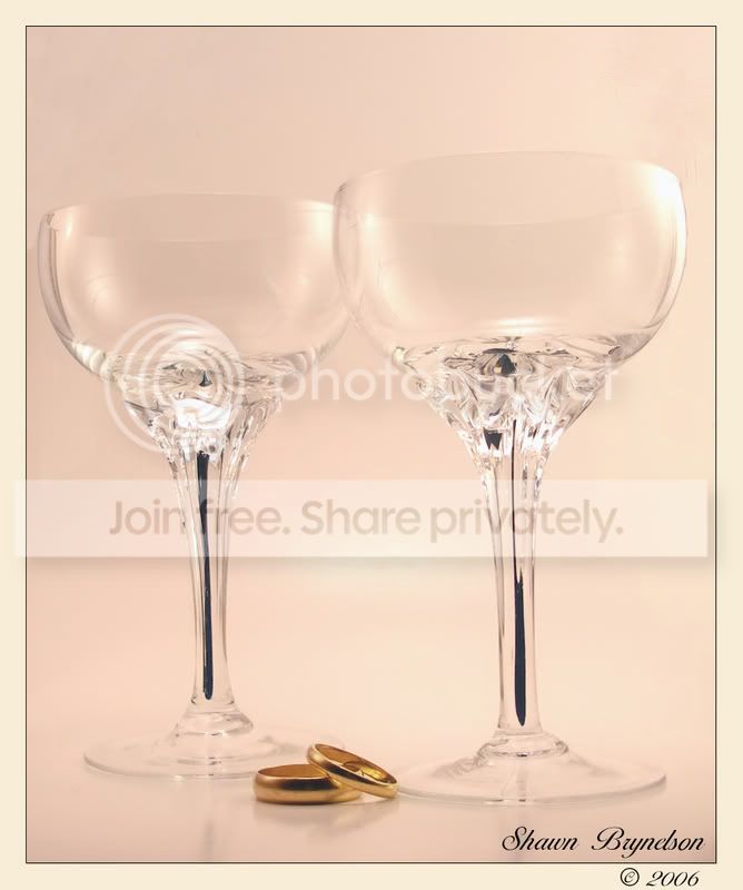
lol thanks, glad im not going crazy :D I like the first one way better in my own opinion. Only thing im not crazy about with the first one is the chain but it the picture was taken just for fun so ya. I decided to take a few more pictures, but for some reason they didn't turn out as white and bright as the watch did, same lamps and all. I did 2 versions, one color, and one black and white, what do you think about these? They're pictures of my parents wedding rings, and 2 wine glasses they got as wedding gifts
edit: deleted original B&W copy
I think the black and white one has a somewhat dramatic feel to it, and the color one is ok i suppose, im just not terribly happy with the background not being pure white as i would have liked, anyone have tips on how to accomplish that?
edit: after looking at the color version, i dont think it would look as nice with a pure white background, you wouldn't see the glasses. (also, thats not my reflection in the glasses, their made to look like that :P
Message edited by author 2006-11-30 04:08:52. |
|
|
|
11/30/2006 03:27:20 AM · #9 |
but the black and white make the glass look better.
how about desaturating all but the rings? |
|
|
|
11/30/2006 03:33:30 AM · #10 |
sorry im not pro with photoshop, how would i do that exactly? i mean the part about doing all but the rings, how to i select them to not be desaturated?
Message edited by author 2006-11-30 03:35:12. |
|
|
|
11/30/2006 03:57:35 AM · #11 |
Nevermind i figured it out, and i have to say i love the way this looks, never would have thought bout b&w and color, guess thats my newbishness shining through lol, thanks for the tip.
Edit: added a 2nd version, tilted slightly to the right, which is better?
Original:

Tilted:

(edited 2nd time cuz i uploaded wrong picture)
Message edited by author 2006-11-30 05:19:48. |
|
|
|
11/30/2006 04:59:59 AM · #12 |
| That looks really good. Does it seem tilted to you at all though? It looks like it's tilted to the left a little to me. |
|
|
|
11/30/2006 05:03:41 AM · #13 |
Hmm i dunno, might be a tiny bit, hard to tell cuz the glasses are offset, ill fiddle with it and see if i can adjust it. ( eesh 2am lol i need sleep :D )
edit: ya your right, it was tilted. Im so tired lol, didn't realize till i looked at the rings and notice it wasn't straight, i think the new one fixed that problem.
Message edited by author 2006-11-30 05:24:44. |
|
Home -
Challenges -
Community -
League -
Photos -
Cameras -
Lenses -
Learn -
Help -
Terms of Use -
Privacy -
Top ^
DPChallenge, and website content and design, Copyright © 2001-2025 Challenging Technologies, LLC.
All digital photo copyrights belong to the photographers and may not be used without permission.
Current Server Time: 09/13/2025 03:49:03 PM EDT.


