| Image |
Comment |
| 03/14/2009 03:55:58 PM |
|
| 03/14/2009 03:54:32 PM |
Silenceby OllyDComment: The border takes away from the pic in my opinion. Also the horizon is dead in the middle.. it would look better i.m.o. if it were in the upper third.. take a lower angle on the shot. Shoot from closer to the ground :) |
 Photographer found comment helpful. Photographer found comment helpful. |
| 03/14/2009 03:53:59 PM |
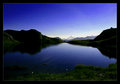
Quietudeby BrinComment: pretty colors. Is that the northern lights or sunset? |
| Photographer found comment helpful. |
| 03/14/2009 03:53:45 PM |
Colors of Nightby KenComment: Pretty colors. Great clarity. Little too much dead space over the light house for my taste. I think it would have been perfect if you were in tighter on the lighthouse... cut out the deadspace to the right and above it. still a 7 though. |
| Photographer found comment helpful. |
| 03/14/2009 03:53:04 PM |
|
| Photographer found comment helpful. |
| 03/14/2009 03:52:21 PM |
Daylightby ltjmanComment: Nice tones. I think more of the plants should have been in focus. little distracted by the blurred background - seems to overpower the few sharp plants/limbs. |
| Photographer found comment helpful. |
| 03/14/2009 03:51:31 PM |
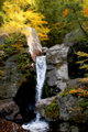
Kent Falls in Autumnby JunieMoonComment: The rock wall seems kind of blurred? Usually these shots keep everything sharp and the water blurred. Maybe use a higher f stop? |
| Photographer found comment helpful. |
| 03/14/2009 03:50:34 PM |
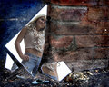
Don't Tread on Meby Jason_CrossComment: Cool idea. Never thought of doing a portrait in broken glass... like the originality and colors/texture of the background. I think if it were cropped a little tighter on the glass (cut out some of that dead space to the right) it would have been a little better. 6 |
| Photographer found comment helpful. |
| 03/14/2009 03:49:50 PM |
The Old Soulby SandyPComment: Nice portrait... good subject - his eyes tell a story for sure. 6 |
| Photographer found comment helpful. |
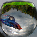
| 03/14/2009 03:49:35 PM |
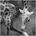
Fish Eyeby soupComment: Well, nothing really making this look like its not just a snap shot. The point of focus would have been good if it were on his eye.. maybe cropped tighter in on the fish and cut out the edge of the bowl. Possibly try putting a backdrop behind the bowl? I do like the clouds in the water though. |
| Photographer found comment helpful. |
Home -
Challenges -
Community -
League -
Photos -
Cameras -
Lenses -
Learn -
Help -
Terms of Use -
Privacy -
Top ^
DPChallenge, and website content and design, Copyright © 2001-2025 Challenging Technologies, LLC.
All digital photo copyrights belong to the photographers and may not be used without permission.
Current Server Time: 08/24/2025 03:07:32 AM EDT.