| Image |
Comment |
| 12/04/2003 07:31:29 PM |
untitledby DieHappyComment: Technical: You already know you didn't read the rules. Underexposed. Composition is okay. Focus good. Lighting- needs more.
Personal: Marginal creativity.
My vote: 1 |
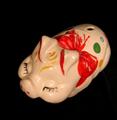
| 12/04/2003 07:28:09 PM |
Maneki Neko Bankby HavokComment: Technical: Fits the challenge. Exposure good, composition too left heavy for my taste, focus good, lighting too harsh for me.
Personal: Banks (bricks and mortar, piggy, and all other types) seem an obvious choice for this challenge. The lines between overdone, perfect fit, and too "out there" are really fuzzy in a lot of cases. I like the shot but I don't go "wow".
My vote: 5 |
 Photographer found comment helpful. Photographer found comment helpful. |
| 12/04/2003 07:21:50 PM |
Dom Perignon draped in diamondsby wetlandComment: Technical: Fits the challenge. Exposure is good, composition feels a little bottom heavy and the bottle rolled just slightly to the left kinda bugs me. The background is interesting but maybe too busy considering the subject itself is pretty busy. Focus is good. I'd like to see the lighting a little better controlled, you've got reflections and hot spots all over the bottle.
Personal: Creative idea, maybe a little over done. More shots with better diffusion on the lights might have yielded stronger shots.
My vote: 5 |
| Photographer found comment helpful. |
| 12/04/2003 07:17:53 PM |
|
| Photographer found comment helpful. |
| 12/04/2003 07:16:51 PM |
Old Moneyby PoobaComment: Technical: Fits the challenge. Exposure is good, composition... not sure about the angle. Another might be stronger? Focus looks off. Lighting looks flat and perhaps could have been diffused to avoid the spots on the face.
Personal: Doesn't look particularly creative or like much time was spent.
My vote: 2. |
| Photographer found comment helpful. |
| 12/04/2003 07:14:14 PM |
Exact Change Only!by drgsoellComment: Technical: Fits the challenge. Exposure looks just a tiny bit too bright. Composition is relatively good if maybe a little too busy. Focus is good. Lighting is even.
Personal: Good idea, perhaps shot a few more ways would yield a stronger photo.
My vote: 4. |
| Photographer found comment helpful. |
| 12/04/2003 07:06:41 PM |
Big Bucks!by basia03Comment: Technical: Fits the challenge. Trees are relatively well exposed, but that means your main subject is overexposed. Composition could have been better for the subject. Focus and lighting are difficult because of the composition. Perhaps getting close to the trees and shooting the house "in the clear" would have made this a better shot given the challenge.
Personal: I feel like maybe you didn't want the owner to see you photographing their house! It feels like a snapshot.
My vote: 3. |
| Photographer found comment helpful. |
| 12/04/2003 07:01:44 PM |
Time is money, but money can't give your time backby alexvoloComment: Technical: Without the title it wouldn't fit the challenge. Exposure, composition and focus are good, lighting is appealing.
Personal: I'm all for the title explaining the shot, but in this case it seems like quite a stretch. As for the photo itself, I really like the movement- beautifully shot.
My vote: 6. |
| 12/04/2003 06:59:12 PM |
.999 Pure Vegas Styleby TooCoolComment: Technical: Fits the challenge, exposure, composition and focus are good, lighting is appealing.
Personal: Fits the challenge but neither the subject nor the way it was shot strike me as particularly creative. The border seems kinda Halloweeny but I'm not marking down for it.
My vote: 5. |
| Photographer found comment helpful. |
| 12/04/2003 06:56:13 PM |
The Stock Market Crashedby QuAcKeRComment: Technical: Fits the challenge, exposure is good; composition- I like the low angle; focus- I'd like a little more depth of field- perhaps the guy could be just a tad sharper? Lighting is good, lends itself to the shot.
Personal: I think it's a good idea and it's interesting to look at. The line from the gun to the hand leads well.
My vote: 8. |
| Photographer found comment helpful. |
Home -
Challenges -
Community -
League -
Photos -
Cameras -
Lenses -
Learn -
Help -
Terms of Use -
Privacy -
Top ^
DPChallenge, and website content and design, Copyright © 2001-2025 Challenging Technologies, LLC.
All digital photo copyrights belong to the photographers and may not be used without permission.
Current Server Time: 08/23/2025 04:20:15 PM EDT.