| Image |
Comment |
| 01/04/2004 02:36:01 PM |
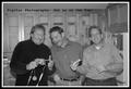
Go Digitalby rll07Comment: Doesn't motivate me?
Looks like a group of men that are all thumbs and wishing it was a football instead?
A better title may have been: "Manual we don't need any stinkin manual" :)
I like the idea but not the final work.
I hope you do not take this the wrong way. I have to find humor in somethngs. |
| 01/04/2004 02:30:52 PM |
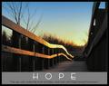
Dreamsby NeuferlandComment: Personally I do not like the wide border on all sides. The tesxt is to small for my old eyes to read. The white balance seems to be off a tad. Nice idea and shot with all things considered. |
 Photographer found comment helpful. Photographer found comment helpful. |
| 01/04/2004 02:28:08 PM |
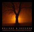
hopeby ursulaComment: Nice shot. I do not agree with the phrase but that is my opinion :) |
| Photographer found comment helpful. |
| 01/04/2004 02:25:53 PM |
Have courage by tp-fcpComment: Very nice! On thing right of I do not like is the square format. where you just showing a cute photo or did you see a thought behind this? |
| Photographer found comment helpful. |
| 01/04/2004 02:22:17 PM |
|
| Photographer found comment helpful. |
| 01/04/2004 02:11:44 PM |
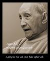
Wisdom Grows With Ageby HRoxasComment: I do not like the large text both within the image. Where is the quick short title?
Very nice idea nd shot but I think the white balance may be off a tad. Is this desaturated, grayscale or ? |
| Photographer found comment helpful. |
| 01/04/2004 02:06:02 PM |
|
| Photographer found comment helpful. |
| 01/04/2004 02:04:31 PM |
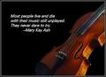
RISKby karmatComment: I think it would have had more impact if the violin were more dominant than the message/text. It would have been more enjoyable to view in my opinion. |
| Photographer found comment helpful. |
| 01/04/2004 02:00:56 PM |
Celebrate life by timmiComment: Nice work. I'm not crazy about the wide border or the color but that is minor. Your message is to Celebrate Life but to me the colors make it comes across as gloomy? The blue border the blur in the image. Still nice vote |
| Photographer found comment helpful. |
| 01/04/2004 01:57:44 PM |
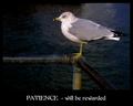
Patienceby pitsamanComment: I think this would have been stronger if you used a vertical crop in lieu of the horizontal. On my monitor the background is just a tad to dark. The font seems to have an oriental feel?. Nice work still a very nice vote. |
| Photographer found comment helpful. |
Home -
Challenges -
Community -
League -
Photos -
Cameras -
Lenses -
Learn -
Help -
Terms of Use -
Privacy -
Top ^
DPChallenge, and website content and design, Copyright © 2001-2025 Challenging Technologies, LLC.
All digital photo copyrights belong to the photographers and may not be used without permission.
Current Server Time: 08/26/2025 09:46:42 AM EDT.