| Image |
Comment |
| 11/06/2003 10:45:39 AM |
I swear, he didn't move!by SoulHunter74Comment: Very nice shot. Love the high key negative space and the simplicity of the subject! Two things I think could make this even better...One, move the lighting around to bring out the lines in the tiles to emphasize that he (mr. moose) is in a corner. Or, two move the lighting around (or use white poster board as a background) to remove the lines in the tiles to emphasize the negativity of the space! Nicely composed shot!
TC |
 Photographer found comment helpful. Photographer found comment helpful. |
| 11/06/2003 09:39:26 AM |
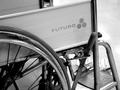
a quiet kind of ironyby MiahComment: A slightly different angle would make the front of the chair more easily recognizable and help with the impact of the shot. I don't get the irony though...
TC |
| Photographer found comment helpful. |
| 11/06/2003 09:37:14 AM |
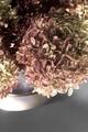
Faded Summerby adineComment: You don't see this angle very often and I like it for this shot. However, the shot suffers from lighting. It needs more light at the top (this will improve focus and give more color and texture) and less on the front of the pot. Great composition!
TC |
| Photographer found comment helpful. |
| 11/06/2003 09:30:06 AM |
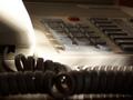
Work Can Waitby EmerauldeComment: The lighting on this shot is incredible!!! I love the feeling that you get that "it's NOT time to work!" It is a little blown out though on the front corner and top of the handset. I do not like the phone cord being so prominent in the front of the shot especially with the kink (funny coil) right in front. If you cropped the front part of the phone cord mostly out it would be (IMHO) more powerful!
TC |
| 11/06/2003 09:21:41 AM |
Still life, running faucet.by HavokComment: This is kinda cool! I don't know if it qualifies as still life but can't be too far outside the genre! It needs some lighting help, but I am playing around with lighting techniques right now myself and don't have any good suggestions. I do like the shot and would love to see you play with it some more!!!
TC |
| Photographer found comment helpful. |
| 11/06/2003 09:17:23 AM |
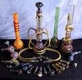
Glass Studyby lumbardhComment: Damn, that's a lot of pipes dude! Interesting subject material and take on the challenge! Nice bright colors. Problem is you can't really see them. If you chose say all the mostly blue ones, or the bong with all the extensions in the middle, got much closer with a tighter crop, you would get to see all the fabulous colors involved. This way it's too busy. And If I was you I'd do the background the same color as underneath. The background shouldn't compete for your eye!
TC
Don't bogart the bong dude! |
| Photographer found comment helpful. |
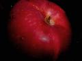
| 11/06/2003 12:54:10 AM |
Juicy appleby mecfcostaComment: Beautiful shot but IMHO the water droplets are a little distracting! Great color and focus!
TC |
| Photographer found comment helpful. |
| 11/06/2003 12:52:34 AM |
|
| Photographer found comment helpful. |
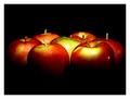
| 11/06/2003 12:49:38 AM |
Macintosh by scab-labComment: Very interesting lighting!!! I like the overall effect! You get a distinct sense of depth. You do have a couple of hot spots though on the center and front right fruit. Nice shot!
TC |
| Photographer found comment helpful. |
| 11/06/2003 12:48:00 AM |
ROSE & BUDSby pookey83Comment: This could be a very nice shot but needs to be lit better. Love the textures in the center where you have contrast between the light colored petals and the darker shadows! I'm still trying to learn about lighting so I don't have any good suggestions here...
TC |
| Photographer found comment helpful. |
Home -
Challenges -
Community -
League -
Photos -
Cameras -
Lenses -
Learn -
Help -
Terms of Use -
Privacy -
Top ^
DPChallenge, and website content and design, Copyright © 2001-2025 Challenging Technologies, LLC.
All digital photo copyrights belong to the photographers and may not be used without permission.
Current Server Time: 08/06/2025 03:28:54 PM EDT.