| Image |
Comment |
| 12/22/2003 09:10:55 PM |
|
| 12/22/2003 09:10:22 PM |
Christmas Surpriseby WildflowerJoyComment: Nice idea, but it's too busy. Take away some of the elements around it and you could turn this into a very nice shot. You also have some lighting issues. Too dark in the tree and too dark under wagon.
TC |
 Photographer found comment helpful. Photographer found comment helpful. |
| 12/22/2003 09:07:59 PM |
|
| 12/22/2003 12:10:53 AM |
|
| 12/21/2003 11:05:25 PM |
Waterworksby thelselComment: This shot is a little too low key for my taste. You lose too uch detail. I don't need a whole lot more, just enough to conect everything...
TC |
| Photographer found comment helpful. |
| 12/21/2003 11:01:11 PM |
Leaping Lotusby shareinncComment: The water looks very nice, but there are some issues with the rest of the shot. The black is underexposed, losing all the detail. The bright white thing (lower right above the black) is very distracting. You have an odd pattern on the background. Is it tile? At first I thought that this might be a moire pattern from a scanner, but not so sure anymore.
TC |
| 12/21/2003 02:54:18 PM |
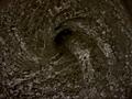
mobius strip - one continuous surfaceby snsComment: From the Critique Club
This is a great subject for a study in lighting and high key approach. I love your use of apparently a single light source! With the twisted but essentially flat surface of the subject you get a very wide gradiation of light. You also have shadows that are very gradiated. Awesome choice of for a study type of shot!
You do have some issues with the background that kind of detract away from the overall effect of the shot. The background though very bright is not truly uniform in it's brightness. I am going through my own issues with lighting and am not sure how to improve this. Also I normally am not a fan of grain in a shot, but this time it seems to work very well!
Unforunately in this environment (DPC) if you are submitting a set up or studio type shot like this, you need to be damn near perfect to achieve the best scores.
Nice work.
TC
PS: I believe that this would be an awesome study subject for any DPC'ers that are having issues with lighting! |
| Photographer found comment helpful. |
| 12/21/2003 12:40:38 PM |
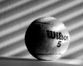
Tennis anyone?by ladpupmoeComment: From the Critique Club
There are many compositional elements that I like in this shot. You have a couple of great contrasts here. Round/Straight, Light/Shadow, Smooth/Fuzzy-Textures, Black Letters/Light colored ball.
There are also a couple of elements that I think could be improved. A B/W shot like this I am finding come out with more impact if they have a little more contrast. This would help to further define the roundness of the spere. If you had a (very slightly) deeper DOF you would also accentuate the sperical qualities and also bring out even more of the fuzzy texture. Also I'm sure you noticed as did several commentors, your shot is slightly crooked. This is an easy fix in PS.
All in all a very nice study type of shot that with a little tweaking could be a great one!
TC |
| Photographer found comment helpful. |
| 12/20/2003 11:25:33 PM |
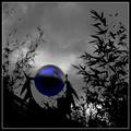
Sphere and Fractalsby GeneralEComment: From the Critique Club
General, I seem to be getting lucky and pulling your shots for critique!
For the most part I really like this shot. You have very nice contrasts. Round ball, pointy leaves. Stormy looking sky, somehow serene-feeling reflection in the ball. B/W background, blue object. I also like the silhouette effect against the sky. I also think that the title fits very well. (and I usually don't even think about titles!)
The thing I like most about the shot is the ball itself. I would never have guessed that you 'created' the color there in effect. I love how the reflection pops out of it.
You do have a couple of issues here that I believe affected the voting. First thing I noticed is the foliage on the left side of the shot has lost a lot of definition. This makes me stop and try to figure out what is really there (really unnecesary elements anyway), detracting from the rest of the shot. I have to 'think' about it too much. You also have lost a great amount of detail in the foreground of the shot (the rusty iron and bronze sculpture?) which also creates a distraction.
A different crop (or shooting angle) and/or some cloning to eliminate some unneeded elements and this shot would be the bomb!
TC |
| 12/20/2003 11:04:18 PM |
Kitesurferby AzrifelComment: I understand what you are trying to do here. I also think that this would be a nice shot at 8x10 or even better at poster size. At the size that we are alowed to post here it really doesn't have much punch. You can hardly see the lines connecting the two parts of your subject. A closer shot of only the skiier would IMHO been more potent.
TC |
| Photographer found comment helpful. |
Home -
Challenges -
Community -
League -
Photos -
Cameras -
Lenses -
Learn -
Help -
Terms of Use -
Privacy -
Top ^
DPChallenge, and website content and design, Copyright © 2001-2025 Challenging Technologies, LLC.
All digital photo copyrights belong to the photographers and may not be used without permission.
Current Server Time: 08/15/2025 11:56:22 PM EDT.