| Image |
Comment |
| 11/07/2004 10:40:19 PM |
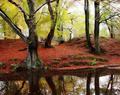
Fall Leavesby eckoeComment: I personally like the backlilt leaves here. Don't know how it will do in this forum though so I will be looking for it in the rankings. I guess to truly appreciate this, you have to walk along the edge of the woods during the prime fall color season!
TC |
| 11/07/2004 10:38:50 PM |
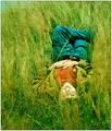
just Burtby Sverige52Comment: Nice lighting. Your subject seems a little soft. Did you do this on purpose? IMHO you need to seperate your subject from the background. If you move him away from the trees more and use a more open aperature you can blur out the background and put the emphasis on the gentleman.
TC |
 Photographer found comment helpful. Photographer found comment helpful. |
| 11/07/2004 10:36:52 PM |
Autumnal Huesby geewhyComment: IMHO This is a tad bit oversaturated. This is my taste only and have a feeling that this will do very well in the challenge if I know voting trends at all. Not saying this is a bad thing, just a thing...
TC |
| Photographer found comment helpful. |
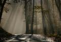
| 11/07/2004 01:44:01 AM |
Pathway of Lightby scalvertComment: This is just plain gorgeous. I can't wait to see what the conditions behind the shot were. I can hear the silence, smell the late autumn aromas of decay, feel the chill in the air and the foggy mist on my face and wonder what is over the hill. Kudos on the simplicity and elegance of this.
TC |
| Photographer found comment helpful. |
| 11/07/2004 01:30:04 AM |
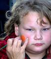
Brillanceby xtabintunComment: Beautiful. The only complaint that this voter has is the reflection in the eyes. If you could clone it away somehow (beyond my skill level) while leaving the pupil intact, this would be perfect! Awesomely vivid colors.
TC |
| Photographer found comment helpful. |
| 11/07/2004 01:26:00 AM |
Lumenby RemieComment: Not sure what is trying to be said/captured/portrayed in this image. The moon in cloud part is nice, but the rest confuses this viewer.
TC |
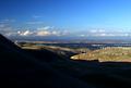
| 11/07/2004 01:24:17 AM |
Beyond The Crestby autoolComment: This is one of those shots that just doesn't deserve to be shrunk to 640 by whatever. Too much detail is lost in the shrinking...
TC |
| Photographer found comment helpful. |
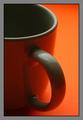
| 11/07/2004 01:23:19 AM |
Shadowsby loboz33Comment: Nice shot with a couple of issues. You have color bandings in the mug (from jpeg?). Not sure if you can do much about this. Try compressing at different levels? Different sizes? Also you have an ugly gray frame around the shot that really detracts (IMO). Main part of shot is very nice though.
TC |
| 11/02/2004 11:03:38 AM |
|
| Photographer found comment helpful. |
| 11/02/2004 11:03:05 AM |
Festival Artistryby L1Comment: Skin tones appear a little off in this one. Also seems a little overexposed maybe. Did you use an on board flash? Not bad composition...
TC |
| Photographer found comment helpful. |
Home -
Challenges -
Community -
League -
Photos -
Cameras -
Lenses -
Learn -
Help -
Terms of Use -
Privacy -
Top ^
DPChallenge, and website content and design, Copyright © 2001-2025 Challenging Technologies, LLC.
All digital photo copyrights belong to the photographers and may not be used without permission.
Current Server Time: 08/27/2025 01:41:16 AM EDT.