| Image |
Comment |
| 01/30/2005 01:36:06 AM |
Happy 3 DPC!by mrorange002Comment: I KNEW someone would use the relevance of the challenge topic in their shot! Almost did something similar myself.
TC |
 Photographer found comment helpful. Photographer found comment helpful. |
| 01/30/2005 01:34:39 AM |
|
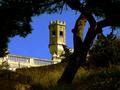
| 01/30/2005 01:33:31 AM |
Counting The Edgesby SirBiggsALotComment: Great idea! It seems a little unballanced though. Some negative space at the bottom (not as much as you have at the top) would help to even it out.
TC |
| 01/30/2005 01:32:11 AM |
Urban Treeby spreadcomComment: I would like to know how this was lit. At first I thought car lights, but it looks like one light source...
TC |
| Photographer found comment helpful. |
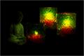
| 01/30/2005 01:31:10 AM |
Letting Go of Three Candlesby whagerbaumerComment: Not a bad composition. Just needs a tad bit more light. I know it seems counter intuititive, but if you were to try a reshoot with some more ambient lighting, this could go from an average shot to a good one. Consider turning this into a study session and post some results if you do. I would like to see them!
TC |
| Photographer found comment helpful. |
| 01/30/2005 01:29:12 AM |
Three O'Clockby NitinComment: This shot is very yellow. This leads me to belive that your white balance is wrong. Did you shoot this under regular lighting (incandescent light bulbs)? If so, you need to adjust your cameras settings to reflect this. Your gold tone border might work with the shot IF the white balance was correct. In this example though, your border accentuates the yellowness of the shot and contributes to the issue. Compositionally the shot is not bad, but the subject material isn't such to hold interest for long...
TC |
| Photographer found comment helpful. |
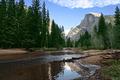
| 01/29/2005 03:26:01 AM |
Half Dome, Yosemiteby gaurawaComment: Appears to be oversharpened a tad. You have the dreaded halo effect around the mountain. Too dark on the left side. Layers/masks might help you lighten up the shadows and retain the detail in the highlights.
TC |
| Photographer found comment helpful. |
| 01/29/2005 03:24:21 AM |
|
| Photographer found comment helpful. |
| 01/29/2005 03:23:55 AM |
|
| Photographer found comment helpful. |
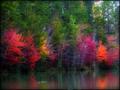
| 01/29/2005 03:23:13 AM |
Autumn Reflectionby SDWComment: Looks too saturated for my tastes. Colors don't seem 'real'. You also appear to be blown out in a couple of spots. Like the soft focus effect though!
TC |
| Photographer found comment helpful. |
Home -
Challenges -
Community -
League -
Photos -
Cameras -
Lenses -
Learn -
Help -
Terms of Use -
Privacy -
Top ^
DPChallenge, and website content and design, Copyright © 2001-2025 Challenging Technologies, LLC.
All digital photo copyrights belong to the photographers and may not be used without permission.
Current Server Time: 08/28/2025 03:04:39 PM EDT.