Good night...by
carsoundComment: From the Critique Club:
Let me preface my comments by saying this: I don't normally cut and paste comments, but I just finished a critique on a shot very similar to yours. Since most of the points from that shot apply here, I'm going to use this approach. I want you to know ahead of time so that if you look at my other comments you don't feel cheated...
I see that this is your very first entry into a challenge here at DPC. Please don't let your low score discourage you from future participation!
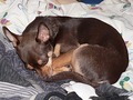
At first glance it appears to be just a snapshot. There is nothing wrong with a snapshot but they only really have value to the person who took them or those that know the subject well. To everyone else there is not really anything to hold their attention.
This shot could be improved in many ways. The first thing is the angle that you shot from. This looks like you shot it from a standing or seated position and from slightly above the subject of the shot. In other words you shot it from YOUR point of view. When shooting kids and pets this doesn't work so well. You need to get down to THEIR level and shoot them more directly! This may mean getting down on your hands and knees or even lying right on the floor. Try this sometime with your dog. Shoot him from a standing position then again from down at his level. You will see a significant improvement assuming you can keep the dog from licking the lens. :-P
The next thing that would help to improve this would be to take out any element of the shot that doesn't really ADD to the shot. In this case it would be the various different blankets and comforters on the bed. The different colors don't fit well together and even clash in places (dark blue against the white.)
Your lighting here is not very creative. It looks like you used the flash on the camera. You can see this in the harsh shadow behind the dogs right ear (left in frame) and the way the coat glows where it faces the camera. It takes all the depth out of the shot and makes it appear very flat. One of the first things that I learned when I arrived here at DPC was to NEVER use the flash on the camera as is. Sometimes you need to use it but most times you can get away without it with some care. Use a tripod to keep the camera still with the slower shutter speed. Use other lights to light up the scene preferably from one side or the other. Use more than one light. One for the main lighting and another to fill in the darker side a touch (this could even be a simple reflecter like a piece of white poster board). If you think that you MUST use your flash you can difuse it a tad by taping a couple layers of tissue paper over the flash. This will help to soften it up. You say that you tried for 2 days to catch a shot of the dog on your bed. With a little planning, you could have your lighting set up ahead of time for just such a moment
The angle that you shot from here is not very flattering to the dog. One of the first things that I noticed is you shot right into his left ear (right in frame) and that's not the most attractive part of a dog. Choosing different angles to shoot from and taking several shots will give you more choices when picking the final shot.
I know that this is a lot to think about when trying to take a picture but if you practice and take lots of pictures, soon it will be second nature! Once again, please don't be discouraged by your score or your placing in the challenge. We all started somewhere and even the best photographers take bad shots once in a while! I'll be looking forward to your future shots.
Hope this helps
Yours
TC