| Image |
Comment |
| 05/08/2006 12:40:46 AM |
Place of Prayer by kiwinessComment: Damn Gary, you really gotta skip a challenge or two to give the rest of us better odds! JK Keep this up! Congrats and keep shootin'
TC |
 Photographer found comment helpful. Photographer found comment helpful. |
| 05/07/2006 11:54:05 PM |
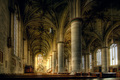
Haleluja!by BoltiComment: From the Critique Club:
Here is an excellent example of taking an ordinary scene and making one that pops using a simple prop and some decent post processing. If I saw this shot in a challenge normally, without the frame added, I would have never have given it a second glance. By adding the simple prop and making the scene within the scene brighter, you have added interest to the scene and you have given the eye somewhere to land. Nicely done!
Yours
TC |
| Photographer found comment helpful. |
| 05/03/2006 12:28:38 AM |
Realm of the Supernatural by BradComment: Dude if you're up reading this now, I'm gonna go find ya and kick your ass! Better be sleepin' and takin care of yourself. Now that that's out of the way, congrats on the (spelled a n o t h e r :-P) blue!
TC
Edit: It must suck when your newest blue ribbon winner doesn't even show up on your home page! ;-) Message edited by author 2006-05-03 00:29:27. |
| Photographer found comment helpful. |
| 05/02/2006 11:34:20 PM |
Dear Mom & Dadby quad1661Comment: From the Critique Club:
I'm not really sure where to start with this critique. My eye is quite confused by elements of this shot. Your choice of such a narrow DOF makes the only object that is sharp the pen. However, the pen is so dark (little detail) and it's shape immediately forces the eye away from it like an arrow. When the eye follows the arrow, there is nothing there that can be accepted and acknowledged for what it is. You end up on a very shiny something that looks important but you can't really see it. Without the title I do not know if I would have figured out what this was.
I think that there are three fundamental problems here. The first and probably the one that detracts the most is the DOF. You simply don't have enough in focus. The second is a compositional problem. I just think that the angle that you shot this at is very awkward. I believe if you would shoot it from a higher angle you would have a more potent shot. For one thing, it would be obvious that the paper had writing on it and upon further examination would show the old school writing style and wording. The last problem is the lighting. It's simply too dark. The camera is trying to lighten up the scene and the result is the blown out reflections.
I really like what you are trying to do with this shot. I also think that it would be a great study type shot. Play around with the lighting. Play around with the camera angles. Move your subjects around. It's a studio shot. You have complete control. Play with it!
Yours
TC |
| 05/02/2006 11:20:29 PM |
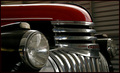
Delivery Van, 1930's Styleby QikiComment: From the Critique Club:
This shot is very nicely done! I am impressed in how you captured the chrome details without blowing out the exposure. You have excellent lines and an awesomely simple color scheme. There is very little here that I don't like. The only thing that I can really think that would improve this shot would be to brighten it up just a touch. In advanced editing this could be done without blowing out the chrome.
Oh and with all that shiny chrome, I'm impressed that you or the camera are not in the shot! ;-)
Yours
TC |
| Photographer found comment helpful. |
| 05/01/2006 06:08:46 PM |
G R E E N 'L I F E'by vikasComment: Nice shot! GREAT TONES! Nicely composed. Don't get the connection to photojournalism...
TC |
| Photographer found comment helpful. |
| 05/01/2006 06:07:37 PM |
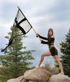
Triumphby angela_packardComment: Excellent shot! Great pose. Nice use of a prop to emphasise the models outfit. Don't see this as a photojournalistic image though...
TC |
| Photographer found comment helpful. |
| 04/29/2006 12:23:01 AM |
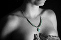
Remembranceby jwillertonComment: From the Critique Club:
There is very little about this shot that I don't like. So let's quickly go over what I do like in detail. First off, I love the fact that you left your models freckles and skin texture in the shot. There was really way to much neat image used in many of the shots entered into this challenge. Women (and men) really do have freckles, moles, birthmarks, pores and hair... Why do we as photographers insist on smudging them out of our images? Your focus here is spot on! Everything that needs to be in focus is acceptably in focus and your soft where a women is soft! Personally I like the fact that you chose to change this to b/w. B/W is a wonderful medium for the human form.
There are a couple of things that I don't like about this image. I'm not to sure about the crop. I think that it either needs to have more of her face included or less... I'm not sure which. I would need to see outtakes to truly decide on this matter. I don't think the choice of selective desat was the best one for this shot. I know that it has meaning to your and yours but to the world around you it's confusing. Why do you want me to look at your models necklace? Your model has an impression that goes around her neck. It looks like she was recently wearing a very tight necked blouse or t-shirt just before this shot. With the focal point of the shot (necklace) being so close to this crease in her skin it draws the eye to it. Cloning this out would have improved the shot or better yet, giving her time to let this impression smooth itself out would have been even better.
Why didn't it score better? I think you have gotten the answer already. You entered a basically black and white shot in a color themed challenge. You entered a portrait challenge with a shot that doesn't show your model's face. I know now and you know there is a story there, but it's not obvious to the voters. Because of these factors, a very nice shot got voted low. Believe me, it happens to all of us.
Very nice shot all around!
TC |
| Photographer found comment helpful. |
| 04/28/2006 04:57:45 PM |
|
| Photographer found comment helpful. |
| 04/27/2006 05:55:07 PM |
Serenityby NstiG8trComment: Looks a little oversaturated/exposed for my taste...
TC |
| Photographer found comment helpful. |
Home -
Challenges -
Community -
League -
Photos -
Cameras -
Lenses -
Learn -
Help -
Terms of Use -
Privacy -
Top ^
DPChallenge, and website content and design, Copyright © 2001-2025 Challenging Technologies, LLC.
All digital photo copyrights belong to the photographers and may not be used without permission.
Current Server Time: 08/26/2025 02:56:51 PM EDT.