| Image |
Comment |
| 07/24/2006 12:37:10 AM |
Roughby Arti-ElviComment: This looks like a Kiwiness shot, but I know it's a self portrait. Now I may not be able to sleep till I figure out who you are...
TC
PS: You got some stuff on your face right here... (pointing at my chin) ;-) |
 Photographer found comment helpful. Photographer found comment helpful. |
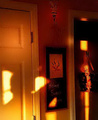
| 07/24/2006 12:32:33 AM |
|
| Photographer found comment helpful. |
| 07/24/2006 12:28:10 AM |
sparkling kissby annahComment: I'm sorry, but something about this touches me as disturbing... Don't know exactly what it is. Maybe the plastic look of the face itself. Maybe the crusty gold stuff on your nails. Probably the fact that you have gold crap all over your lips...
TC |
| Photographer found comment helpful. |
| 07/24/2006 12:24:07 AM |
A Touch of Goldby AnastasiaComment: Thank you for realizing that women have pores and skin textures and not NI'ing all the detail away!
TC |
| 07/24/2006 12:22:38 AM |
Thunderheadby tateComment: The background IMHO is distracting from the image...
TC |
| Photographer found comment helpful. |
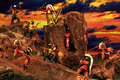
| 07/23/2006 11:47:15 PM |
Ten Little Indians (Nursery Rhyme)by JudiComment: From the Critique Club:
Wow, this is twice today that I've pulled pics from very eminent members of the DPC community. This is kinda cool! OK, here goes...
This shot is definately in the spirit of the challenge, but there's just too damn much going on in the shot. There's just too much detail. Too much texture. Too much to take in. Your eye is just totally overwhelmed by what is there and doesn't know where to land. I have found that the best photographs (generalizing here I know) are the simplest ones. They don't have anything going on that doesn't add to the shot. In this example everything adds to the shot but the end result is kind of a jumble.
This shot also appears to be quite soft. It may not really be soft. It's hard to tell with all the minute details that are at 640 by whatever resolution. At 8x10 this may look just fine sharpness-wise. This is one of the things that I had to learn the hard way myself.
The tonality of this shot kinda puts me off. It doesn't quite look natural. I'm assuming that you were trying to match the white balance of the foreground with the tonality of the sky on the screen, but to me it just doesn't look 'natural'...
I think if you put all this together, you'll see why you scored in the low fives. Personally, I would probably have given this a 4 or a 5 because of all the above reasons.
I know that this may seem a little harsh but it's the way I see the shot. Hope you take it in the spirit in which it was given!
Yours
TC |
| Photographer found comment helpful. |
| 07/23/2006 10:53:49 PM |
10¢by TechoComment: From the Critque Club:
This shot begs for my what I like/don't like treatment, so here goes!
What I like: You have spot on focus here! Great detail. Your lighting though a little dull is enough to bring out the depth of the coin, especially in the reflection. You can even see the textures in the 'smooth' part of the coin. Great DOF to make the reflection go out of focus in the foreground to give some sense of depth to an otherwise flat shot. Great work in that effect!
What I don't like: The color cast does put me a little off. It looks, color wise, more like a penny than a dime. I am more of an old school, traditionalist type of photographer and would prefer to see the silver color. I do like the tone of the background though. I'm assuming, though that this is where the shading of the coin comes from. I don't like the brighter part of the background. I think that this steals a little of 'focus' away from the dime itself. I do believe that you could have brought out even more of the depth of the coin by playing around with the lighting more. This is very difficult to do with a coin as thin as a dime is. I've had better luck with thicker coins in this aspect.
All in all this is as you put it a great study shot and the type of shot that I think all photographers should play with. I know I've done my share of coin shots though most of them will never see the light of day.
Hope this helps ya in future shots.
Yours
TC |
| Photographer found comment helpful. |
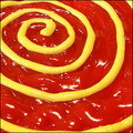
| 07/23/2006 06:28:25 PM |
Condiment Chaosby taterbugComment: Dude, what were you thinking? :-P
TC Message edited by author 2006-07-24 01:12:10. |
| Photographer found comment helpful. |
| 07/23/2006 04:31:26 PM |
Break 10 of Tenby karmatComment: From the Critique Club:
I can't believe that I drew a Karmat to critique! Whew the pressure! :-P
Boy, I don't know where to start with this one... First of all, I really think the idea is unique and I truly appreciate the work that you put into this concept. However...
With a studio set up shot like this, detail is everything. Hit them dead on and the shot works. Miss a couple and the shot suffers. Here, your striped 'balls' have lines that aren't straight. I know how hard it must be to try and paint straight lines on an egg, but to make this really work, they would have to be perfect. You also have several spots on several of the 'balls' where it looks like there is too much paint making it look splotchy.
There is another effect going on here that probably affected your score and that was mentioned by a couple of the commentors. This really looks distorted. I know that it's not, but that's what it LOOKS like. This makes the overall image look very distorted and hurts my eyes to look at it too long. Your lighting is a little flat and that makes the shot look flat overall. This seems to exagerate the distortion effect...
Overall, a nice idea, but one that I would be amazed to see pulled off to such a degree that it scores well here.
Hope this is helpful!
Yours,
TC |
| Photographer found comment helpful. |
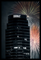
| 07/19/2006 05:28:00 PM |
Wanna See the Show? Don't Bank On It...by kgearyComment: From the Critique Club:
As I said in my original comment, it's kinda too bad that there is so much of the building in the shot. It kinda overpowers the whole subject of the image which to me is the fireworks. Other than that, this is still a very nice composition.
Technical notes: It appears as I look closer that you desaturated the building. I am wondering why you would do this? Is it to give more attention to the fireworks themselves? I'm not sure that this really adds to the shot and the more I look at it, the more distracted I am by it. I notice that you shot in bulb mode. It appears to me that you are a touch overexposed. Your fireworks are mostly blown out. I had the same issue with my entry. You can tell that the fireworks are blown by the lack of color and by the dullness of the color that is left.
All in all a very nice shot and a decent score for a speed challenge!
Yours
TC |
Home -
Challenges -
Community -
League -
Photos -
Cameras -
Lenses -
Learn -
Help -
Terms of Use -
Privacy -
Top ^
DPChallenge, and website content and design, Copyright © 2001-2025 Challenging Technologies, LLC.
All digital photo copyrights belong to the photographers and may not be used without permission.
Current Server Time: 08/25/2025 02:11:15 PM EDT.