| Author | Thread |
|
|
07/23/2006 10:53:49 PM |
From the Critque Club:
This shot begs for my what I like/don't like treatment, so here goes!
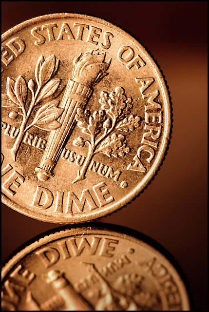
What I like: You have spot on focus here! Great detail. Your lighting though a little dull is enough to bring out the depth of the coin, especially in the reflection. You can even see the textures in the 'smooth' part of the coin. Great DOF to make the reflection go out of focus in the foreground to give some sense of depth to an otherwise flat shot. Great work in that effect!
What I don't like: The color cast does put me a little off. It looks, color wise, more like a penny than a dime. I am more of an old school, traditionalist type of photographer and would prefer to see the silver color. I do like the tone of the background though. I'm assuming, though that this is where the shading of the coin comes from. I don't like the brighter part of the background. I think that this steals a little of 'focus' away from the dime itself. I do believe that you could have brought out even more of the depth of the coin by playing around with the lighting more. This is very difficult to do with a coin as thin as a dime is. I've had better luck with thicker coins in this aspect.
All in all this is as you put it a great study shot and the type of shot that I think all photographers should play with. I know I've done my share of coin shots though most of them will never see the light of day.
Hope this helps ya in future shots.
Yours
TC |
|
 Photographer found comment helpful. Photographer found comment helpful. |
Comments Made During the Challenge  |
|
|
07/16/2006 10:22:30 PM |
|
| Photographer found comment helpful. |
|
|
07/16/2006 01:26:36 PM |
|
Very nice macro. Everything of importance is crisp and clean. Lighting is good. I even like the different tone to this, I think leaving it as the shiny silvery color normally seen in dimes would make it too glaring and distract from all the detail. I like the addition of the reflection as well and it has some great clarity to it too. Composition is great, its not just smack dab in the middle so it has a good interest level. Simple, clean and crisp. I gave a 7. |
|
| Photographer found comment helpful. |
|
|
07/11/2006 10:33:40 PM |
|
Great macro. Color looks too much like a penny...would like to see it more silver. |
|
| Photographer found comment helpful. |
|
|
07/11/2006 07:28:26 PM |
|
I could never imagine a better photo of a dime. |
|
| Photographer found comment helpful. |
|
|
07/10/2006 10:35:48 PM |
|
Nice clean macro. great for the challenge |
|
| Photographer found comment helpful. |
|
|
07/10/2006 09:48:21 PM |
|
Great comp, reflection and superb details. The contrast and tones really polish this off quite nicely. Well done :) |
|
| Photographer found comment helpful. |
|
|
07/10/2006 09:05:32 AM |
|
I usually hate images of coins, but for some reason, this works for me. |
|
| Photographer found comment helpful. |
|
|
07/10/2006 07:02:25 AM |
|
excellent work...a lovely copper tone to the shot works well |
|
| Photographer found comment helpful. |
|
|
07/10/2006 04:24:33 AM |
|
didn't you find it weird that no where on the dime does it say "10 cents"?? |
|
| Photographer found comment helpful. |
|
|
07/10/2006 02:54:44 AM |
|
Super! Sharp, detailed with a cool crop. 9. Good luck! |
|
| Photographer found comment helpful. |
|
|
07/10/2006 01:19:20 AM |
|
Nice and sharp macro. I like the reflection. Well done. |
|
| Photographer found comment helpful. |
Home -
Challenges -
Community -
League -
Photos -
Cameras -
Lenses -
Learn -
Help -
Terms of Use -
Privacy -
Top ^
DPChallenge, and website content and design, Copyright © 2001-2026 Challenging Technologies, LLC.
All digital photo copyrights belong to the photographers and may not be used without permission.
Current Server Time: 06/29/2026 05:19:36 AM EDT.