| Image |
Comment |
| 10/10/2003 05:02:11 PM |
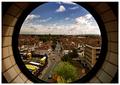
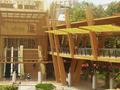
City viewingby jonpinkComment: base 1: 1/1; challenge: 3/3; technical: 3/3; aesthetics: 3/3; total: 10
Excellent perspective and DOF. |
 Photographer found comment helpful. Photographer found comment helpful. |
| 10/10/2003 05:00:23 PM |
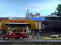
Hot Dog Standby rheardComment: base 1: 1/1; challenge: 2/3; technical: 2/3; aesthetics: 1/3; total: 6
Had to resort to toys? The one off of challenge was just because it wasn\'t real. Technical -- fire dept. car is splotchy and a bit of soft focus all around. Perhaps this was to fool the viewer into thinking this was real? |
| Photographer found comment helpful. |
| 10/10/2003 04:57:04 PM |
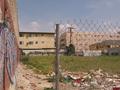
trash and urban calligraphyby takethatComment: base 1: 1/1; challenge: 3/3; technical: 3/3; aesthetics: 0/3; total: 7
You've captured the essence of 'urban landscape' in a well composed photo, but I'm not seeing anything of beauty to share. |
| 10/10/2003 04:53:14 PM |
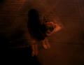
A Portrait of Pavement, Woof.by xionjaComment: base 1: 1/1; challenge: 0/3; technical: 0/3; aesthetics: 0/3; total: 1
Were you trying for last place? If so, I think you have a lock! Maybe this is some \'art thing\' I just don\'t get, but clearly, I don\'t get it. |
| 10/09/2003 04:46:32 AM |
duotone townby rhipsterComment: base 1: 1/1; challenge: 3/3; technical: 3/3; aesthetics: 1/3; total: 8
Nice balance between shadow and light. The bicycle really helps set the tone of this image. Perfect execution. This is a case where I wish it were in color -- I know, you have to make a choice and some are going to commend you for the B/W shot -- in this case, I'm not one of them. |
| Photographer found comment helpful. |
| 10/09/2003 04:43:06 AM |
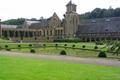
Belgian trappist monastery breweryby InfinityComment: base 1: 1/1; challenge: 2/3; technical: 1/3; aesthetics: 2/3; total: 6
Beautiful church/cathedral/whatever, but this single building doesn't meet 100% of the challenge 'picture of buildings' -- plural. The pond reflection is nice -- I wish it showed more of a reflection -- perhaps a polarizing filter? The pond is clipped off the corner on the left and the part of a tree branch on the right are distracting. Perhaps moving to the right to get MORE of the tree and also the left edge of the pond would have given a better perspective. The sky also looks blown out, but maybe it really was this white that day. |
| 10/09/2003 04:39:35 AM |
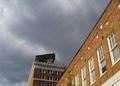
a view from downtownby perkygothComment: base 1: 1/1; challenge: 3/3; technical: 1/3; aesthetics: 0/3; total: 5
Qualifies for challenge, but no real visual appeal to me. Visible JPG artifacts in the clouds and the lamps seem out of focus. Timing is everything here and the picture would have worked much better with a more interesting sky.
|
| Photographer found comment helpful. |
| 10/09/2003 04:35:51 AM |
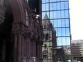
Old and newby carinaComment: base 1: 1/1; challenge: 3/3; technical: 1/3; aesthetics: 2/3; total: 7
Sky seems blown out, building slants to the left and parking structure? to the right is also tilted. I LOVE the reflection. I find it interesting that the arches to the left look purple but the reflection of the building shows it to be gray. |
| Photographer found comment helpful. |
| 10/09/2003 04:33:18 AM |
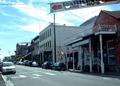
Virginia Cityby msstyckComment: base 1: 1/1; challenge: 3/3; technical: 2/3; aesthetics: 0/3; total: 6
Too small for my taste. Also seems too blue. Lines running across the top are distracting. Nice diagonal. |
| 10/09/2003 04:31:11 AM |
philippines!!!by miketherockComment: base 1: 1/1; challenge: 3/3; technical: 2/3; aesthetics: 1/3; total: 7
Nice concept -- I wish there were more colors involved than yellows and greens. (OK, a small hint of red umbrellas...) |
Home -
Challenges -
Community -
League -
Photos -
Cameras -
Lenses -
Learn -
Help -
Terms of Use -
Privacy -
Top ^
DPChallenge, and website content and design, Copyright © 2001-2025 Challenging Technologies, LLC.
All digital photo copyrights belong to the photographers and may not be used without permission.
Current Server Time: 08/21/2025 03:39:03 PM EDT.