|
|
|
Showing 871 - 880 of ~1255 |
| Image |
Comment |
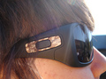
| 01/27/2009 08:59:06 PM | P I N Kby toddheadComment: It is a shame that the lens cuts through one of her eyes. Also, the refelction of the photographer in the glasses detract from a great composition and idea for the challenge |  Photographer found comment helpful. Photographer found comment helpful. |
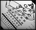
| 01/27/2009 08:57:24 PM | Homeworkby gysComment: Nice picture, great light and I like the use of depth of field in this photo.
What is the light stripe below his chin. It might be part of his clothing. However, it jumped out at me as being out of place. I think it especially is where it is located. | | Photographer found comment helpful. |
| 01/27/2009 08:55:29 PM | Camoby jakeman93Comment: The haze, internal light reflections, angle of the Sun, crop and composition do not work for me here. |
| 01/27/2009 08:54:12 PM | | | Photographer found comment helpful. |
| 01/26/2009 09:14:05 PM | Monkey'ing Aroundby jeroweComment: I like the idea you have gone with, attempting to show the different personalities of the kids. The bockground of natuiral brown matter works really well here, the blue and green contrasting jumpers with the same design, the same shirts, all link the two boys together as brothers without the photo being boring colourwise due to the same cloths.
However.........
The faces appear overexposed, especially the left hand side of the boy in the upper part of the shot. The detail in his face has been lost, and with it, some of the expression. If both of these were correctly exposed, more of the expression would have been obvious, and therefore more of their personality on show.
I would prefer to be able to see the eyes. The lower boy is good, the upper boy I cannot see them. Maybe just a preference, but the eyes tell much of the story........
The faces are off centre. Always an interesting argument around here. To me it makes the photo left dominated. I wouold have cropped with the two faces closer to the middle. This would also have removed the partically cropped out hand. The upper boys left hand is also awkward. The lower boys hand is good. The upper boy could have had both hands on his chest, or that left hand on the ground instead, but not in the air.
Even the expression on the upper boy is not greta. The lower boys expression (if not overexposed), appears to be great and spot on.
Well, my two cents. Hope it helps. And questions, PM me...... |
| 12/26/2008 07:13:03 PM | | | Photographer found comment helpful. |
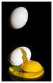
| 12/10/2008 04:15:32 PM | To Make an Omelet...by klkitchensComment: How many eggs did you break trying to do this shot? Plenty of mess to be made here.
I think the shot is great. Light is pretty good on this. Black background is perfect as it then means the colours stand out well. Coulours and whites are good. This shot really works.
A few minor, tiny things....
The line on the RHS of the photo, I guess where the table and backdrop meet is visable.
The small pieces of egg shell ont he table, would have been good if they were noticed and removed prior to dropping the second (or 22nd) egg. Would have been hard to remove the tiny bits in the egg white without stuffing it up, but these are not as much of a problem anyway.
Both things would have been easily fixed under the advanced rules, but under basic can't be done.......
Not voting, don't have time to go through the images, but this stood out when having a quick look at the thumbnails. Would have got a high score from me (that would then have been scrubbed) | | Photographer found comment helpful. |
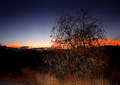
| 12/10/2008 12:57:11 AM | Delicately Flashedby JulietNNComment: I can see the use of fill in flash here, but I am not sure it is trully adding to the picture. The lit grass does little for me, nor does the lower half of the tree. The bright white on the horizon also detracts from the overall view | | Photographer found comment helpful. |
| 12/10/2008 12:47:12 AM | Family Portraitby ryant35Comment: I thought this challenge was perfect for Family Portraits (from someone who normally hates them), yet few people have gone this way. Exposed for the sky effects and then use fill flash to correctly expose the subject. Seems easy.
The boy is a little dark, comes from being behind the girl, especially when the light is coming from the left. Also, i think the light needed to be slightly (read slightly....._ more central, just enough to move that shaddow just off their eyes.
I have taken many kids photos, and get sick of saying 'drop your chin slightly', but I think a light drop of the chin (to match the girls) for the boy also would have been good.
I know, small things, and yes, being a little picky, but that isn't affecting your score. Just trying to help and see if next time, you can get that perfect shot........well done |
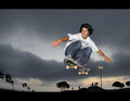
| 12/10/2008 12:41:18 AM | Storm Rider by nutzitoComment: Great capture for the challenge. Good use of fill light to highlight the subject. The white might be a tiny bit overexposed though when being fussy. Sky looks great. The little red is good. The border works. Great submission here. | | Photographer found comment helpful. |
|
Showing 871 - 880 of ~1255 |
Home -
Challenges -
Community -
League -
Photos -
Cameras -
Lenses -
Learn -
Help -
Terms of Use -
Privacy -
Top ^
DPChallenge, and website content and design, Copyright © 2001-2025 Challenging Technologies, LLC.
All digital photo copyrights belong to the photographers and may not be used without permission.
Current Server Time: 08/10/2025 06:08:12 PM EDT.
|