| Image |
Comment |
| 04/29/2009 10:56:37 PM |
Need for Speedby karenkComment: Stunning. What I wanted to see in this challenge. An anlimal captured in full motion, and captured well. Good DOF of this, excellent picture, nothing more to add........... |
 Photographer found comment helpful. Photographer found comment helpful. |
| 04/29/2009 10:49:39 PM |
Slow Motionby BujanxComment: Very interesting and clever composition. Great DOF on this. I like how the yellow stripe on the bug matches the line on the road |
| Photographer found comment helpful. |
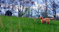
| 04/29/2009 10:48:12 PM |
Where No Puppy's Gone Beforeby JammurComment: There is something about this photo that haes just made my eyes go weird. I think it is the out of focus trees that is just at the range that my eyes are trying to focus it. Very disturbing. Hard to comment the photo when I have to do it in 2 sec looks.
Nice idea and composition. But the focus makes it hard for me to look at it.........Just commenting, not voting anyway |
| Photographer found comment helpful. |
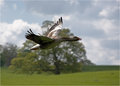
| 04/29/2009 10:45:31 PM |
Honk!by SaraRComment: Nice photo, a shame that it woasn't captured slightly later against the cloudy sky instead of being in front of that large tree |
| Photographer found comment helpful. |
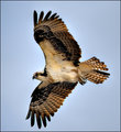
| 04/29/2009 10:44:54 PM |
Flightby basssman7Comment: Love the capture of this. However I feel the bird is a little constrained by the crop. Some additional space around it would have helped balance the shot, and given it somewhere to 'fly' to |
| Photographer found comment helpful. |
| 04/29/2009 10:43:52 PM |
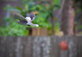
White-Winged Doveby signal2noiseComment: Great capture. You have managed to stop the bird dead and sharp. I would have cropped close on this. I normally love the negative space(and use it), but with the different colours in your bqackground, it becomes a distraction. The DOF is good to try and eliminate them, but the large brown fence across the image doesn't help it |
| 04/29/2009 10:42:21 PM |
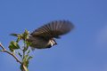
Sparrowby hajekaComment: The branch in the photo is a distraction. I like your shutter speed, getting the head sharp but the wings slightly blurred, however being slightly in front of the bird would have helped, as then the large blur of the wings would no longer be the focal point |
| Photographer found comment helpful. |
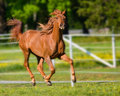
| 04/29/2009 10:41:02 PM |
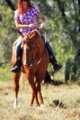
So, you think you can dance....by BarbBComment: Goo depth of field on this to remove all elements from the background. I however are not a fan of the crop at the top, where you have cut the risers head off.......
With this subject, having the horse in full motion, the tail streaming behind and the Riders Red hair also streaming behind would have been a great look. |
| Photographer found comment helpful. |
| 04/29/2009 01:06:32 AM |
Real stonework was not in the budget that yearby Yo_SpiffComment: I didn't vote, but will comment this cause you asked.
The suttlties of this are always going to be lost ont eh 2 second voter, who only seem to vote on the Wow factor. Nothing you can do about that unless you live in Iceland.......
I noticed the painted on stone lines. It is common in some areas, especially some parts of Germany for the Rebuilding after WWII. Gives an effective look and enables you to match the surrounds, without the cost.
The angle you chose is interesting, and the amount of sky is always something that comes down to personal choice. I like the angle, I would have been tempted to include more sky, but that comes down to something i play with when i am PPing.
I think the title is fine. Unless you used 'Painted Bricks' the 2 second voters are never going to get it. Those that take the time should have been able to look and see the real bricks in there. They are pretty obvious.
Maybe the low score is a combination of the 2sec voters, some people thinking you were making a Religious statement, a heap of DNMC from those who didn't bother to look and that it lacks the Wow factor. Under 5 is harsh for this, but that is sometimes the way the votes go |
| Photographer found comment helpful. |
| 04/15/2009 11:13:00 PM |
2_Februaryby DJWoodwardComment: A great shot. I love the spray coming off the waves in this.
A few little things maybe with the composition. I would have preferred (yes, I am being picky now, but thats what this is for) that the lighthouse is closer to the third line. I do not know the area (ie what is to the left) but either through a slight angle change, or a slight crop change, it would then have made it more of a focus by occupying that space. At the moment, being far left, it seems a little bot of an afterthought.
Not sure whether the Red light adds or not. I know you said it flashes Red, but as its the only red in the picture, not sure it was needed........
I am a fan of panoramic photography, however i think the border does work here. The lighting in the waves is magnificant. A brilliant photo |
| Photographer found comment helpful. |
Home -
Challenges -
Community -
League -
Photos -
Cameras -
Lenses -
Learn -
Help -
Terms of Use -
Privacy -
Top ^
DPChallenge, and website content and design, Copyright © 2001-2025 Challenging Technologies, LLC.
All digital photo copyrights belong to the photographers and may not be used without permission.
Current Server Time: 08/12/2025 02:55:18 AM EDT.