| Image |
Comment |
| 05/13/2009 11:44:06 PM |
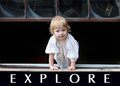
E X P L O R Eby TammerComment: Great image, great title, would ahve loved a phrase like the traditional poster as well
Composition, lighting and exposure are all very good on this image for this challenge. This photo is very appealing, its simple, yet well executed and works very well |
 Photographer found comment helpful. Photographer found comment helpful. |
| 05/13/2009 11:42:08 PM |
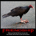
Friendshipby vawendyComment: Great image, title, phrase combination for this........just a shame I am currently eating lunch
The depth of field is good, the image might be a little contrained by the crop, but you have met the challenge well, and the pverall presentation is also good |
| Photographer found comment helpful. |
| 05/13/2009 11:06:00 PM |
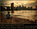
a c h i v e m e n tby vikasComment: The title, and words are good, however the image seems to lack a bit. The bridge does not stand out very well against the cityscape, and egts lost amoungst it. Parts of the bridge I cannot tell if it is realyl bridge or city. The entire image is very brown which goes against much of what I would expect in a motivational poster.
A different way to lay it out, and I think that is reasonably affective as well. |
| Photographer found comment helpful. |
| 05/13/2009 11:03:57 PM |
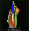
TENACITYby LydiaComment: The title over the photo annoys me greatly, as does the second green border around the whole thing. Its a shame as I feel the image is really good for this, the title is fitting as is the phrase. The choice of colours from the photo is also very well matched.. I really like the colours you have in teh photo, the saturation of this is great.......... |
| Photographer found comment helpful. |
| 05/13/2009 11:01:53 PM |
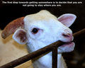
The First Step To Getting Somewhere by sepvComment: Great saying, interesting photograph that does match it, just not in the way i expected it to. The photograph is well composed for this, the animal is well lit and not overexposed. Just not what i was expecting |
| Photographer found comment helpful. |
| 05/13/2009 11:00:37 PM |
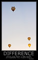
D I F F E R E N C Eby BradComment: I like the photo, the title and and saying on this. The presentation is very good. The composition of the photograph is very interesting here. The main subject lies on a line of third,a dn the three balloons at the opposite end. However, it seems to work for this, especially as it is a motivational poster...... |
| Photographer found comment helpful. |
| 05/13/2009 10:18:08 PM |
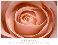
Optimismby rio78Comment: You have chosen not to follow the standard black background, and for this submission, I think it was the right choice. The more delicate photo needed the white surround, and not the heavy black. A good choice.
A great photo of the detail in the rose, showing off the natural beauty, even down to the dew drops. The crop works on this. The colour chosen for the words is spot on. Nothing really for me to put forward to improve. A great overall submission. |
| Photographer found comment helpful. |
| 05/13/2009 10:14:29 PM |
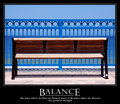
B a l a n c eby phloverComment: Simple, yet it works. The Title, words and photo compliment each other for this. The words are terriffic for a motivational poster. The overall presentation of this is really very good, exactly what you would find on someones wall. A great submission |
| Photographer found comment helpful. |
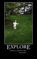
| 05/13/2009 10:12:15 PM |
Exploreby turnofthesueComment: Great title, words and photo combination. They all compliment each other really well. presentation of this is very good, except that i feel you should have cropped more off the bottom. The poster should end below the persons name, not witht he large balc area.......but ignoring that now
Photo composition is good. You have given him somewhere to run to so he is not contrained by the crop. The place he is going for someone his size is the perfect exploration.......a really good submission for this challenge |
| Photographer found comment helpful. |
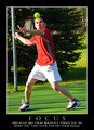
| 05/13/2009 10:09:22 PM |
F O C U Sby peterComment: Great title, words and a picture that matches these exactly. This is the type of thing that you expect to see hanging on someones wall. The presentation is really good, the use of the Green for the title works well and the presentation of the words is spot on
The photo is captured at exactly the right moment, showing complete focus on the ball, and is perfect for this. the only problem is the blown out areas on his face, right arm and both of his legs. Its obvious that a strong sun was out so hard to avoid these, but thats the only criticism of a great submission. |
| Photographer found comment helpful. |
Home -
Challenges -
Community -
League -
Photos -
Cameras -
Lenses -
Learn -
Help -
Terms of Use -
Privacy -
Top ^
DPChallenge, and website content and design, Copyright © 2001-2025 Challenging Technologies, LLC.
All digital photo copyrights belong to the photographers and may not be used without permission.
Current Server Time: 08/12/2025 10:43:47 AM EDT.