| Image |
Comment |
| 05/14/2009 11:19:11 PM |
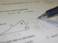
MATH...by ksks0102Comment: I do not see how this image, especially presented in this way, meets the challenge. Your narrow depth of field does not work, the focus point makes little sense. The subject is plain and uninteresting |
 Photographer found comment helpful. Photographer found comment helpful. |
| 05/14/2009 11:17:59 PM |
|
| Photographer found comment helpful. |
| 05/14/2009 11:16:53 PM |
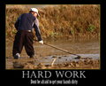
Hard Workby witt34Comment: The image matches the title and phrase well. not exactly what i will have on my wall, but the combination works.
Not really sure about your choice of colour for the border, and the white words are very stark when compared to an image of very little white. Using either the green of the plants, or the blue of his shirt would have fixed this, and tied it closer to the image. |
| Photographer found comment helpful. |
| 05/14/2009 11:15:22 PM |
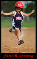
Finish Strong!by SinickPhotographyComment: As you should. Would have preferred a stronger title/phrase combination that is traditional of motivational posters. The image you have chosen fits the challenge well, and the capture is very good in mid air. However the crop lets it down with this. I feel that you needed more space all around the photo. The right hand is cropped off, there is no space above the head, and the base is cropped out. It is like he is jumping out of the page as you have given nowhere to land, no space where he is headed. |
| 05/14/2009 11:13:18 PM |
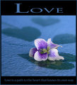
Love is a path to the heart that knows its own wayby libertyComment: A great use of shaddows in this image. It creates an effective space for me without being a distraction from the main subject. It helps the photo rather than having a large plain blue space. A good idea.
Nice capture of the flower. The image is sharp, and the depth of field applied is quite good. I also like your colour choice for the border and words, as it matches the image very well, and creates a good, finished end product. |
| Photographer found comment helpful. |
| 05/13/2009 11:53:13 PM |
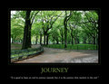
Journeyby BBBastetComment: Yep, spot on. A perfect combination between the photo, the title and the phrase. I could see this on a wall, in an office, as a motivational poster. The entire poster is well executed, the green for the border and title (maybe could have been slightly more the grass green, but I am being really picky). The photo is great, the perfect thing for a poster, well executed and all. Well Done |
| Photographer found comment helpful. |
| 05/13/2009 11:51:05 PM |
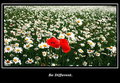
Uniquenessby bethany_marie_23Comment: A stronger, more traditional motivational phrase would have worked exceptionally well with this photo. Something about daring to be different, having the courage to be different, would be more motivational, then the more ordering to be different. I like the image and its composition, the daisies fading into a sea opf white and green works very well here |
| Photographer found comment helpful. |
| 05/13/2009 11:49:25 PM |
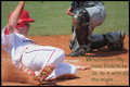
Reaching for Homeby kallisonComment: I like the phrase, adn how it connects to the challenge. I feel this would have worked better laid out in a more traditional motivational poster layout. The words are not as easy to read as they should be for this. The cropp is also a problem, losing both the shoulder, the hand and the other person mean that is has an unfinished look about the overall image. The capture is very good, in full motion, but the crop is too tight to complete the scene. |
| Photographer found comment helpful. |
| 05/13/2009 11:47:12 PM |
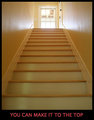
You can make it to the top!!!!!by cowboy221977Comment: A little plain and uninteresting for this challenge. A title could have been included, a different angle, some better lighting all could have made this into a much better submission. As it is, it is quite boring.......... |
| Photographer found comment helpful. |
| 05/13/2009 11:46:03 PM |
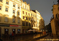
Where there is shadow, there is light.by szalonaComment: A great phrase for this photo. The cast of shaddows on the buildings is very interesting, and creats some cool shapes. This is not normally somehting that will go well here due to these shaddows, but with the phrase and challenge, is quite a good submission. Sections of the buildings though appear a little blown out. |
Home -
Challenges -
Community -
League -
Photos -
Cameras -
Lenses -
Learn -
Help -
Terms of Use -
Privacy -
Top ^
DPChallenge, and website content and design, Copyright © 2001-2025 Challenging Technologies, LLC.
All digital photo copyrights belong to the photographers and may not be used without permission.
Current Server Time: 08/12/2025 08:27:47 AM EDT.