| Author | Thread |
Comments Made During the Challenge  |
|
|
05/19/2009 11:26:09 PM |
Very nice. I was being stingy with ribbons, but what the hell. I love this.
 |
|
|
|
05/19/2009 08:47:38 PM |
|
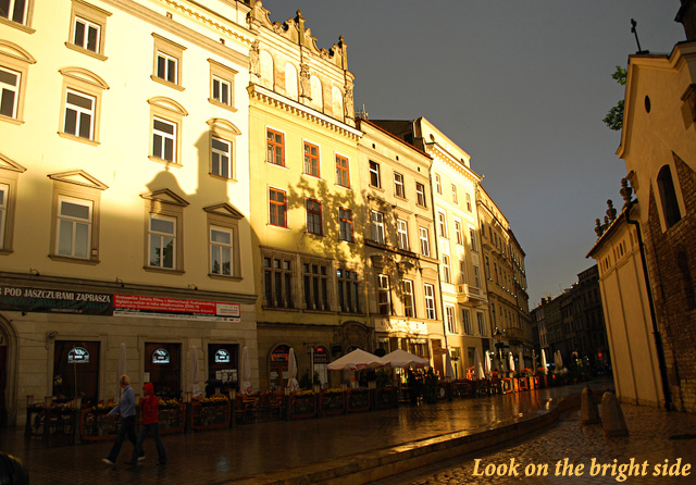
It's a good idea, but the photo lacks a center of interest for me. Perhaps if the shadow/light line was place according to the rule of thirds it might work better? |
|
|
|
05/15/2009 04:57:28 PM |
|
not sure if the message fits |
|
|
|
05/14/2009 05:02:26 PM |
|
|
|
05/14/2009 01:26:37 PM |
|
this photo lacks of a border (I'd prefer there to be one, consider it as you were writting a motivational letter and following certain rules) but I do like the message and the view |
|
|
|
05/13/2009 11:46:03 PM |
|
A great phrase for this photo. The cast of shaddows on the buildings is very interesting, and creats some cool shapes. This is not normally somehting that will go well here due to these shaddows, but with the phrase and challenge, is quite a good submission. Sections of the buildings though appear a little blown out. |
|
|
|
05/13/2009 08:49:49 PM |
|
|
|
05/13/2009 04:05:38 AM |
|
|
|
05/13/2009 01:04:04 AM |
|
nice picture. text not fitting enough. |
|
Home -
Challenges -
Community -
League -
Photos -
Cameras -
Lenses -
Learn -
Help -
Terms of Use -
Privacy -
Top ^
DPChallenge, and website content and design, Copyright © 2001-2026 Challenging Technologies, LLC.
All digital photo copyrights belong to the photographers and may not be used without permission.
Current Server Time: 06/28/2026 12:42:51 AM EDT.