| Image |
Comment |
| 05/18/2009 11:08:43 PM |
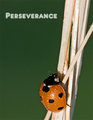
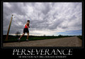
Perseveranceby rrdjservComment: The light reflection is instantly noticable. The plain green of the background doesn't appeal to me. Its just a boring and uninspiring colour which takes up much of the photo. I would have used a deeper depth of field and kept the sticks in focus for the entire photo as well. |
 Photographer found comment helpful. Photographer found comment helpful. |
| 05/18/2009 11:04:59 PM |
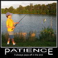
Patienceby jcarComment: I feel some space to the left of this image, just to move the boy closer to the third line, would have helped balance this out a bit more. At the moment, he is very close to the side of the image. The shaddow accross his leg is annoying, and this follows through the foreground.
The colours in this also seem like they could have been improved during Post Processing |
| Photographer found comment helpful. |
| 05/18/2009 11:03:02 PM |
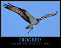
PROGRESS is made one stick at a time by scottiehamComment: Nice, crisp. Great photo for this, showing the bird in all its glory. Crop, exposure, composition, capture are all spot on with this image and the image would score well in any relevant challange. A really good capture.
The poster is well constructed and well put together. A really good submission.......... |
| Photographer found comment helpful. |
| 05/18/2009 11:01:31 PM |
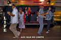
Life, Age Has No Limitsby BrianRComment: A little snap-shotish. there lacks a clear subjecct, with many elements involved and none standing out ahead of the others. Too much happening in the background, and too many elements overlapping each other to make this work. no one is looking at the camera, and the entire image does not really look like a poster someone would post on their wall for motivation. |
| Photographer found comment helpful. |
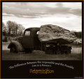
| 05/18/2009 10:58:40 PM |
Determinationby HipychikComment: I like the image, although it is too dark in many spots. Some fill lighting on the truck would ahve made a differece as then the sky would not be blown out as much.........
Not 100% convinced by the choice of the text style, I don't think the curved text helps you here. Title, with phrase underneath would have worked better. Also don't know why you introduced in the yellow colour.
Also, why B&W for this? Most motivational posters have colour, and I think this could have looked really good if in colour with some rich rust browns through the truck etc, and the colour detail through the rock.
One last one, Not meant to have names on any of this, as we are not meant to know who submitted during voting........ |
| Photographer found comment helpful. |
| 05/18/2009 10:54:44 PM |
Remembering Youby jukeboxxComment: Not what I would call Motivational poster material.
An interesting image though, not sure about the crop on this, I feel she is too high in the photo and this needed more space above her to really work. |
| Photographer found comment helpful. |
| 05/18/2009 10:53:21 PM |
Stand Out.by jfritz27Comment: The bird does stand out, but there is so much boring, faded, out of focus greenery in this photo that it just doesn't appeal, and not something I could see people putting on a wall for motivation. A tighter crop of the bird would have been better, and more consideration of the overall presentation, prehaps intraditional motivational poster style, with a positive phrase could have helped significantly here. |
| Photographer found comment helpful. |
| 05/18/2009 10:51:36 PM |
PERSEVERANCEby LVicariComment: Not sure that the sign post was really needed for this, especially the doctored sign post. The post is on a lean which is a distraction. Just having the long road with the runner was a strong enough message that linked in really well to the title and phrase. The sign is a little over the top for me. other than that, it is a really well constructed poster with all elements considered and great presentation. |
| Photographer found comment helpful. |
| 05/18/2009 10:49:42 PM |
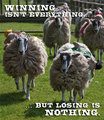
A Word to the Sheepishby ImagineerComment: Not really sure what you were trying to achieve here. The humour of this is good, but the overall presentation has a rushed feel to it. The picture is poorly composed. The cropping seems a little arbitary rather than well considered. You cut off half a sheep on the right.........The text really doesn't work as it runs over the sheep, rather than being placed in negative space |
| Photographer found comment helpful. |
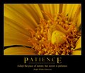
| 05/18/2009 10:47:25 PM |
Patienceby gysComment: A nice, subtle poster that really does fit the theme you have chosen. the colours are vibrant, and the crop you have chosen is very interesting, and adds to the overall appearance of the poster, making it more than just a flower shot. the attention to detail makes the entire submission work well. |
| Photographer found comment helpful. |
Home -
Challenges -
Community -
League -
Photos -
Cameras -
Lenses -
Learn -
Help -
Terms of Use -
Privacy -
Top ^
DPChallenge, and website content and design, Copyright © 2001-2025 Challenging Technologies, LLC.
All digital photo copyrights belong to the photographers and may not be used without permission.
Current Server Time: 08/13/2025 11:36:44 AM EDT.