|
|
|
Showing 481 - 490 of ~1255 |
| Image |
Comment |
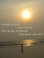
| 05/19/2009 10:57:03 PM | iDream iWalk iSucceedby fahadkalsekarComment: The uneven horizon, either intentional or not, is a major distraction for me in this photo. Maybe you did it to centre the sun more, which I don't think is right. Having the horizon straight, the sun in the top right corner, and the guy on the beach would ahve worked better.
Great phrase for the photo, which really works for this challenge |  Photographer found comment helpful. Photographer found comment helpful. |
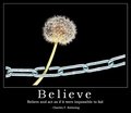
| 05/19/2009 10:55:15 PM | Believeby IreneMComment: A very interesting photo, and a very professional looking presentation. The combination of the photo, title and phrase is exactly what I thought this challenge was about, and you have done that exceptionally well.
Maybe it is a little overexposed/light. Especially the chain and the stem could have been darker, giving just that hint of green in the stem, and dulling down the chain. this would have helped really emphasise the plant as the subject, rather than the chain, which by being that light, does jump off the page a little too much. However, that is a small thing, a really very good submission for the challenge | | Photographer found comment helpful. |
| 05/19/2009 10:52:18 PM | |
| 05/19/2009 10:51:48 PM | Be A Dad!by vtruanComment: More of a campain poster appealing to dads, rather than a motivational poster. In the campain poster, it has merits, int erms of meeting the challenge, it does struggle
Good depth of field, but not really what I would want on the office wall | | Photographer found comment helpful. |
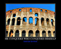
| 05/19/2009 10:50:21 PM | Conquerby npaselComment: Unfortunately, there are a number of artifacts int he sky that are clearly visible. I also think that this image needed some extra sky to really balance it. I find that I am seeing a part of a scene, and that it does not have any clear ending point that makes me think I am seeing the whole picture. A wider shot of this would have worked better.
It does tie in well with the title/phrase. Would have likes the presentation to have the title in the more traditional motivational poster style as welll. | | Photographer found comment helpful. |
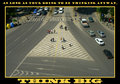
| 05/19/2009 10:47:59 PM | As long as your going to be thinking anyway, THINK BIGby bogdypaduComment: The overall image is a little uninteresting. i wonder if there was a better subject to choose, a large building or something, rather than a large island in the road. I think of these as wasted sapce, not an inspiration. The overall image lacks a clear and interesting subject, and due to the large areas of grey, also lacks colour that could have also made it interesting. |
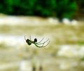
| 05/19/2009 10:46:13 PM | Focus on your Goals and not on your Challengesby yjoshiComment: I feel this needed a tighter crop, or needed something else in the image that connects to the statement made. As it is, most of theimage is a blurred mess, and the change in background colour by this is a distraction that hurts the overall image. The tighter crop of the spider would have illiminated this, allowed us to see more detail int he spider, and removed most of the distracting elements, making a much stronger picture. | | Photographer found comment helpful. |
| 05/19/2009 10:44:36 PM | Tough Times Never Last, But Tough People Doby DebbiComment: An interesting concept, maybe one you could have used for the de-motivational quite effectively. The biggest issue with this is the presentation. Some extra time spent to make this look like a poster could have helped its appeal, and helped really connect it more strongly to the topic. This couls have also helped push the slightly humourous take you have gone with for this challenge.
The background, well, the brick lines, are a little too sharp for me. Having the man stad further away from the background, and blurring these through depth of field could have helped remove these distracting elements. Seeing the rest of his face, by moving both of the signs down slightly I also think would have added to the image. |
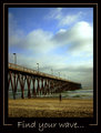
| 05/19/2009 10:41:33 PM | Find your wave...by tonodzComment: An inteeresting subject, but I don't think the overall capture does it justice. The image appears to be soft. The pier leads to the edge of the photo, neither negative space or a subject. The lines lead me to this space in the border.........
Even the wave in the image is a minor element, and yet this is what you highlighted in your title. A stronger connection between the photo and the motivational message you are trying to put forward was really needed. | | Photographer found comment helpful. |
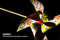
| 05/19/2009 10:38:51 PM | ENERGY | You are the power that keeps us movingby rkupbensComment: I find the lighting of this to be a bit problematic. The light is very harsh, causing very bright areas, and very dark shaddows. Some additional diffused light to remove the harshness of the shaddows would have been great.
Also, you are talking about movement and energy, and yet the photograph is static. Having this, with the fan moving, would have connected the photo much more to the theme you chose. |
|
Showing 481 - 490 of ~1255 |
Home -
Challenges -
Community -
League -
Photos -
Cameras -
Lenses -
Learn -
Help -
Terms of Use -
Privacy -
Top ^
DPChallenge, and website content and design, Copyright © 2001-2025 Challenging Technologies, LLC.
All digital photo copyrights belong to the photographers and may not be used without permission.
Current Server Time: 08/13/2025 04:32:54 AM EDT.
|