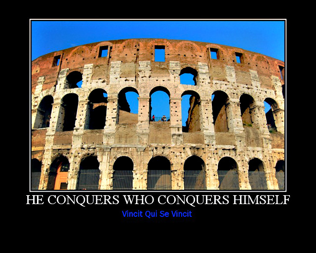
Unfortunately, there are a number of artifacts int he sky that are clearly visible. I also think that this image needed some extra sky to really balance it. I find that I am seeing a part of a scene, and that it does not have any clear ending point that makes me think I am seeing the whole picture. A wider shot of this would have worked better.
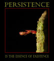
It does tie in well with the title/phrase. Would have likes the presentation to have the title in the more traditional motivational poster style as welll.
I don't understand why you put your text so close to the picture, it feels somewhat unbalanced. But that's the only point I could find for nitpicking, the rest is perfect! I love your symmetrical composition and the color tones.






 Add photograph to your favorites
 Add photographer to your favorites


 Photographer found comment helpful.


