| Image |
Comment |
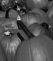
| 09/25/2008 08:38:19 PM |
Pumpkinsby snafflesComment: You have managed to make Pumpkins interesting, n ot an easy task. The layout works really well, execution is great, depth of field is spot on and lighting is pretty good. Well Done |
 Photographer found comment helpful. Photographer found comment helpful. |
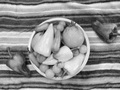
| 09/25/2008 08:37:22 PM |
Peppersby landon1013Comment: The photo looks soft and is very very noisy. Idea was good, but execution realy lets it down here. |
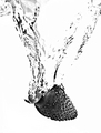
| 09/25/2008 08:36:23 PM |
Strawberry Splash!by socalsteveComment: I don't like to blown out look of the background. i think it then looses the definition of the trail through the liquid.. |
| Photographer found comment helpful. |
| 09/25/2008 08:35:23 PM |
The Bearer of Thornsby VitaminBComment: A nice sharp photo of a (red?) rose. Colour and shaddows of the rose are great. Not really my thing but meets the challenge really well and does scream Red to me. |
| Photographer found comment helpful. |
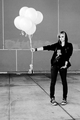
| 09/25/2008 08:34:13 PM |
Six Pink Balloonsby zackdezonComment: They may be pink, but they are overexposed int he photo, making them white and loosing definition. Would have been much better if they were still a shade of grey, and the shaddows and shapes of the balloons obvious, as that wouldhave portrayed the colour better |
| Photographer found comment helpful. |
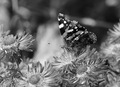
| 09/25/2008 08:32:22 PM |
Butterflyby ravins4Comment: Good photo, nice depth of field. Looks like there is a bit on noise through the background. Meets the challenge well |
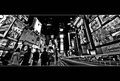
| 09/25/2008 08:31:33 PM |
City Lights : Times Square by APComment: Well, the square is colourful. Photo is good and very busy, which also portrays colour and movement.
Not sure that the wide black border top and bottom quite works. |
| Photographer found comment helpful. |
| 09/25/2008 08:30:11 PM |
Hot Stuffby BrownEyesComment: Great idea, but I am not sure about the Lighting on this one. A mo4re even light, instead of the harsh reflections, may have been better |
| Photographer found comment helpful. |
| 09/25/2008 08:29:23 PM |
Seafood Anyone?by witt34Comment: I had a similar idea (but went with something else) The greys with the White and black does portray the different colours making up the Neon sign. Would have attempted to have a little more room to the right as I don't think there is quite enough space between the crab and the edge at that point (but I don't know what else might have been in the way) |
| Photographer found comment helpful. |
| 09/25/2008 08:27:11 PM |
Orchidby wei1108Comment: Its a nice photo, but this challenge said that the photo MUST be black and white, with no colour allowed. I would have attempted to have a slightly greater depth of field, as even parts of the main flower are soft because of the depth, while the center is very sharp. |
| Photographer found comment helpful. |
Home -
Challenges -
Community -
League -
Photos -
Cameras -
Lenses -
Learn -
Help -
Terms of Use -
Privacy -
Top ^
DPChallenge, and website content and design, Copyright © 2001-2025 Challenging Technologies, LLC.
All digital photo copyrights belong to the photographers and may not be used without permission.
Current Server Time: 08/04/2025 08:11:33 PM EDT.