|
|
|
Showing 161 - 170 of ~770 |
| Image |
Comment |
| 06/17/2009 06:25:17 PM | Rocky Reflectionby IWhisperedComment: Greetings from the Critique Club :)
Composition:
The composition whilst not bad is just a little lacking, with setup shots on DPC you really have to nail the composition if the voters are going to look favourably on your shot, you have an odd number of stones which is generally considered a good thing for balance, but I think there may have been more interesting ways you could have presented them, maybe having one very close to the front of your scene would have given some depth to your shot, at the same time it would have allowed a lot more of the textures to be seen.
I'm personally not keen on cutting the center of an image with the horizon (or represented horizon in this instance), but that's quite possibly just my personal preference.
Camera Work:
The technicals look pretty good, the lighting is solid enough and there's just enough detail in the shadow areas for my taste and your focus is on the money.
Post-Processing:
I think that you have processed your shot fairly well, I might have taken a few different steps had it been my shot, a shadows highlight definitely brings out some more details and then a small contrast brightness boost puts the levels back nicely and just finished off with a little sharpening
My Opinion:
It's a nice enough shot that is well executed, I feel the composition is a little weak - but I am assuming these are small pebbles on a home setup rather than some huge boulders on a lake somewhere as one of your commentors remarked.
Anyway the above is just my personal opinions and I hope they have helped in some way, if not please do not be offended and I am more than happy to discuss this critique further should you wish to pm me.
Good luck in future challenges!
Mark |  Photographer found comment helpful. Photographer found comment helpful. |
| 06/17/2009 05:50:36 PM | Far far away Bridgeby Haukur JoComment: Greetings from the Critique Club :)
Composition:
I think the composition choices here were quite limited, however presentation wise I personally think I might have cropped 3cm off the bottom and made it in to a pano style shot, for me this strengthens the draw to the bridge, for some strange reason it also limits the impact of the post sticking out the of the sea which in the original does demand quite a lot of attention. These are obviously just my opinions so please don't take offense.
Camera Work:
The technical look great, nicely exposed, great tonal range.
Post-Processing:
Nicely post processed in my opinion, it would have been very easy to over saturate this shot and for me the soft feel (not talking focus here) is a big part of the images charm. I think you have kept the image very "real" so kudos for that.
My Opinion:
I really like the image and could easily see it hanging on an office wall somewhere, it kind of exudes serenity and calm, I think if the bridge had been a little more "in your face" then it would have scored much better, whether my suggestions above would have achieved that or not I do not know, but I believe those steps are how I would have chosen to submit this shot.
Good luck in future challenges!
Mark
| | Photographer found comment helpful. |
| 06/17/2009 04:03:31 PM | Lost River 1by RebelBlueComment: Greetings from the Critique Club :)
Composition:
I think the composition is slightly awkward here, the rock is a little too high in my opinion and would make for a stronger image if it was located on the lower right side in the rule of thirds line, this would have resulted in a leading line away from the rock making the picture a little more complete (even though the challenge was rocks I think you would still have been meeting the challenge this way but you would also have had a more interesting composition).
I guess there's a case for suggesting this is also on the fussy side, with the plants / grasses not really bringing anything to the shot, but infact they detract a fair bit and demand quite a bit too much of the viewers attention.
I see this is your first entry so don't worry it will soon become apparent that clean, crisp, well composed and sharp entries are what is generally required to score well here. It can be quite frustrating but at the sametime it's 1 of the best learning curves I have ever experienced.
Camera Work:
The shot looks a little underexposed although that could be due to the processing creating an almost flat look to the image. The rock also looks a little soft on the closest end which appears to be the main focus point of the image.
Post-Processing:
I think a curves adjustment at the highlight end would make a world of different in the histogram, I also think a better way to get a sepia look (if that's what you were going for) is to use DuoTone mode but maybe that's just personal preference. Whilst basic editing is quite limiting there is still a whole load of things you can do to improve an image generally.
My Opinion:
Your score was always going to be pretty low with this image on this site, for the reasons mentioned above regarding DPC voters requirements or expectations. I think there's plenty of scope to move forward and I would recommend commenting on the challenges try and comment on 100% of the images within any given challenge if you can, then when voting is over it's most useful to go back and see how the voters found the images in relation to your take on each one, this gives you some idea of what to submit if scores are your main concern.
Good luck in future challenges!
Mark
| | Photographer found comment helpful. |
| 06/17/2009 02:18:49 PM | Suleyman Mosqueby miminComment: Greetings from the Critique Club :)
Composition:
I think the composition is not too bad, although I find the heavy inward tilt a little too distracting it almost makes the building / model look skewed front to back as well as inwards from the edges which takes a while to adjust to. Also the chosen angle has forced you to have a tilted look to the shot, which obviously can work in some circumstances but I feel that as you have had to frame so tight it hasn't worked as well as it could have.
Camera Work:
Nicely exposed and I really like that you managed to retain detail in the shadow area under each arch.
Post-Processing:
I think overall your post work on this shot was really good, I like the detail you have in the building and the textures look good, considering this is a model I think you have done an excellent job of making it look real. The sky has some banding on the left side and I am not sure if this is due to the background chosen (if this is shot inside with a fake background) or to the limitations of file size (I suspect the latter).
My Opinion:
Had you not mentioned that this was a model I probably wouldn't have known any differently, as I do not know if this was taken indoors or is a commercial model and is outside I will only say that the lighting is excellent and very realistic.
I think to improve on the score the shot would have needed to have been taken from slightly more to the left as I believe this would have minimised the effect of the distortion, in my opinion that is what has cost you the most in your final score and a close second would be the banding in the sky.
Good luck in future challenges!
Mark | | Photographer found comment helpful. |
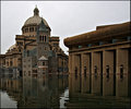
| 06/17/2009 12:43:00 PM | Dusk at the National Art Galleryby rhadshawComment: Greetings from the Critique Club :)
Composition:
I think the composition is pretty good, I feel you were maybe attempting to frame the shot with the tree on the right but in this case I think it has worked against you in that it makes the shot look overly fussy, with so much going on in the buildings construction I think that getting in front of the tree may have made for a stronger image. However you have created some strong leading lines in to the red area of the building so in that respect maybe you achieved your goal.
Camera Work:
Nice use of a long exposure to get the shot in what must have been fairly difficult conditions.
Post-Processing:
My first thoughts were that this is way over saturated in both blues and reds and if I am honest I think in this case it very much adversely affected your score.
Sharpening looks good, infact all other elements of the post work looks to be fine just maybe a bit heavy handed on the Hue / Sat Sliders this time out.
My Opinion:
I feel your image meets the challenge nicely and is a well executed shot, as I stated above I think the post work (or one element of it) maybe held you back from a achieving a better score, you've captured some lovely lines which lead you nicely through the main elements of the shot.
Good luck in future challenges!
Mark | | Photographer found comment helpful. |
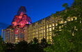
| 06/17/2009 12:25:22 PM | Western Canadian Placeby CitadelComment: Greetings from the Critique Club :)
I really like this image I think the subject is spot on with regards meeting the challenge as the 6+ final score shows.
You have captured this building in a very clever way, the left hand edge being straight within the frame and the leaning of the right hand side I find very nice compositionally which makes for a nice lead down through the image where my eyes come to rest on the dark area (what I assume is the entrance of the building) unfortunately I feel this may be where the image falls down ever so slightly and what may have stopped it from scoring even higher, the dark area is maybe a little too dark especially after all the glorious detail within the upper 2/3 of the shot. Obviously this is out of your control in a basic editing challenge so I understand you were working within the limitations of the shot recorded.
Conversion to B&W fits this image extremely well and the sky is nice and dramatic, I wonder if anyone was fooled into thinking this was over sharpened looking at the windows on the left hand building, however I do not think it is oversharpened I believe it to be the reflections of the building opposite making for a busier area. My opinion is your post work was right on the money.
Overall a very fine entry which easily deserved your 6+ score
Mark | | Photographer found comment helpful. |
| 06/17/2009 08:01:09 AM | Candy, anyone?by Yo_SpiffComment: I really like the humour and would have found it hard to give this shot less than 5 simply for the smile.
Technically I think the pink cast might have cost you some points, I think possibly desaturating it some might have helped with this. | | Photographer found comment helpful. |
| 06/16/2009 03:52:39 PM | | | Photographer found comment helpful. |
| 06/16/2009 03:52:02 PM | 605 feetby cabaComment: This is really nice, appreciated more on second look - Bumping +1 (7) | | Photographer found comment helpful. |
| 06/16/2009 03:51:05 PM | | | Photographer found comment helpful. |
|
Showing 161 - 170 of ~770 |
Home -
Challenges -
Community -
League -
Photos -
Cameras -
Lenses -
Learn -
Help -
Terms of Use -
Privacy -
Top ^
DPChallenge, and website content and design, Copyright © 2001-2025 Challenging Technologies, LLC.
All digital photo copyrights belong to the photographers and may not be used without permission.
Current Server Time: 07/18/2025 09:38:31 AM EDT.
|