DPChallenge: A Digital Photography Contest You are not logged in. (log in or register
 
Browse Settings
Currently viewing:
Registered UserZoomdak

Show comments:

Per page:

Order:

Comments:


Comments Made by Zoomdak
Pages:   ... [292] [293] [294] [295] [296] [297] [298] ... [318]
Showing 2941 - 2950 of ~3179
Image Comment
ginster.jpg
03/24/2004 03:56:59 AM
ginster.jpg
by SMarkus38

Comment:
Interesting! I like the faint blur.
1,784,394 Parallels
03/24/2004 03:35:56 AM
1,784,394 Parallels
by ellamay

Comment:
[Critique Club]
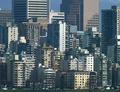
Composition - I like the infinite effect, how they are just stacked and stacked. I agree with cropping out the bottom, I believe this would have enhanced the effect more. But the ground also gives you the perspective to go off of.

Technical Quality - I wonder what this would have looked like at different times of day and how much more the buildings would stand out had it been taken at a different time. Semi-sharp and natural looking but the contrast may have been boosted a little more, but that also makes all the shadows darker. Its a strong photo but it doesn't jump out at you.

Meeting the Challenge - Check :)

Creativity - Very original, although many people used cities for their parellel's (how were you to know). I love the idea of multiple and multiple parellel lines. This photo conveys, to me, the blandness of the city and repition, but also the orginization and stucture of it.

Title - Love the suggestion in the title. It makes you wonder, 'Wait, did this photographer count all those!?' But it also makes you wonder if your just making it up. This quality forces people to stop and think about the possibilities of it. Seems like everybody has the same gag writer (Although I can't say that I would have said something different).

Overall - I don't know why this didn't score higher, possibly the technical aspect, becuase I think its a imaginitive shot, but only through the title. That may be one of the weak points, that the photo isn't as good just standalone. The infinite perspective is cool and its a nice portrayal of the city.
Photographer found comment helpful.
gus gus
03/24/2004 12:44:14 AM
gus gus
by betlogs

Comment:
Awsome shot. Carrot seems dry and disgusting and there is a hair on it. (not much you can do about that). Great focus and composition. Interesting border and title.
Photographer found comment helpful.
What was that !!
03/24/2004 12:10:27 AM
What was that !!
by matt

Comment:
[Critique Club]
Composition - The background is distacting, it would have been better if had been blurred or replaced. Centered is good, but also normal. Size could have been bigger (up to 640 largest size).

Technical Quality - I think this could have been edited to a higher quality. Lighting is good, could have been sharpened a little, contrast could have been boosted. Red eye could have been eliminated.

Meets the Challenge - check.

Creativity - Nice capture of the expression, funny.

Overall - Funny picture, but could have had a higher quality.
Lighthouse Digest
03/23/2004 05:21:35 AM
Lighthouse Digest
by brownt

Comment:
Seems like the contrast could have been boosted a little more. I like how it is so isolated. Nice Composition, although I wonder what it would look like in different points (the corners are almost identical)/ nice shot
Photographer found comment helpful.
Cooking Light
03/23/2004 05:18:31 AM
Cooking Light
by TommyMoe21

Comment:
Background is noisy. Like the spacing and lighting.
Photographer found comment helpful.
Birder's World
03/23/2004 05:01:08 AM
Birder's World
by debrown

Comment:
I would like this cropped closer. The leaves seem unnaturaly blurry. Like the red/green contrast.
Photographer found comment helpful.
WaterFowl
03/23/2004 04:58:08 AM
WaterFowl
by faidoi

Comment:
I like the attention of its eye. I don't really like staring at its back though.
Photographer found comment helpful.
Country Living
03/23/2004 04:55:31 AM
Country Living
by moodville

Comment:
Seems to be blurred unevenly. Good composition. I like how it suggest peace and quiet, how it invites you to stop, sit, rest and think.
Photographer found comment helpful.
Audobon
03/23/2004 04:53:16 AM
Audobon
by qnjt

Comment:
Nice capture! The little specs in the background are distracting, although I realize its part of the water. I like the contrast from the white to black.
Photographer found comment helpful.
Pages:   ... [292] [293] [294] [295] [296] [297] [298] ... [318]
Showing 2941 - 2950 of ~3179


Home - Challenges - Community - League - Photos - Cameras - Lenses - Learn - Help - Terms of Use - Privacy - Top ^
DPChallenge, and website content and design, Copyright © 2001-2025 Challenging Technologies, LLC.
All digital photo copyrights belong to the photographers and may not be used without permission.
Current Server Time: 06/17/2025 04:28:12 PM EDT.