| Image |
Comment |
| 03/30/2004 11:38:03 AM |
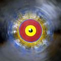
untitledby StevePaxComment: Could you not think of a title for this?
I like the black/white contrast. Excellent blur. I like how it seems to glow. I would like a little more space at the bottom of the frame. |
 Photographer found comment helpful. Photographer found comment helpful. |
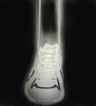
| 03/30/2004 11:36:23 AM |
Nude 1Aby dsrayComment: Sorry, seems too abstract. No real subject. Is pretty original though. |
| Photographer found comment helpful. |
| 03/30/2004 11:35:21 AM |
50mph at 1/45 sec.by JasonComment: Great capture! Good focus, and lighting. The only thing that bothers me is the yellow streak coming from the hatch on the top. |
| Photographer found comment helpful. |
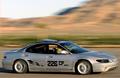
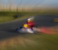
| 03/30/2004 11:33:31 AM |
Fassst at the Trackby RasaiComment: Seems too abstract. I like how the motion blue lines curve towards him. NIce racing idea. |
| Photographer found comment helpful. |
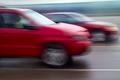
| 03/30/2004 11:28:56 AM |
Racing down the highwayby pcodyComment: Cool idea, it would be awsome had the cars been in focus. Also the white bar on the top is distracting. I like dueling idea. |
| Photographer found comment helpful. |
| 03/30/2004 11:26:40 AM |
|
| Photographer found comment helpful. |
| 03/30/2004 11:22:15 AM |
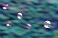
Chasing the windby divernickComment: I like the bubbles idea. Its good focus. But, It seems too noisy to me and the colors seem unnatural. |
| Photographer found comment helpful. |
| 03/28/2004 11:10:46 PM |
|
| 03/25/2004 12:18:07 AM |
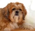
The Eyes of Blindnessby Everyday ReneeComment: Greetings from the Critique Club
Composition - Well positioned, background is distracting. But if you didn't know what were you supposed to do (rebalence your monitor :| ). Would table(?) fits perfectly with the color of the dog.
Technical Quality - Lighting is even, looks a tiny bit harsh on the back of its neck (hardly noticible). I like the slightly blurry/dreamy look. I also think the eyes could be brightened a bit. But I don't know how much this would effect the idea of your title.
Overall - Nice shot, knocked down from a few technical asspects, but does a good job capturing the emotion of the dog.
|
| Photographer found comment helpful. |
| 03/24/2004 05:14:30 AM |
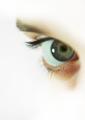
Gazingby moviemanComment: Greetings from the Critique Club!
Composition - I like the originality of the 'letterbox' form because it gives spacing for the direction he is looking. Whatever is in the background is distracting, but also gives his face a little bit of an emphasis. Maybe if it had been a solid color or less descript it would have been less distacting
Technical - I don't really like the amount of noise/grainyness in this photo. I think the lighting could have been more even (his chin fades into his shirt yet his hand glares). I like the contrast that the black shirt makes. Seems like it could be slightly more in focus. The color is natural.
Meets the Challenge - Check :)
Creativity - I like how he seems so relaxed, yet alert. How his eyes give interest to whatever is happening. In this sense it is a good portrait.
Good summerizing title, nice border.
Overall - Good portait but a little lacking in the technical aspect. They eyes sum up the shot, they are so full of depth. Keep up the good work. |
| Photographer found comment helpful. |
Home -
Challenges -
Community -
League -
Photos -
Cameras -
Lenses -
Learn -
Help -
Terms of Use -
Privacy -
Top ^
DPChallenge, and website content and design, Copyright © 2001-2025 Challenging Technologies, LLC.
All digital photo copyrights belong to the photographers and may not be used without permission.
Current Server Time: 06/17/2025 04:27:16 PM EDT.