| Image |
Comment |
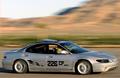
| 03/30/2004 11:35:21 AM |
50mph at 1/45 sec.by JasonComment: Great capture! Good focus, and lighting. The only thing that bothers me is the yellow streak coming from the hatch on the top. |
 Photographer found comment helpful. Photographer found comment helpful. |
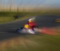
| 03/30/2004 11:33:31 AM |
Fassst at the Trackby RasaiComment: Seems too abstract. I like how the motion blue lines curve towards him. NIce racing idea. |
| Photographer found comment helpful. |
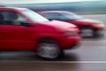
| 03/30/2004 11:28:56 AM |
Racing down the highwayby pcodyComment: Cool idea, it would be awsome had the cars been in focus. Also the white bar on the top is distracting. I like dueling idea. |
| Photographer found comment helpful. |
| 03/30/2004 11:26:40 AM |
|
| Photographer found comment helpful. |
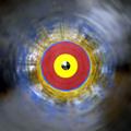
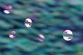
| 03/30/2004 11:22:15 AM |
Chasing the windby divernickComment: I like the bubbles idea. Its good focus. But, It seems too noisy to me and the colors seem unnatural. |
| Photographer found comment helpful. |
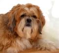
| 03/25/2004 12:18:07 AM |
The Eyes of Blindnessby Everyday ReneeComment: Greetings from the Critique Club
Composition - Well positioned, background is distracting. But if you didn't know what were you supposed to do (rebalence your monitor :| ). Would table(?) fits perfectly with the color of the dog.
Technical Quality - Lighting is even, looks a tiny bit harsh on the back of its neck (hardly noticible). I like the slightly blurry/dreamy look. I also think the eyes could be brightened a bit. But I don't know how much this would effect the idea of your title.
Overall - Nice shot, knocked down from a few technical asspects, but does a good job capturing the emotion of the dog.
|
| Photographer found comment helpful. |
| 03/24/2004 05:14:30 AM |
Gazingby moviemanComment: Greetings from the Critique Club!
Composition - I like the originality of the 'letterbox' form because it gives spacing for the direction he is looking. Whatever is in the background is distracting, but also gives his face a little bit of an emphasis. Maybe if it had been a solid color or less descript it would have been less distacting
Technical - I don't really like the amount of noise/grainyness in this photo. I think the lighting could have been more even (his chin fades into his shirt yet his hand glares). I like the contrast that the black shirt makes. Seems like it could be slightly more in focus. The color is natural.
Meets the Challenge - Check :)
Creativity - I like how he seems so relaxed, yet alert. How his eyes give interest to whatever is happening. In this sense it is a good portrait.
Good summerizing title, nice border.
Overall - Good portait but a little lacking in the technical aspect. They eyes sum up the shot, they are so full of depth. Keep up the good work. |
| Photographer found comment helpful. |
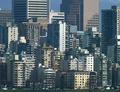
| 03/24/2004 03:35:56 AM |
1,784,394 Parallelsby ellamayComment: [Critique Club]
Composition - I like the infinite effect, how they are just stacked and stacked. I agree with cropping out the bottom, I believe this would have enhanced the effect more. But the ground also gives you the perspective to go off of.
Technical Quality - I wonder what this would have looked like at different times of day and how much more the buildings would stand out had it been taken at a different time. Semi-sharp and natural looking but the contrast may have been boosted a little more, but that also makes all the shadows darker. Its a strong photo but it doesn't jump out at you.
Meeting the Challenge - Check :)
Creativity - Very original, although many people used cities for their parellel's (how were you to know). I love the idea of multiple and multiple parellel lines. This photo conveys, to me, the blandness of the city and repition, but also the orginization and stucture of it.
Title - Love the suggestion in the title. It makes you wonder, 'Wait, did this photographer count all those!?' But it also makes you wonder if your just making it up. This quality forces people to stop and think about the possibilities of it. Seems like everybody has the same gag writer (Although I can't say that I would have said something different).
Overall - I don't know why this didn't score higher, possibly the technical aspect, becuase I think its a imaginitive shot, but only through the title. That may be one of the weak points, that the photo isn't as good just standalone. The infinite perspective is cool and its a nice portrayal of the city. |
| Photographer found comment helpful. |
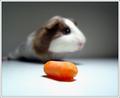
| 03/24/2004 12:44:14 AM |
gus gusby betlogsComment: Awsome shot. Carrot seems dry and disgusting and there is a hair on it. (not much you can do about that). Great focus and composition. Interesting border and title. |
| Photographer found comment helpful. |
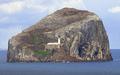
| 03/23/2004 05:21:35 AM |
Lighthouse Digestby browntComment: Seems like the contrast could have been boosted a little more. I like how it is so isolated. Nice Composition, although I wonder what it would look like in different points (the corners are almost identical)/ nice shot |
| Photographer found comment helpful. |
Home -
Challenges -
Community -
League -
Photos -
Cameras -
Lenses -
Learn -
Prints! -
Help -
Terms of Use -
Privacy -
Top ^
DPChallenge, and website content and design, Copyright © 2001-2024 Challenging Technologies, LLC.
All digital photo copyrights belong to the photographers and may not be used without permission.
Current Server Time: 04/26/2024 05:36:29 PM EDT.