| Image |
Comment |
| 01/05/2004 09:39:27 PM |
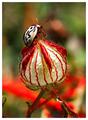
thanks!!by sanandanComment: Amazing colours. Is this enhanced? Doesnt' matter, still love it. 10 |
 Photographer found comment helpful. Photographer found comment helpful. |
| 01/05/2004 09:38:37 PM |
|
| Photographer found comment helpful. |
| 01/05/2004 09:37:31 PM |
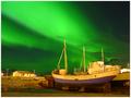
illuminationsby eikidigiComment: Fantastic. Great composition. And it didn't hurt to have a little help with the lighting!
10 |
| 01/02/2004 12:47:43 PM |
Lilyfingersby inspzilComment: Yep, this is a stunner for sure. Your colour and composition set this apart from the usual flower macro. |
| Photographer found comment helpful. |
| 01/02/2004 12:03:37 PM |
|
| Photographer found comment helpful. |
| 01/02/2004 10:28:25 AM |
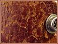
Cracked Leatherby Spanish_GreaseComment: Greetings from the Critique club
hmmm, this one is difficult to comment one.
The colour is good, and it is an interesting idea. That said, I'm afraid the shot itself is not really compelling.
Possibly a different lighting technique would have created some drama, or a different angle. Illuminate from a side more to create harsher shadows.
As this is, it is a good study of the leather but there is no WOW factor.
Including the snap is a good idea, but compositionally it doesn't quite work.
I don't know what this is, but what comes to mind is that if you could bend it and have the snap be profiled and cause the leather to be more, rough (for lack of a better term) it could be quite interesting.
Remember, these are just my ideas..
I hope this helps.
JC |
| Photographer found comment helpful. |
| 12/31/2003 05:35:14 PM |
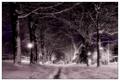
Sticky Situationby TerryGeeComment: Greetings from the Critique club
Very good lighting, nicely done.
I think your main issue here is that there is just too many elements present.
The one spire that is in focus would have been a great shot by itself.
At the very most there should have been 2 or 3 elements. With the foreground spires being out of focus it really detracts from the entire image.
When shooting plants like this some times it is possible to gently and in this case, carefully!, move the foreground bits out of the way.
Many times I use a piece of twine or small stick to just tuck them out of site.
Otherwise I would suggest shooting the two in the front and having everything else be out of focus. That way there would be a clear sign what is the main focal point of your shot.
Hope this helps.
JC |
| 12/31/2003 04:26:29 PM |
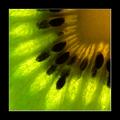
Kiwi Sunshineby puyaComment: Greetings from the Critique club
Very nice shot! Excellent composition, colours and lighting.
There is a little noise showing to the upper right. Without that I think it would have been a perfect 10.
A little fill light, very little, you don't want to blow out any of the other colours could probably correct that.
I wouldn't want any more light anywhere else because the rest is quite nice.
Great work.
JC |
| Photographer found comment helpful. |
| 12/31/2003 04:23:22 PM |
Rainbow Raindropsby WILDBLUEComment: Greetings from the Critique club
I think the strongest part of this image is the composition. It is very good.
I would say the weak point is the focus. It appears that the focal point is actually the disk, the writing is very clear and sharp. The drops are not.
On this sort of image it us usually desirable to have the drops be very sharp and clear. No amount of USM use can correct that. Here it appears you tried to use that tool, or something similiar, to correct a lack of focus on the drops themselves.
The large front especially should have been spot on focused so the rainbow in it was very clear.
I hope this helps.
JC |
| Photographer found comment helpful. |
| 12/30/2003 11:32:15 AM |
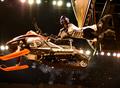
Super Sled Snow-Xby wickedpeteComment: Greetings from the Critique club
Great shot. It's so hard to work with the existing light in these situations.
The main thing I see is the crop. Way too tight horizontally.
I'm probably the worst person to get this image to critique, since I don't do this sort of work!
The large sign (?) above the person detracts. I'd suggest cloning it out. A little darkening of the bright lights would also cause the machine and rider to stand out more.
I think this image could be made to be really outstanding with a bit of work in Photoshop.
JC |
Home -
Challenges -
Community -
League -
Photos -
Cameras -
Lenses -
Learn -
Help -
Terms of Use -
Privacy -
Top ^
DPChallenge, and website content and design, Copyright © 2001-2025 Challenging Technologies, LLC.
All digital photo copyrights belong to the photographers and may not be used without permission.
Current Server Time: 09/02/2025 12:20:15 PM EDT.