| Image |
Comment |
| 02/15/2004 12:08:02 PM |
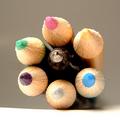
The Bathby soupComment: I love this shot. Excellent in all ways.. 10 |
 Photographer found comment helpful. Photographer found comment helpful. |
| 02/11/2004 12:09:46 PM |
|
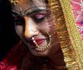
| 02/10/2004 01:20:13 PM |
In the darkness of Sagittariusby DsealeComment: Greetings from the critique club
Nice shot!
I think the main issues are the light and crop. That said, I'll tackle the crop first.
I might suggest have the tip of the arrow in the shot and cropping more for it to have the feel of a panorama. You can crop some of the bottom of the image with out loosing the feel of the pose.
As for the light. Not knowing how you had this lit it is difficult to say. So I'll just say what I would have done.
Using a diffuser of some sort, in front of a single light source placed to the right and slightly below the elbow, I would have angled it so that it did not fall directly on the elbow but just below. This would help give more definition to his entire body and not have the bright area on the tip of the elbow.
A reflector of some sort placed low to reflect the light up on the front towards the hand holding the bow would help define that area and even out the rest of the light, while still keeping the intriguing shadows.
Really, this shot is very well done already and just a little tweaking would make it perfect.
hope this helps.
JC |
| Photographer found comment helpful. |
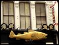
| 02/10/2004 01:13:00 PM |
Pisces Eateryby BAMartinComment: Greetings from the critique club.
I see you've already recieved a very detailed critique during the challenge. I pretty much agree.
This is a good idea and does meet the challenge.
Because you are using existing light, it is just a bit flat. I see there are lights, possibly if you had waited until just dusk, it could have been more interesting. Just enough ambient light to outline the fish and the spots to create interest.
Rotating to even it out would be good, and a tighter crop to give it a panoramic feel would also probably help.
Hope this is of some assistance.
JC |
| Photographer found comment helpful. |
| 02/10/2004 11:31:54 AM |
|
| Photographer found comment helpful. |
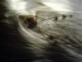
| 02/10/2004 10:52:39 AM |
Age of Aquariusby lizzyc3Comment: greetings from the critique club
Nice image!
It's an interesting abstract. You've balanced the light and dark areas well, and I love the diagonal composition.
There is one area in the upper right that is a bit overexposed and that does detract a bit from the overall quality. An argument could be made that it adds to the balance of the very dark area, but I think it is just a bit too much.
I think on a site more geared towards "art" images this would do quite well, with the OE area burned in a bit. Here on DPC it placed just about right, which is a shame.
Very nicely done.
JC |
| Photographer found comment helpful. |
| 02/10/2004 10:47:12 AM |
Pen and Pencilsby NeuferlandComment: Greetings from the critique club.
This is a very creative shot. I like the angle a lot!
Some of the problems have been pointed out during the challenge.
The focus is a bit off. How to correct that, I understand wanting to try this as a macro to capture all that lovely detail in the pencils. But at this angle it makes it very hard to have everything in focus.
This may have been a time to use a shallower DOF and concentrate on one or two pencils and the pen. Because the pen is smaller it would need to be more inline with the pencil(s) you choose to focus on.
Now, having said that, if you choose a different angle of approach, say straight on, your DOF would not be such an issue. I could see, having the pen stick out just a bit further than the pencils, with the DOF on it so that it was the main focal point. Your title is Pen and Pencils, so that would play into it being the centre of attention.
Just my thoughs, I hope they help. Feel free to email me if you have any questions.
JC |
| Photographer found comment helpful. |
| 02/09/2004 02:47:16 PM |
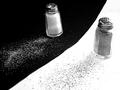
Salt 'n' Pepperby goinskiingComment: Greetings from the critique club.
This was my favourite of the salt/pepper shots in the challenge.
I like your placement of the two backgrounds. diagonal but not corner to corner.
I feel that the top crop is a little too close, because the pepper shaker is appearing to be farther away, it gives the illusion that the top is cropped closer than it is. The two main elements in an image like this tend to "feel" better if the negative space is equal, or at least looks like it is.
The shakers are at different angles, possible having them at the same angle or more extreme in the difference it would have been better.
One other thing and this is probably just a personal preference of mine, the salt and pepper are rather messy... I'd like to suggest making it neater. The pepper looks as if it is running over on the salt side and vice/versa.
I hope this helps, and remember, this is just my opinion.
JC
|
| Photographer found comment helpful. |
| 02/09/2004 02:40:56 PM |
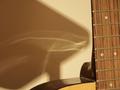
Instrument and Soundby DibutilComment: Greetings from the critique club.
I see you have already responded to some of the comments made during the challenge.
I thought this was a very creative idea. If the depth of field had been a little less shallow, the guitar would have been in focus. I think that is the one main thing here.
It's also possible if you had been able to have a string vibrating as if it had just been plucked, and the rest still it would have conveyed even more the concept of sound.
The crop is pleasing as is are the warm tones.
I hope this helps.
JC |
| Photographer found comment helpful. |
| 02/08/2004 09:38:58 PM |
|
| Photographer found comment helpful. |
Home -
Challenges -
Community -
League -
Photos -
Cameras -
Lenses -
Learn -
Help -
Terms of Use -
Privacy -
Top ^
DPChallenge, and website content and design, Copyright © 2001-2025 Challenging Technologies, LLC.
All digital photo copyrights belong to the photographers and may not be used without permission.
Current Server Time: 09/02/2025 09:25:53 PM EDT.