| Image |
Comment |
| 07/23/2003 03:58:47 PM |
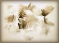
light as feathersby shutterflyComment: This is a beautiful photograph. I can't vote on this challenge but I am sure it will receive high marks from those who can. Very nice. |
 Photographer found comment helpful. Photographer found comment helpful. |
| 07/23/2003 03:57:19 PM |
Zenby mbardeenComment: I can't vote on this challenge, but if I could, this would be a 10 from me. Beautiful framing, composition and theme. I don't see a single thing about it I don't like. Nicely done. |
| Photographer found comment helpful. |
| 07/18/2003 07:48:40 AM |
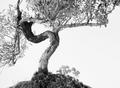
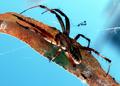
Webmasterby autoolComment: EW! So detailed it gives me the creepy-crawlies. |
| 07/18/2003 07:46:00 AM |
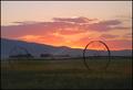
Round and roundby pncowleyComment: It's a beautiful shot of a sunrise, but the wheels, rather than being the focal point (as they should be for this challenge), sort of get lost in the shadows. |
| Photographer found comment helpful. |
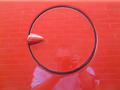
| 07/17/2003 11:51:31 AM |
RedRoundby MikeOComment: A nice idea for a circle, but I don't like the reflection in the paint. You at least should have worn a darker shirt so it wouldn't be quite so noticeable. |
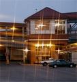
| 07/11/2003 09:09:37 AM |
Twilightby PHOTOCHlXComment: I don't care for the effect of the lighting. I imagine you are going for that being the focus of the shot, but to me, it's distracting and, with so many of them, it loses its effect. |
| 07/11/2003 09:06:13 AM |
|
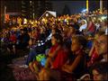
| 07/11/2003 09:05:46 AM |
Illuminated by Fireworksby alanfreedComment: This is kind of cool because you chose to focus on the crowd rather than the fireworks themselves. My eye is drawn to the child in the front center of the picture since his face is just a bit lighter than the boy sitting closer to the camera. It's a shame he wasn't lit a little better since his body language and facial expression speak for the rest of the crowd. |
| Photographer found comment helpful. |
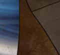
| 07/11/2003 09:01:58 AM |
Textures at nightby TopQComment: This is an interesting abstract and well done dark-on-dark, but I don't think it fits this challenge very well at all. It does nothing to suggest night on the town, even stretching the definition of the challenge. I do like the blue in the top left and the fact that you were able to capture your textures despite very limited lighting. |
| 07/11/2003 08:59:01 AM |
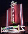
Old Cascade Theater, Renovatedby sunflowerComment: This is a bit too much out of focus. I wish you had been able to get all of the lettering readable. I do like the colors and placement on the page. |
| Photographer found comment helpful. |
Home -
Challenges -
Community -
League -
Photos -
Cameras -
Lenses -
Learn -
Help -
Terms of Use -
Privacy -
Top ^
DPChallenge, and website content and design, Copyright © 2001-2025 Challenging Technologies, LLC.
All digital photo copyrights belong to the photographers and may not be used without permission.
Current Server Time: 08/04/2025 06:53:21 PM EDT.