| Image |
Comment |
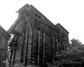
| 08/13/2003 03:55:30 PM |
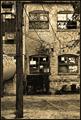
Industrial Revolutionby crabappl3Comment: I like how the lighting captures the character of the building, particularly the bricks. I also think the tree branches and pole in the front adds depth to the shot that would otherwise have been lost without it. Nicely done. |
 Photographer found comment helpful. Photographer found comment helpful. |
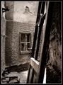
| 08/13/2003 03:52:11 PM |
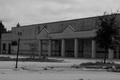
empty & aloneby NukktaComment: Brighten it up so that the facade of the building is more visible and I think this would have been more effective. |
| 08/13/2003 03:48:17 PM |
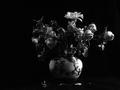
Alone in Desolationby banmornComment: In this instance, I think centering the still life better would have been more effective. Interesting use of light to just vaguely suggest the flowers for the most part. |
| Photographer found comment helpful. |
| 08/13/2003 03:45:16 PM |
untitledby AesculapiusComment: Interesting photo, nicely executed but I'm having a hard time seeing how you intended it to fit into the theme of the challenge. I do think the shadow extending from the left hand is a little long and perhaps a solid white tabletop would have been more effective than the sheets of paper. |
| Photographer found comment helpful. |
| 08/13/2003 03:38:12 PM |
Aloneby a1leyez0nm3Comment: This is a beautiful photo, but rather than evoking a feeling of desolation, the rays of light shooting out from behind the clouds give me more a sense of hope and peace. The title alone doesn't alter this perception. Wonderful shot though. |
| Photographer found comment helpful. |
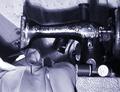
| 08/13/2003 03:34:54 PM |
Her hands lie idle nowby neenee1999Comment: Touching theme and wonderful title. The shot might be a bit more effective though had you managed to light it a little differently to soften that large shadow behind the machine. Also, the resolution does not seem very crisp on my PC. It's not that it's out of focus, it looks to be more of a digital problem. |
| Photographer found comment helpful. |
| 08/13/2003 03:32:08 PM |
Abandonedby medic391Comment: The building itself is a bit dark. Bringing out the details of the warped and rotting timber would help enhance your theme. |
| Photographer found comment helpful. |
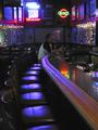
| 08/13/2003 03:29:48 PM |
Home Sweet Homeby JBosieComment: Good theme but the execution of the shot could be a little better. It took me a little while before I recognized the shot for what it was, let alone your lone patron sitting at the edge of the bar. It's a good thing he was wearing a white shirt or he would have been completely lost. I wonder if there was a way you could have found to light him better, keeping the shot dark and moody but making your subject stand out a bit more. |
| Photographer found comment helpful. |
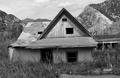
| 08/13/2003 03:27:03 PM |
Twenty Years After the Floodby dr rickComment: I like how the triangle formed by the peak of the roof being almost identical in shape to the mountain on the right side of the shot gives the illusion of the house blending right into the surrounding landscape. |
| Photographer found comment helpful. |
| 08/13/2003 03:23:54 PM |
Real Estate Bargain!by miss parkerComment: I like the photo very much. I think a different title would add to the mood more. The one you chose is a tad too jovial for the emotional impact the shot could otherwise have. I won't mark down for that, of course. Just an observation. |
Home -
Challenges -
Community -
League -
Photos -
Cameras -
Lenses -
Learn -
Help -
Terms of Use -
Privacy -
Top ^
DPChallenge, and website content and design, Copyright © 2001-2025 Challenging Technologies, LLC.
All digital photo copyrights belong to the photographers and may not be used without permission.
Current Server Time: 08/04/2025 10:40:54 PM EDT.