| Image |
Comment |
| 10/29/2003 08:22:55 AM |
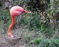
flamingoby katiedid270Comment: This is an amusing shot with his head down like that. It's more comical than graceful t me, but I won't alter my vote because of that. I do like the contrast of his coloring against the earthy backdrop. Focus on the bird could be a little sharper. |
| 10/29/2003 08:07:09 AM |
Graceful Shellby KINGComment: Nice use of light and color. This shot is very tranquil to me. |
 Photographer found comment helpful. Photographer found comment helpful. |
| 10/29/2003 08:03:49 AM |
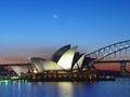
Urban Grace by brianlrComment: Beautiful! The colors are so vivid and the lights on the structures are nicely balanced. The moon is the perfect touch. |
| Photographer found comment helpful. |
| 10/22/2003 07:28:58 PM |
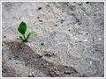
Hug Me!by KhalidComment: I had to chuckle when I looked down and saw the picture that goes with the title. Clever. I love how bright the plant is against the gray of the ground. It really stands out. |
| Photographer found comment helpful. |
| 10/22/2003 07:05:50 PM |
|
| Photographer found comment helpful. |
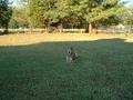
| 10/22/2003 04:04:16 PM |
Skippyby ashleyXcoreComment: The shadow is overwhelming and drowns out your focal point. Also, the dog being almost smack in the center of the photo gives it little artistic interest. Perhaps if it were bigger it would help but as is, it's hard to see this as much more than a snapshot. |
| Photographer found comment helpful. |
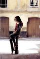
| 10/22/2003 12:53:34 PM |
Sighby BlurryComment: I love the colors and lighting (it has a wonderful, romantic feel to it) but I think your subject should be off to the left a little. However, I do like the person's shadow on the ground so maybe not. Until you notice that, the picture doesn't feel right but you don't want to lose the impact of that shadow. Perhaps soften the bright white light on the pavement and instead of cropping off the right of the picture, leave more to the left. |
| Photographer found comment helpful. |
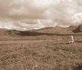
| 10/22/2003 12:45:14 PM |
My first time allone.....by litboltiComment: Make your subject just a little closer and maybe down on the page a little. Cute shot of a cute child, let's see him just a little better. Otherwise, beautiful landscape shot, colors, tones and composition. |
| Photographer found comment helpful. |
| 10/22/2003 12:44:02 PM |
Sit awhileby MikeOComment: Because the bench facing left, I think it would be more effective to have the open space to the left of the photo instead of the right. The shadows are effective however, as are the muted tones. Nice detail in the ground covering. |
| Photographer found comment helpful. |
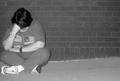
| 10/22/2003 12:13:14 PM |
Lonelyby GinxComment: Bring your subject over to the right just a bit so her knee isn't cut off. Otherwise a nice use of negative space. |
| Photographer found comment helpful. |
Home -
Challenges -
Community -
League -
Photos -
Cameras -
Lenses -
Learn -
Help -
Terms of Use -
Privacy -
Top ^
DPChallenge, and website content and design, Copyright © 2001-2025 Challenging Technologies, LLC.
All digital photo copyrights belong to the photographers and may not be used without permission.
Current Server Time: 08/04/2025 02:20:11 AM EDT.