| Image |
Comment |
| 04/30/2008 04:06:53 PM |
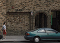
Telephone Rackby VpphotoComment: IMHO, not sepia. Sepia prints should not have greens, reds and blue. Also, found the composition a bit disorienting, out of focus and totally blown out sky in the upper left. |
| 04/30/2008 03:50:52 PM |
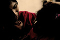
Allureby youngandambitiousComment: Sorry, but out of focus, grainy, centered composition...I just don't get this shot. |
| 04/30/2008 03:42:09 PM |
|
 Photographer found comment helpful. Photographer found comment helpful. |
| 04/30/2008 03:41:10 PM |
Cloverfieldby superclaryComment: I would have liked a tighter crop...had to study the shot for a while to figure out that it really was clover...and had it not been named as it was, not sure I would have figured it out. |
| 04/30/2008 03:39:59 PM |
|
| 04/30/2008 03:39:10 PM |
|
| 04/08/2008 08:22:41 PM |
Watching the Dancersby OmanOtterComment: I think this really needs to be cropped to remove the blown out upper right corner. At that point, I then looked at cropping the bottom to remove the knee. Yes, you loose the sword, but to me that is the only significant detail. I find that crop much more pleasing. |
| Photographer found comment helpful. |
| 04/08/2008 08:13:34 PM |
Gloriousby MelethiaComment: I loved this image (I wish I could take something this stunning). I apologize for hot having anything constructive to add..... |
| Photographer found comment helpful. |
| 04/08/2008 07:48:11 PM |
Tilt En Vogueby colorcarnivalComment: For me, I loved everything about this shot except the "vogue" part. However, this is such a personal shot that what I think does not really matter. I still gave it a good score because I loved the contrast, the tilt, the lighting on his face. I don't think I would have changed much on this one. |
| Photographer found comment helpful. |
| 04/08/2008 07:39:42 PM |
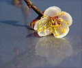
Blossom on Iceby Pug-HComment: For me, the reflections of the branches are distracting and take away from the rest of the image. Perhaps cutting the stem much closer to the flower....although from the reflections it looks like the branch might have been pulled down for the picture...not actually cut. I also don't want to sound like a broken record, but I think a tighter crop would help. |
| Photographer found comment helpful. |
Home -
Challenges -
Community -
League -
Photos -
Cameras -
Lenses -
Learn -
Help -
Terms of Use -
Privacy -
Top ^
DPChallenge, and website content and design, Copyright © 2001-2025 Challenging Technologies, LLC.
All digital photo copyrights belong to the photographers and may not be used without permission.
Current Server Time: 08/04/2025 02:46:30 PM EDT.