| Image |
Comment |
| 09/23/2005 02:22:55 PM |
In Redby danderson107Comment: **Critique Club**
What a gorgeous photo! I can actually see very little wrong witt this photo. Her litstick as mentioned by most of the commenters is a bit off color tothe gorgeus reds of the background. I think if she had put on a gorgeous matte red lipstick this photo would have been up in the top 10.
|
 Photographer found comment helpful. Photographer found comment helpful. |
| 09/23/2005 02:07:58 PM |
Mother and Childby flip89Comment: **Critique Club**
flip89
Nikon D70
Your photograph shows a mother and son? a lady and a kid? Do they know each other? or care about each other? This to me looks like a photograph of two strangers watching something over a wall instead of a portrait. The sign in the background doesn't add to the photo, it distracts. By cropping into the little boy, you might have gotten an ok portrait of him. If you know these people, you could have had her put her arm around him, and have them watch off the same way, movign to remove the background.
The colors of the young man and the lady are beautiful tho, and make their skin look warm. The color in the background looks true to life also.
|
| 09/21/2005 01:34:34 PM |
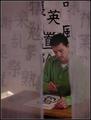
Understanding Comes Slowlyby shutterphunkComment: **Critique Club**
shutterpunk
Pentax *ist D
This is a well composed photograph, with the calligrapher framed by his work.
As this is advanced editing, improvements to this photo would have been to clone or crop out the sunlight in the left side and using something to reflect that light to the calligrapher or by working with your brightness and contrast to bring him out and make him the focus of the picture. Those are the only two areas I can see that need improvement on.
Congratulations on a very nice photo :) |
| 09/21/2005 10:05:18 AM |
Adamby callanComment: This photogrpah is way too dark, and its difficult to see whats goign on in this photograph.
I can see the side of a persons face and what appears to be a microphone?
|
| Photographer found comment helpful. |
| 09/20/2005 12:13:20 PM |
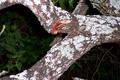
Wounded Branchby TheresaAComment: **CRITIQUE CLUB**
This photo had a lot of potential. The cut branch fits very well with the title of your photo.
The lichen has hot spots on it from your flash. By stepping back and zooming in a bit you would have lost that and given the background more blur. I would also have liked to see you pull the stick immediatley behind it out to remove it from the photo. It is a touch distracting from the cut in the wood. By cropping in a bit also you woudl make the cut in the wood more noticeable.
Good Luck in future Challenges :)
|
| 09/19/2005 11:55:04 AM |
|
| 09/19/2005 09:17:18 AM |
|
| Photographer found comment helpful. |
| 09/18/2005 11:07:56 AM |
Branching Artby Bus352Comment: ** Critique Club **
Carlton Johnson
Sony DSC-F717
Branching Art
Gorgeous colors, Branch at top overlapping is awesome! It gives the photo more dimension. You captured the shadows and highlights on wallin a fantastic way. Artist in photo is an added good thing
Artist is too bright and has hot spots on her. She has potential to be as colourful as the wall, with the paint on her pants, and the bright coloured shirt. The backpack could have been moved for the photo, when you asked her permission to take the photo.
All in all this photo has more positive things than the slight negative thing and all in all a VERY delightful photo!
Congratulations
|
| 09/18/2005 09:50:57 AM |
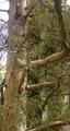
Endeavorby lilylilyComment: ** Critique Club **
Lily
Gateway DC-T50 5.25 megapixels
Endeavor is a photograph that has excellent potential. The prospective is good, and you caught the tree at a spot that fits the Title.
The photo has a very, very tight DOF though, and hides all that. Is it possible that your camera was set on fixed focus or on a macro mode? Is it possible that your autofocus is off and needs repairing? This would explain part of the problem. I would like to see other photos from this camera to see. The Focus problem hides the Endeavor.
The coloring is off I believe because of the focus problem. The part that I do see in focus looks to be spot on for coloring with this type of tree.
The crop of the photo could be improved slightly, the branch coming off and up to the top of the picture is distracting and in shadow so it does not look pleasing to the eye. With a tighter crop this would be removed.
Good luck in future challenges :) I’m sure that your future challenges will do well :)
Message edited by HBunch - fixing cc glitch. |
| 09/13/2005 08:24:33 AM |
Attitudeby shutterflyComment: Excelletn photo, love the lighting and colors of this photo. |
| Photographer found comment helpful. |
Home -
Challenges -
Community -
League -
Photos -
Cameras -
Lenses -
Learn -
Help -
Terms of Use -
Privacy -
Top ^
DPChallenge, and website content and design, Copyright © 2001-2025 Challenging Technologies, LLC.
All digital photo copyrights belong to the photographers and may not be used without permission.
Current Server Time: 08/05/2025 03:41:04 AM EDT.