| Image |
Comment |
| 05/17/2005 09:17:06 AM |
|
 Photographer found comment helpful. Photographer found comment helpful. |
| 05/17/2005 09:15:57 AM |
Photographers at dawnby allankentComment: Oh - nice. I can just see this gracing a book cover perfectly. I really like the tonal range here, as well as the composition and combined ideas. Lovely stuff. 10 |
| Photographer found comment helpful. |
| 05/17/2005 09:14:46 AM |
Father and Sonby twm122Comment: This lovely idea suffers from too much extraneous background spoilers. Also, there seems to be too much bottom. 4 |
| Photographer found comment helpful. |
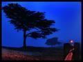
| 05/17/2005 09:13:41 AM |
Blue Mood & Moonby MonaComment: Two points: 1/ A better balance is needed. If the space from the bottom to the tip of the tree matched that of the top to the moon, the composition would have felt much more connected. 2/ I don't like the title. How about 'moon & branch'? 5 |
| Photographer found comment helpful. |
| 05/17/2005 09:10:51 AM |
Evening Bluesby kevrobertsonComment: I'm normally not so picky, but here this excellent photo suffers too much from a faulty horizon. 6 |
| Photographer found comment helpful. |
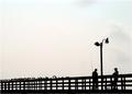
| 05/17/2005 09:08:55 AM |
Ferris Wheelby RickHComment: You've filled the frame well. The sky and the main subject are both very appealling. Maybe if you'd have waited just a touch, you could have avoided the pure white behind the centre of the wheel. Otherwise, good stuff. 8 |
| Photographer found comment helpful. |
| 05/17/2005 09:07:23 AM |
Before Sunriseby kmbr2001Comment: You've got such lovely and rich colours here. The composition works for me, too as both sets of left-right lines compliment each other well. My only quibble is with the border and with the left tree clipping the border. It's screaming out for space all around it. 7 |
| Photographer found comment helpful. |
| 05/17/2005 09:05:44 AM |
|
| Photographer found comment helpful. |
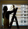
| 05/17/2005 09:04:04 AM |
Unveiling Beautyby clarmoreComment: Classic and a beautiful amount of texture outside. The border and line emphasise this perfectly. I think that you've got just the right amount of space above the head. I tried to visualise it a number of ways, but I always came back to what you've given here. Good stuff. 8 |
| Photographer found comment helpful. |
| 05/17/2005 09:01:45 AM |
|
| Photographer found comment helpful. |
Home -
Challenges -
Community -
League -
Photos -
Cameras -
Lenses -
Learn -
Help -
Terms of Use -
Privacy -
Top ^
DPChallenge, and website content and design, Copyright © 2001-2025 Challenging Technologies, LLC.
All digital photo copyrights belong to the photographers and may not be used without permission.
Current Server Time: 08/04/2025 07:18:03 AM EDT.